PICK YOUR AI THEME TO GET STARTED

DAY 03 | EPISODE 02 | QUICK CLIP 18
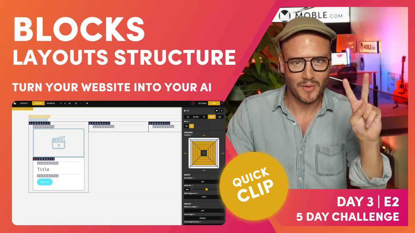
MARGIN

Paul Davenport | 03:42
While we don't recommend having bespoke Padding for Left and Right, you can use Margin to determine the exact pixel height for Top and Bottom, on both desktop and mobile.
Please note, part if this Clip is is taken from Part 2 below, where we combine Shift Up Effect with Margin to create perfectly balanced formatting.
"To do this, I'll go to frame and then scroll down, and this is where I'm going to introduce margin. Now, what margin does, it adds padding to the outside of the frame, right? This is CSS now, right? In here, I could put in 100 pixels. Now, the reason I'm doing 100 pixels is because I've put 100 pixels in here. Now, I've shifted up 100 pixels, and I've allowed padding of 100 pixels, right? Top tip on using margin.
Now, shift is only a function of desktop. We don't shift up on mobile by default. At this case now, I'm only adding margin top 100 pixels to the desktop only. We've got desktop here, we've got mobile there. Okay? This is pretty cool. Remember now, we talked about using padding, and these are standard padding heights and widths that we've got, but we can control any pixel height with margin. This is really cool now. We're not going to get into any trouble because we're designing in a really logical way thinking about everything. I'm back in business mode now. I can now see that we can see this has shifted up by a hundred pixels. It's actually shifted up and we've had a hundred pixel margin in here. Pretty happy with that. We're looking really nice."