PICK YOUR AI THEME TO GET STARTED

DAY 03 | EPISODE 02 | QUICK CLIP 03
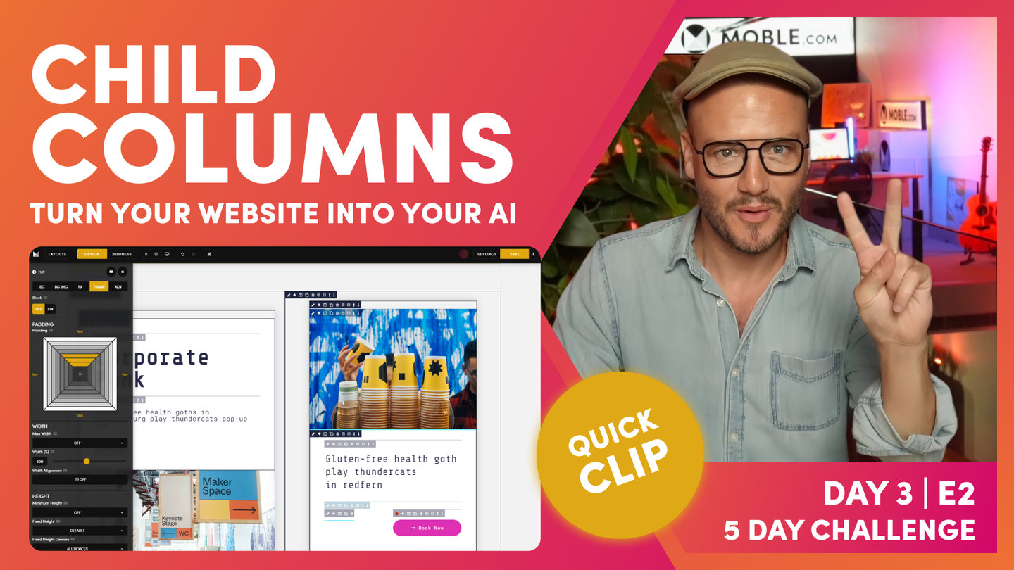
FRAMES - LAYOUTS STRUCTURE

Paul Davenport | 06:28
As an Agency, MOBLE designed a methodology of how to structure Frames, that are not just convenient for initial designers, but also keep our clients on track so they never stray off brand. As a platform, MOBLE bots have been created to serve this methodology, and if you stick to what you learn in this episode, our bots will be able to make rapid future changes changes and redesigns for you.
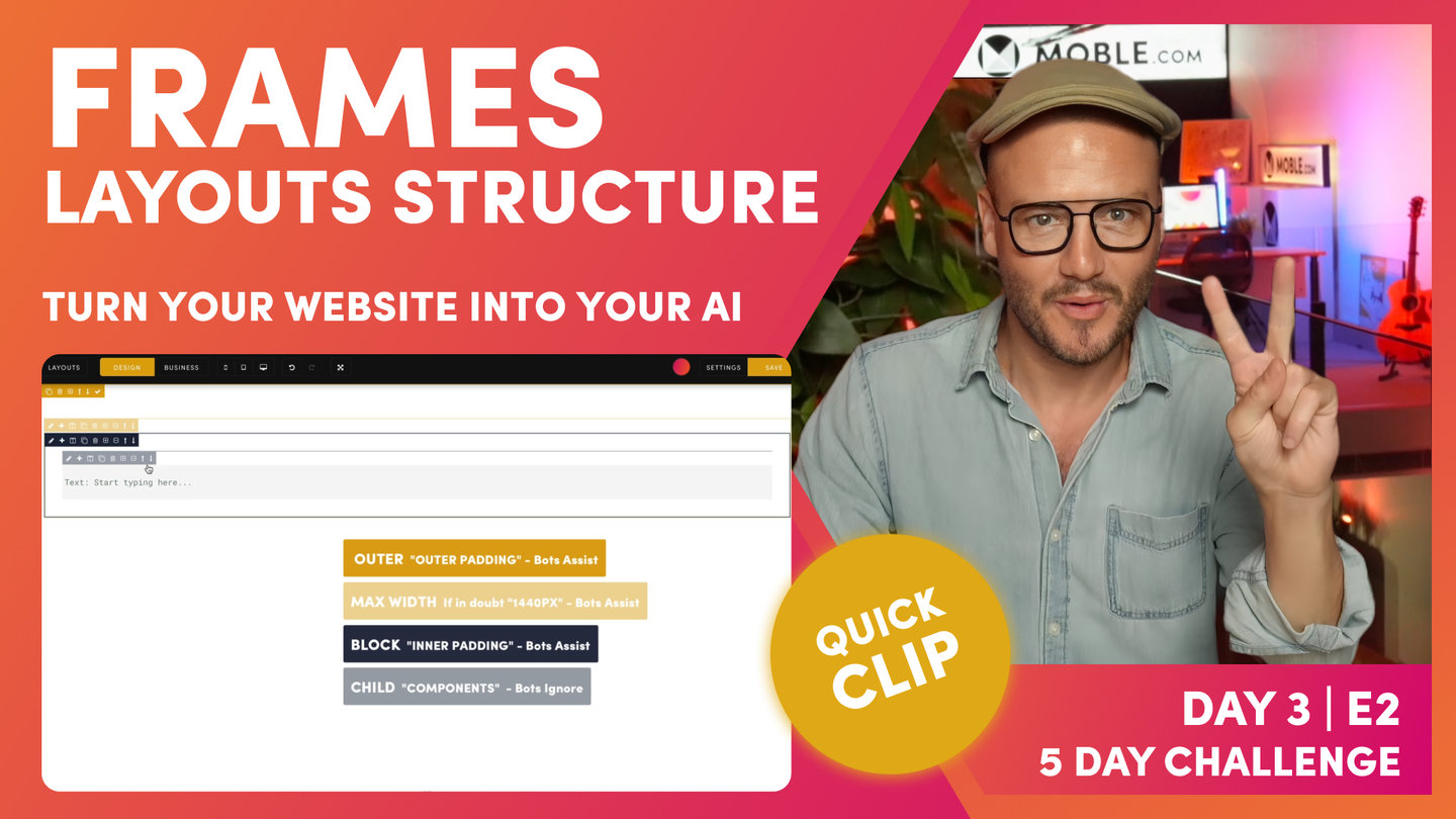
"When you build out a layout, you need to have at least three frames so that our AI Website Bots can work with you. We have our outer frame and then within that, we have our max width frame. Let's just... adding a child here. You can see, I can drop all these embedable components onto the page. In this case, I can also drop new frames. So, I'm going to drop a child frame that drops it inside this one. That's as opposed to a parent frame, which drops it to the outside. It starts a new frame. I can just minus this, I can just... Sorry, I can just delete this at any time when I want to. I'm just going to click delete there and keep nice and clean.
So, we're going to frame for our out padding. We're going to turn this one into our max width. And inside this, we're going to have another child for our inner padding. Let's go and set this up now. On the pencil icon, I'm going to come to frame because we're going to set up our frame, and I'm going to apply padding to the outside, so I can put 64 and 64 or I can close them all here, hold the alt on a PC or option key on a Mac, and click one side, and it will put the padding around all sides for me. Okay, shortcut. That's option on a Mac, alt on a PC, all sides of a frame.
Now, on the next frame in here, I'm going to apply our Mac width. As we learn in the essentials, ever in doubt, desktop 1440. Our desktop users, it will be a max of 1440 on a desktop. So, if their screen is 1920 pixels wide, it'll be a max width of 1440. Okay, so now we have our inner padding, which our inner padding is what we call a block, so we Colour our block in. This is only a CMS backend setting that we see and our future users see. What we want them to know is when the Colour is bold, that's padding. Our bold mustard is for our outer padding, and our bold blue is for our inner padding. Keeps it nice and easy.
Inside the inner padding, we have our child frame where we put our component. You can see here, we have a light mustard, which is the max width, and then we have a light blue, which is for the component. Well, I'll just put in our padding here. I'm just going to put 32. I'm going to hold option on my Mac here, alt on a PC, to apply this padding to all four sides at once. That's a shortcut there. Hold option or alt, and it applies for all four sides at once.
This is lovely. Now, this is a classic setup we have. We have a outer padding, inner padding, our max width, and then a light blue frame for our component. Let's put a component in here. Here, we use the plus icon to drop in a component. I can add all types of component, text, images, buttons, widgets, even forms, menus. All of these things you will have seen in initial episodes here, I'll just drop in a text.
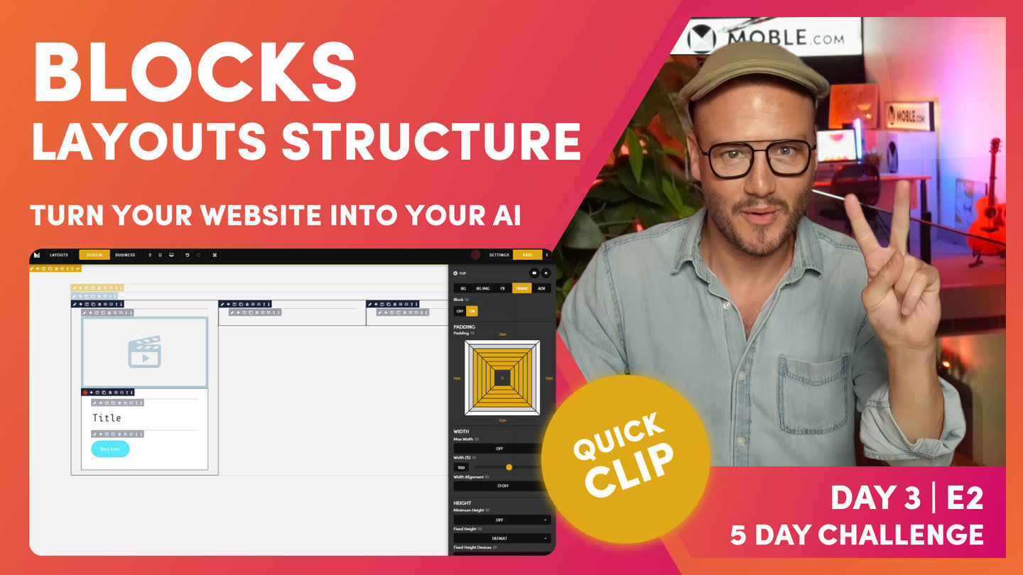
What I'll do now, just explain why we use a frame for our child components. What we often see is people dropping in like a text, and then a button, and not putting them in a frame. This is not good practice. It might be good for that immediate requirement, but what we are always thinking about, and this is the lesson and the narrative for this intermediate class, is we're always thinking about our future content editors in the future. We're not designing for ourselves right now. We're designing for everyone in the future so that they never mess it up.
Let me explain. Here, I'll put in another child frame. If I can click the child here, it drops it at the top. I'll remove this frame by hitting the minus, okay, because now I'm going to show you another shortcut, which is, again, if I hold the alt on a PC, option on a Mac, it's going to drop at the bottom. So, I'm going to hold alt or option and hit the frame, and it drops it at the bottom. Nice. Now, I'll just put in a button component here so that you can see that. This is the beauty now. I can move this up and down, which is such an easy way for our content editors in the future to move things up and down. We want them to have some controls like this.
And now, they could put in padding, which is another function that we're about to look at. Here, they can apply that also within the frame. This is what we call divs in front-end development. MOBLE, we call them frames. This is because we can apply properties inside that div inside that frame. So, we're looking pretty good here. What I'm going to do is just delete these components. Another great reason why we put things in frames, nice and easy to delete. And we're going to add a column, so I don't need this inner padding right now, so I'm also going to use the delete function here to delete that. And now that's gone."
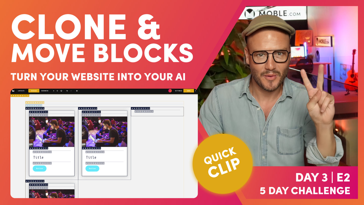
And now, I'm going to show you the third icon along, which is columns. In this case, I'll start with the two-column layout. You can see here, these are all evens and these are actually two columns by fractions, and these are three columns by fractions. Okay? We're just going to start with a straight two. And you can see here, it's automatically added our inner blocks. We've got two columns, and it's automatically put the inner padding into this block, and then it's got a child component ready for us to go. Well, that's pretty nice.
Now, in here, I could go and actually add my components in as I would like. Okay, pretty basic stuff there, but watch what happens in here. I can go back to my column, and I can now just turn this to any of these. In this case, we're going to build out a three-column, aren't we? So, I'm just going to select three column, and it changes it for us."