PICK YOUR AI THEME TO GET STARTED

DAY 03 | EPISODE 01 | QUICK CLIP 03
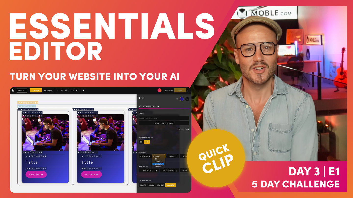
FRAMES STRUCTURE

Paul Davenport | 8:47
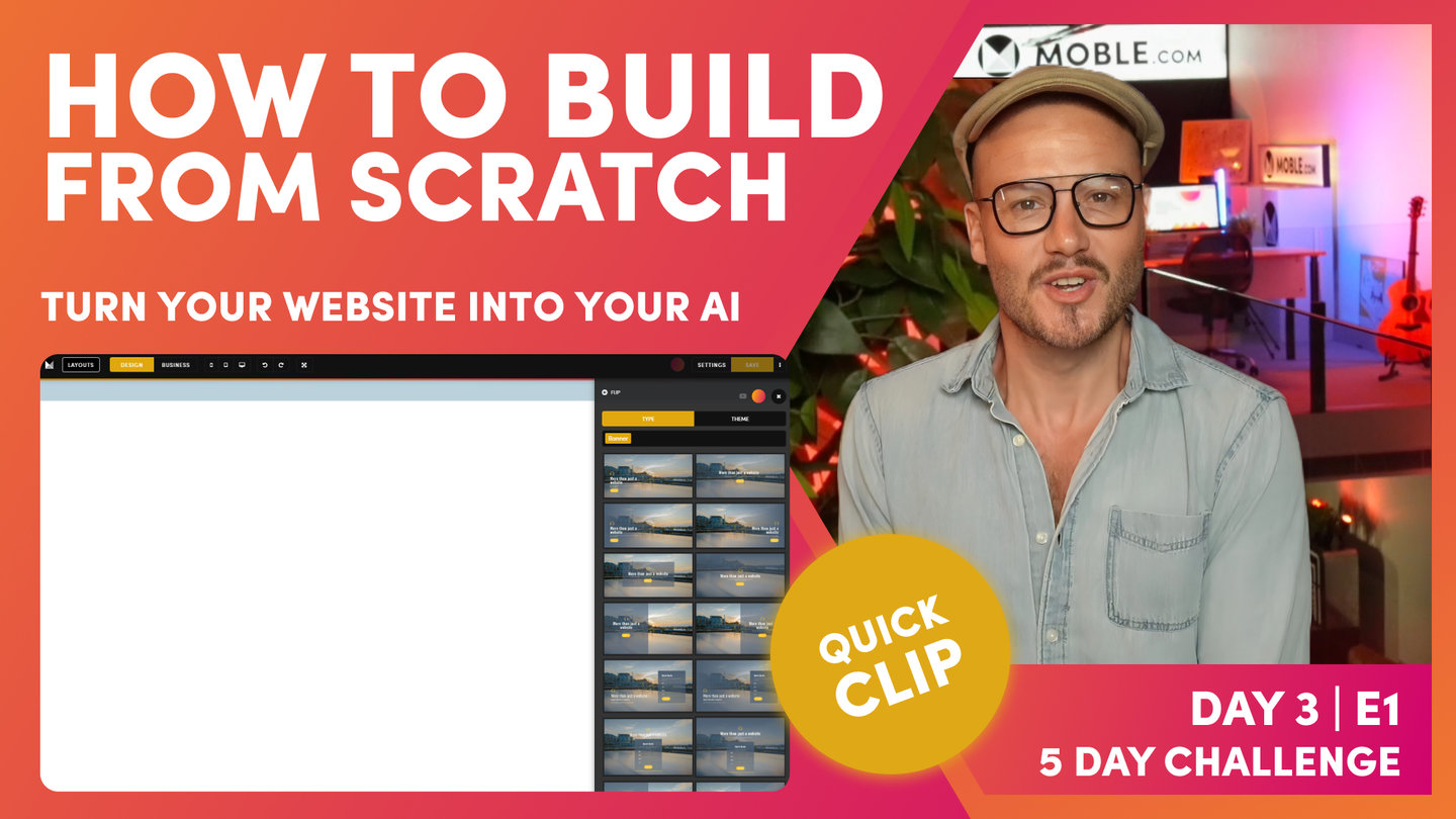
Frontend developers use divs (Divisions) as the base structure that design elements can be applied to. At MOBLE we simply called these Frames. In the intermediate class, you'll learn everything about Frames so that you can build from scratch.
Frontend developers all have their own way of structuring divs, though most just apply them on a must need basis for that particulate task. Well without a uniform structure, it can get very messy very quickly, particularly if one developer hands over a website to another. Nobody has time to go though another persons code, this is why developers just prefer to do it form scratch.
Well at MOBLE we wanted to put an end to these inefficiencies and ensure that all pages across all teams and all projects have a uniform structure for Frames. So that everything just works, and everybody is always aligned. This means changes can be made quickly, and entire redesigns can happen without having to start again.
In this clip we introduce Frames for the first time and show you MOBLE's tried and tested structure for setting up Frames. If you use this structure you can't go wrong. Plus we have built bots based on this structure so that you can get your bots to do wholesale changes in just a few clicks.
Pro Tips:
MOBLE 5 FRAMES METHODOLOGY
If designing from Scratch these simple rules will ensure your website Layouts always work with MOBLE AI and Bot Assisted Design. Watch the Intermediate Class to see this in practice.
- Outer Padding
Select: 64px, 32px or 16px or None - Max Grid
Select: 1440px, 1280px or None - Column
Select Columns or Grids.
Apply Mobile Stacking: - Reverse, Fixed, Double, Single - Inner Padding
Select: 64px, 32px or 16px or None
Add Top and Bottom Margin only if needed. - Component
Select Component. Add Top and Bottom Height.
"Now, what I'm going to do is show you the structure of those Frames in Business Mode. To do this, I'll go back over to the Layouts Drawer, and what I'm going to do now is search via a Theme. As you know, I can search for all the Themes along here as we've done on the first two days. I'm just going to choose this Theme called Inco, which is quite a clean Theme. It's going to help us explain the structure of the page. What I'll do is just go down and we'll take this three-column Layout, 1, 2, 3. I'm going to hold shift and drop this onto the page, and then it drops into the page for us here. You can see it's now in our fonts and it's brought over one of our Colours as well. We've got the Layout just in here. Our previous Layout is still on the page. This is just dropped in on top.
Now, I'll go back to the Layout Drawer, and I'm going to show you a Layout from the type Drawer. I'll click here and you can see this is showing me banner Layouts at this stage. If I remove that, look at all of these, I can go for all the body Layouts, Singles, Halves, Thirds, fourth, fifth, and it goes on. Lots of different types of Layouts. Well, I'm going to choose a three-column Layout. I'm going to select Thirds, so show me all the Layouts in Thirds. Well, why do we say ‘Third’s’, and not ‘three-column’? Well, these Layouts are all split into Thirds. Look at this one, it's one-third, two- thirds and it has only two columns. This is why we say Thirds, and why we categorize Layouts by Fractions, not by number of columns. It makes it easy for you to choose Layouts that share the same alignment. Now, I'm going to go to the top of the page,grab this three-column Layout that is three thirds. You can see the Drop Zone appears on the Canvas, I just need to click and the Layout will automatically drop into the Drop Zone. Also note, that I can Hold Shift and click, and now that drops at the very top of the page, or I can Hold Alt (Option of a Mac) and Click and it will add to the Bottom of the page.
Well, here you can see I'm in Business Mode. If we observe the page and compare between the Type Layout, that we just dropped, and the Theme Layout from the Inco Theme, well look, these Layouts aren't aligned, so that's no good. We want all of our Layouts to be aligned and to look nice on desktop, tablet, and mobile. You can imagine now if we had content users, with no design skills, try to go change this, it would be too hard for them. It could even be too hard for Designers. This is why we have AI Website Bots that sort the alignment for you.. We want it to just work automatically. Now I'm going to show you how to fix your Padding Alignment, using our AI Website Bots, with just one click. To explain, It is good to know, in this Essentials Episode, how the pages are structured, even if you're just going to use the AI Website Bots to do this for you, you will benefit by know how it works.
To demonstrate, I'm going to put this into Design Mode and I'm going to drawer your attention now to the Colours of these Frames. This is a very MOBLE structure. This isn't CSS, now, this is the MOBLE Editor that helps us keep everyone aligned. This is the frame structure on what you're going to become very familiar with in a logic that just works for everything, works for all users, and our AI Website Bots are going to look at this and be able to instantly go and change things for you. This is super simple and it makes everything just work. Like I say, it's a very MOBLE thing. This isn't to do with other code, but this is why MOBLE just works. This is the secret to making sure everything is aligned. We have this bold mustard Colour on the outside, and then we have this lighter mustard Colour. Then we have this bolder blue, and then we have this lighter blue.
What's the bold mustard? Well, the bold mustard is for our outer padding. If I click the pencil icon here, it opens up what we call the Frames Drawer. In the Frames Drawer, I've got background Colours, background images, effects. I've got more advanced properties such as border Colours and how this behaves on different devices, a lot of advanced settings. I've got my Frames, and the Frames where I put my outer padding. If I look at the top padding here, which is 64px, I could turn that off or I could turn it back on to 64px. That's our outer padding. We put padding on the outside. Then on the inside here, you can see this bold, what we call block. This also has padding. You can see here, I'm just going to put this to 64px and then back to 32px.
The two bolds is what we put padding in. We have the bold mustard, and then we have the bold blue. When it's bold, that just says to everyone, that's where we put padding. We only need two lots of padding on any page. We've got our outer padding and our inner padding. We don't ever need any more padding than that on a page. Padding is in bold, keeping it really simple. Then there's these two lighter Colours. We've got the light mustard and we've got the light blue. Let's have a look at the light mustard. Well, here's what we call the Max Width. This is the maximum width that a page will expand to. I'm here on a MacBook Pro, which is 16-inch, which is quite large. What I'll do here is show you what will happen when I move this to 1440px.
Well, as you'd expect, it moves out to 1440px. Now, if you are on a laptop, which most people generally are when they're doing the course, your laptop is on average 1366 pixels. You're not going to see this desktop if you put it on desktop. All you're going to see is the 64px padding on the outside. Because 1440px is wider than your screen. This is why it says desktop here. I always say to people, if ever in doubt, set it to desktop because it's quite nice to have a laptop that goes full screen. All you're going to see on your laptop is the 64px, even though you've got this set. That means that when people on larger screens, like what I'm on here, or on a big desktop, which is 1920px, they're not going to be stretching the neck left and right to read the content.
They're going to have a nice contained reading pane. What I'll just show you now is that the MOBLE platform is responsive even in the Editor as you're designing. What do I mean by that? Well, this will actually all shrink down. It doesn't expand past 1440px as we've got setup here, but it will shrink. Look at this, how it collapses, and then our blocks actually collapse there and stack on top of each other. You can see what happens here on MOBLE, the MOBLE padding is actually adjusted. I'll cover this in a second, but on mobile that 64px has now turned to 16. Here, this 32px-pixel padding has changed to 16 as well. That's a little trick. I'm going to show you that just shortly. Here, we can see that, that is our light mustard, which is our Max Width. Fantastic.
Now, on the inside, we have our light blue Frame. Now, this Frame is for our components. In here, I can embed any type of components.To demonstrate, I'll put a child frame, and you can see I can embed all different types of content in here. I could put Widgets, which is our dynamic feeds of content, for things like Photo Galleries or Online Shopping Products, News Articles, or Events. I can configure a feed of widgets or I could put in here text and images. We're going to cover all of this in the Intermediate session where I show you how we actually build from scratch and layer all these Frames out, which is what you're going to learn in the Intermediate. Now it's just Essentials. It's essential that you know what this frame structure is. We've got bold mustard on the outside for outer padding. We've got lighter mustard for our Max Width, and we've got bold for our block, which we put padding around for our components, which are in the very inner.
The two bolds are for padding. Then just as a little trick here, you can see this one's a little bit different because it's got columns. You can see our columns here have a parent blue. Again, we're going to cover this right at the start of the Intermediate session."