PICK YOUR AI THEME TO GET STARTED

DAY 03 | EPISODE 01 | QUICK CLIP 04
BOT ASSISTED DESIGN

Paul Davenport | 07:49
Now you understand Frames, you can now understand how are bots have been built, and how they work to go and make rapid changes for your right across your entire website.
Pro Tips:
If you're an advanced designer working in an Agency, the following tips will be helpful to know.
If adding Effects or Shadow:
- Use one effect per Frame. Consider adding a wrapping Frame around the Block and applying the effect or Shadow to that Frame. See Intermediate Class.
If designing Bot Assisted Layouts for an Agency, or for future Client Projects:
- Block Inner Padding: Instruct the Bots to apply Inner Padding when the Layout reused in the future by Toggling the Block class On and Off. Off will never adjust Child Padding when this Layout is Dropped.
- Parent Outer Padding: Instruct the Bots to never apply Outer Padding by removing Outer Padding (Left and Right). Then, set the immediate child Max Grid Frame to ‘None’. No Outer Padding will be applied when this Layout is dropped.
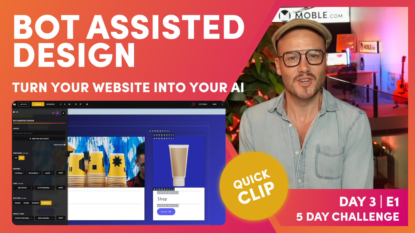
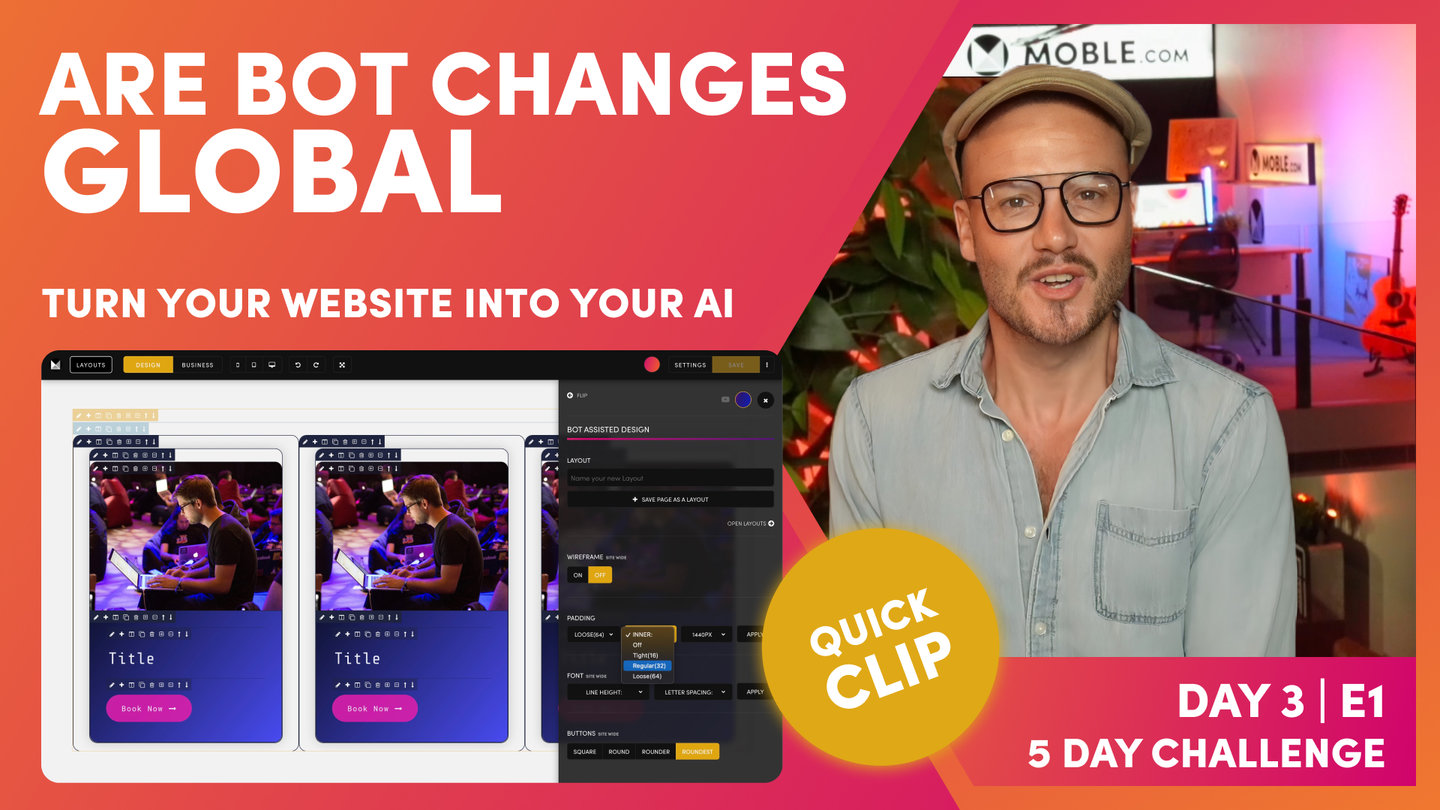
"That's how we structure a page. On this page, now we've got two Layouts that aren't aligned. We've got this one from the type Drawer, which the alignment is here, and this one from Inco, which is different. Our text comes out here, so that's not good. That's not good design. Let's now just go and get our AI Website Bots to update everything for us. Before we do, let's remind ourselves of the setting. Well, this Layout has 64px as the outer padding and it's got 32px as the inner padding, the left and right. Let's have a look at the Max Width. Well, the Max Width was 1280px.
Now let's go and look at the one from Inco. Well, Inco only has 32px left and right on the outer padding. It has 32px also on the inner padding. For the Max Width, well it doesn't have a Max Width. Well, that's interesting. Now let's go and get our AI Website Bots to go and update that for us. Could you imagine if we had to go in there and change all the padding ourselves? Even worse, imagine if the content team dragged in a Layout and they had to go and do that. Well, this is why websites become a mess very quickly. There's a lot of human error going to change padding and alignment. You don't want to be doing this. Even as a designer, you don't really want to be doing this. You just want to hit a button and know that it's all done and it all works and no testing and no time required whatsoever.
Let's do it. Well, so let's have a look at the bot. Where does it live? Well, we'll go to the Layouts Drawer and here's our bot. Here, you can see the Padding settings. Here, we've got Max Width are outer and inner. Max Width, ever in doubt, make it 1440px. You know this now because on a laptop, it goes full width anyway, left to right. We definitely want to set, normally, if ever in doubt, set it for those desktop users, who are on 1920px screens and we're just going to consider their width. There are a few exceptions which we're going to learn in the Intermediate class just shortly. I'm going to set this 1440px. Outer, ever in doubt, I say make it 64px. I actually like 32px, but since these are about 32px already, let's mix it up a little bit and make them 16.
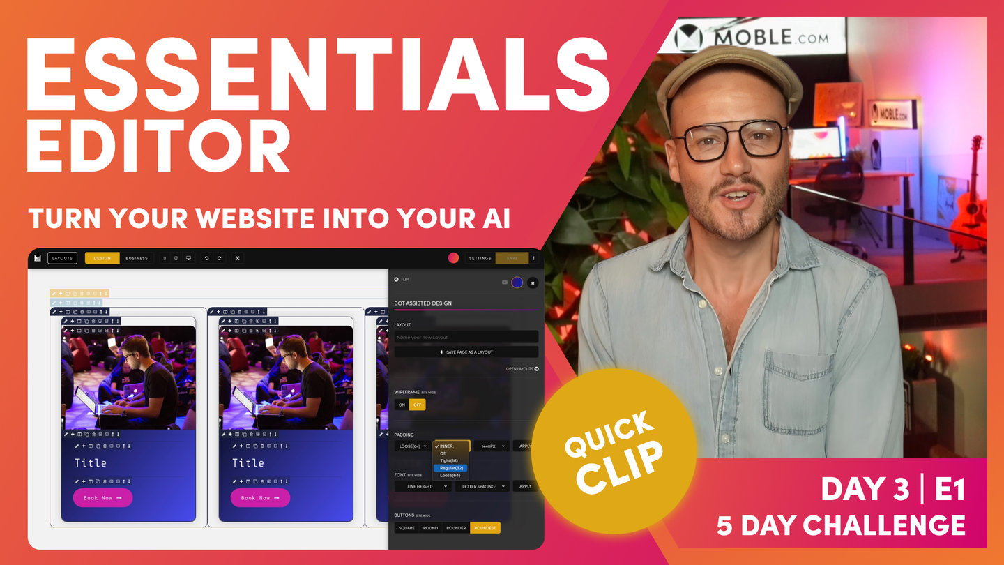
I'll make this 16px and then let's hit the apply button, and bang. Let's close the Drawer to go and take a look. Let's first look at our alignment. It's looking pretty good. We've got 64px on the outer and we've got a 1440px Max Width. Then our inner, we've got 16px on all Inner Padding Blocks. You can see all Blocks are now 16px. Remember, the bot is only changing the Left and Right Padding. It's not changing the Top and Bottom Padding. The AI Website Bots are only ever looking after the Padding and Alignment of Width, not Height. Let's go down, and look at how the Bot performed on Inco Theme Layout. Cool! Well, we’ve now also got 64px for the Parent Outer Padding. Note that it hasn't changed the top and bottom Padding. Brilliant. We've also got a 1440px Max Width and we've got 16px on all the Inner Padding. Amazing, that folks, is Bot Assisted Design. How easy does Bot Assisted Design make your design life. Now you can use any Layouts from any of the Themes and they will instantly be aligned to your Padding Alignment Bot settings, so you have 5,000 Layouts inside your MOBLE website that you can now mix and match and be confident that they all work together. This is why you don’t need to be a designer, or need any design skills whatsoever to build a website on MOBLE.
That's all lovely. Now, I'll flip to Business Mode and you can see the alignment there is looking good. Now, I'll show you one last trick that you need to just be aware of. I'm going to show you a mobile. Now, look at our mobile. This is also perfectly aligned. Mobile, notice, it's not 64px plus 16. This is actually 32px. The way the MOBLE platform works is it's making a lot of the hard decisions for you. You don't even have to think about anything and you don't even have to do anything. Everything just works. This is why we only have outer padding and inner padding. We've only got two lots of padding on any Layout. We've got outer and inner. What we basically do, the way that the algorithm works is when we've got an outer padding on mobile, it makes it 16. Irrespective if it's 64px on desktop, 32px on desktop, the outer padding on mobile is always 16.
Then on the inner padding, irrespective if it's 64px or 32px or 16, on the inner padding on mobile is also only 16. We've got these two banks of 16 pixels. Everything just works on MOBLE. We just sort all that out for you. It's just important to be aware of that. People say, "Oh, well what happens if I wanted to make my outer padding, let's say 100 pixels or this eight pixels?" Well think about what that would mean. That would mean any content Editor coming in the future would have to know that and be aware of it when they're making changes. That's why website designs get in a mess. There's no difference in the beauty of how it would look between using 64px and 100px, because we can control that by not using padding. There's other ways we can control it.
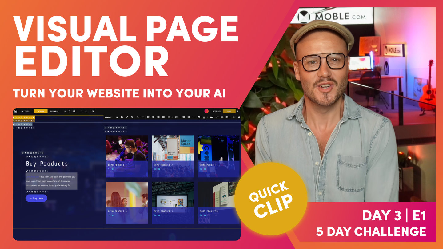
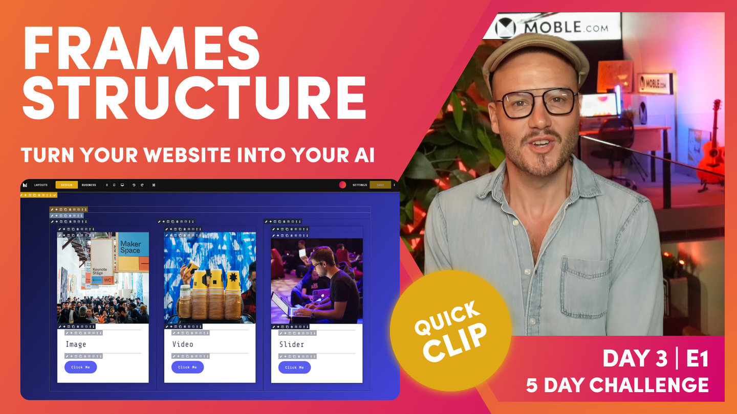
I'll just show you this. We'll cover more of this in the Intermediate Episode. On Layout, if I wanted to change the width of this one to be a bit smaller, I could say I'm going to change the width and make that in the center. Well, width is just a function of desktop in CSS. This width is only working on desktop, in this case. If I went to look at this now on mobile, even though I've changed the percentage width of this particular frame, just going to pop that onto mobile. Look, it's still beautifully aligned because we've only got those two banks of padding. If I was to go and add a third bank of padding and not use the width, do something like this and go to mobile, you can see now I've got three lots of 16 which adds up to 48px. But on mobile if you only have two Frames with Padding, the Outer Padding and the Inner Padding, then you will always have 32px from mobile, and every Frame will automatically be aligned. That's the way the MOBLE system works and that's the way we like to structure pages so that we know they always work together.
I'm just going to put this Layout back and clean as we go. Notice, I'm just cleaning up as we go there. That is the beauty of the MOBLE platform. The way that I structure website pages is like this, in that system, without a padding, a Max Width. An inner padding on a block, and then the components inside that block. You'll notice that's the way the Layouts work on the MOBLE platform. That's why we can be sure that everything works together. All future content users are working. Well, they don't need to do anything, they're just going to change the content. If they do go and drag things in, then we've just made settings so it's going to work for them anyway. Everything just works. That's the beauty of this structure and the system built around that structure."