DAY 01 | EPISODE 04 | QUICK CLIP 04
PICK TWO TYPEFACES

Paul Davenport | 06:49
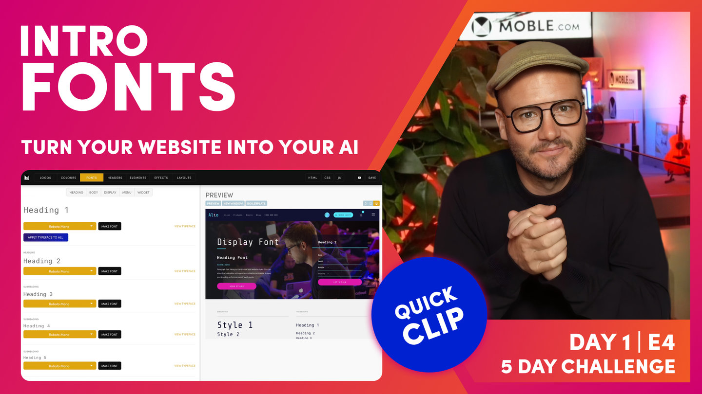
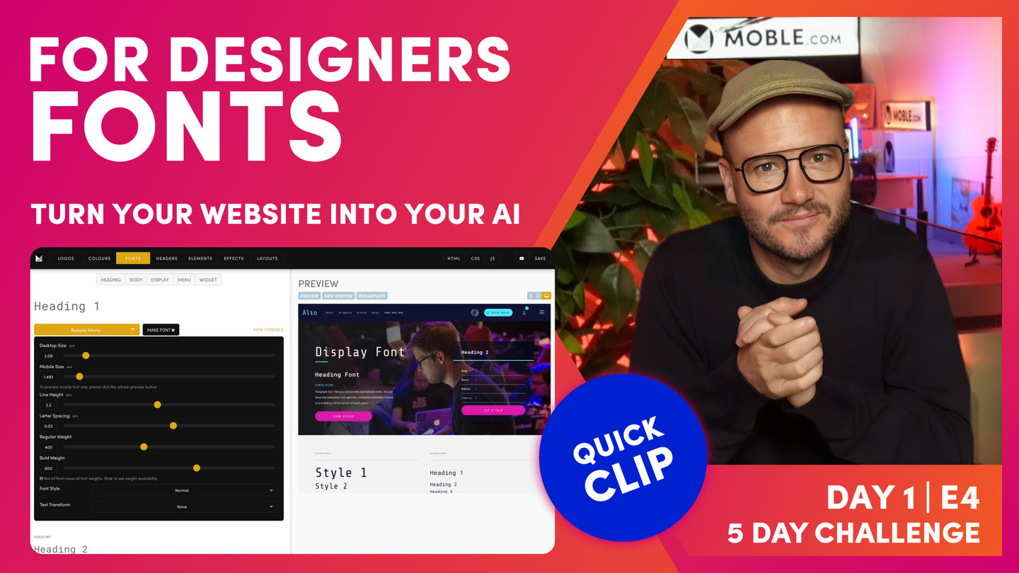
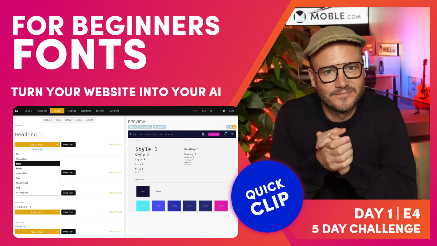
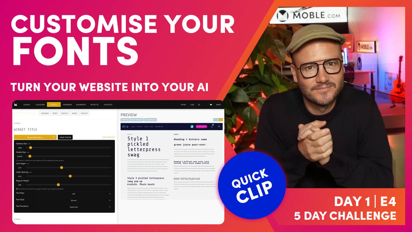
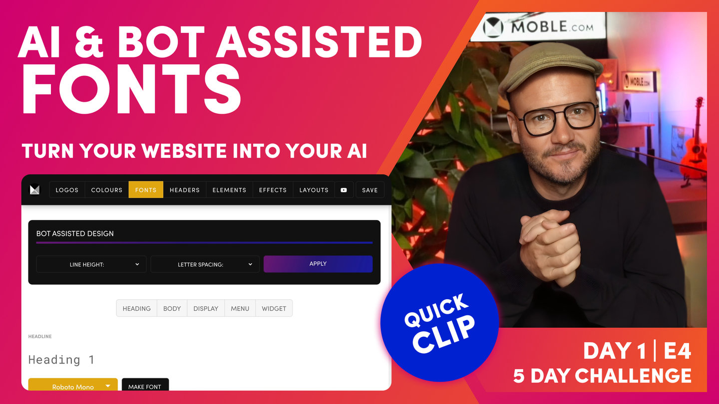
"Well here, you can see I'm back in my brand guidelines and I've got two typefaces. I have Share Tech Mono and Roboto Mono. Well, I'll go back into the Fonts area and I can now add these fonts. So I'll click the first typeface here on Heading 1 and I'll type R-O-B, which gives me a filtered list of Roboto fonts. So I'm going to select Roboto Mono. And now, notice the anchor links at the top. I can use the body to scroll down to the body fonts which consists of paragraphs and forms and I can also click the display font to go to our more poppy display fonts. Now, this is where I would add my Share Tech Mono. So if I type Share, it filters down and now, I can select Share Tech Mono.
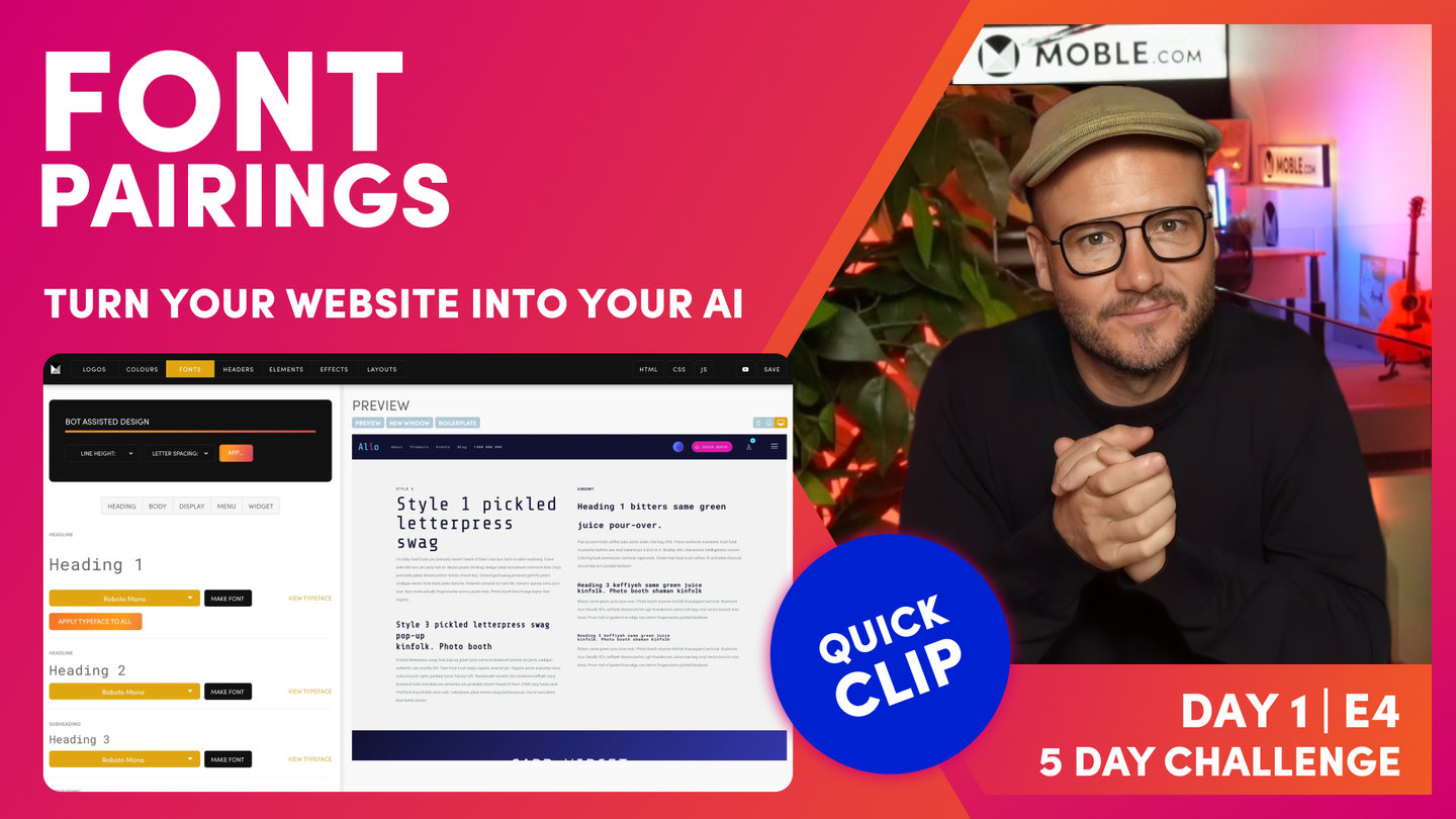
Okay. Well, let's scroll back up to the heading font and notice here that if I choose Roboto Mono and apply this typeface to all, it's going to populate all of the fonts that are available in one hit to save me having to populate them all. It's going to save a lot of time. So you can see here, they're all now populated with Roboto Mono.
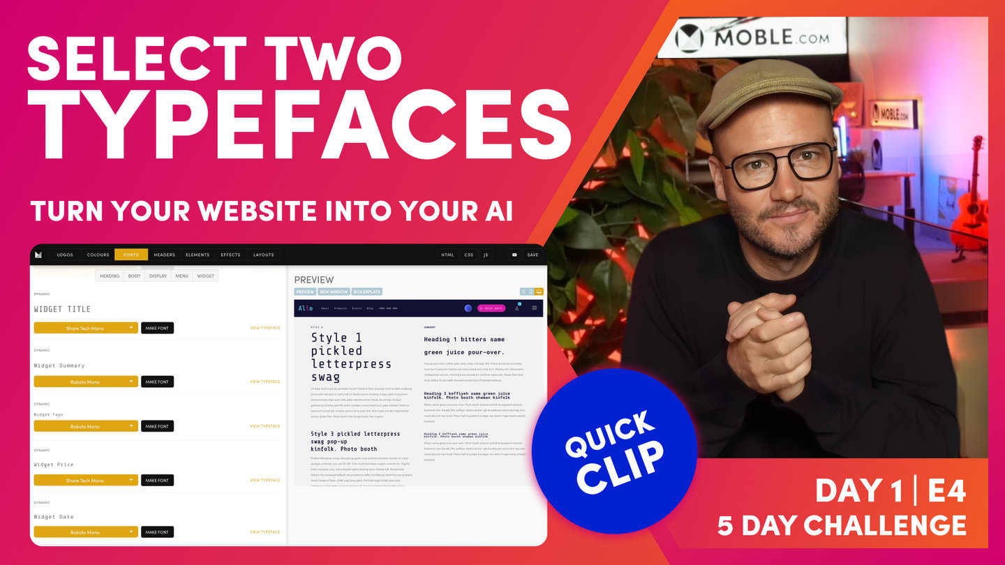
But if I go back to my first display font, which you can see here, it says Style 1. Now, I can just go through the display fonts that I want to put Share Tech Mono. So if I apply this first, Share Tech Mono, and I'll go through now the rest of the display fonts. Okay. So at this point you might be wondering, what do we mean by display font? What do we mean by this style font that you can see here? Well, to explain this, I'll just jump over to the Editor.
When you first go back into the Editor, you'll notice that your changes haven't updated. So that's where we need to hit the Refresh button if you've made any changes in the font area. So the Editor will now pick up those changes for you. So just be conscious of that. If you're looking at old fonts in the Editor, just hit Refresh. Now, if you've used other platforms, you'll be used to heading fonts, these H tags, and these are important for styling your fonts and keeping them consistent but they're also important for SEO.
So when you set up a page, what Google likes to see is there's one Heading 1, maybe there's two Heading 2s, and it's a hierarchy down through those headings. Well, if you're managing a webpage, what if lower down in the page as a Heading 4 you want a big poppy title, right? Then is that to say that if you follow Google's instructions or followed other web platforms, that you have to have this hierarchy and you can only use smaller fonts lower down the page?
Well, that doesn't make sense for a design but this is why at Moble, we have these display fonts. And you can see here in the Editor, I have my normal heading fonts 1-6 here. But then, I also can choose the style of those fonts. So this is where you can still have your nice SEO hierarchy with only one heading font but you could have a Heading 5 lower down in the page in Style 1 as you can see here. And so, that's why we have the two types at Moble to give you that flexibility.
So back in the Fonts area, you can see this is why I was saying we will choose the heading font as a more conservative font. As a rule of thumb, this is. This is just my advice to get you going. And then, I'm using a more creative display font. In this case, I'm using Share Tech Mono. So I can go through all of these display fonts and turn them into Share Tech Mono.
And that's my immediate advice, make them all the conservative one and then make your display fonts a more poppy style. So the only thing that you might change on that is down in the widgets, you might have the title to be your display font. I often like to make the widget price Share Tech Mono. So the title and the price in the widgets pop a little bit more. So at any point, I can press save and then hit the preview. If I scroll down here in the preview, now you can see my fonts have been updated, and if I look at my widget card, you can see both the price and the title are in Share Tech Mono.
Okay. So that should make sense. Now, if we look back in the Fonts area here, you'll see that we've also got these styles 7 through to 12. Well, back in the Editor, you can see it only goes up to Style 1-6. So what are Style 7-12? Well, Style 7-12 are secret fonts that only the designer can see. Sometimes, you don't want the content team to be messing around with certain fonts that only you want to use for yourself. So an example of that here, I'll jump over to the Allio site, and you can see I've got this really large font here. Now, this particular font is there because as I scroll, it moves to the right. So this is a very much of a design feature. Well, let's go and have a look how that's managed.
Okay. So here in the Editor, I can see the font. If I just highlight this, you can see here that it's not a particular style. But if I look at the source code, I can see here that it's a heading tag. It's a H4 but it's in Style 12. So I could change this Style 12 here to Style 7 or to Style 8 and so forth and it's now going to change to that particular style. So because designers know a bit of HTML and we want some secret fonts, this is how we manage it in the source code. We just literally market a... I could market as Style 6 as normal and just change the 6 to 12. So 7 and 8 and 9 are those secret fonts. 12 is what we reserve for a more poppy, the large font by default. And then, Style 10 and Style 11 are used for the shop and the member profile. There's fonts in there that sometimes you want to change and we'll cover more on those two in Day 4."


