PICK YOUR AI THEME TO GET STARTED

DAY 01 | EPISODE 04 | QUICK CLIP 05
CUSTOMISE YOUR FONTS

Paul Davenport | 03:41
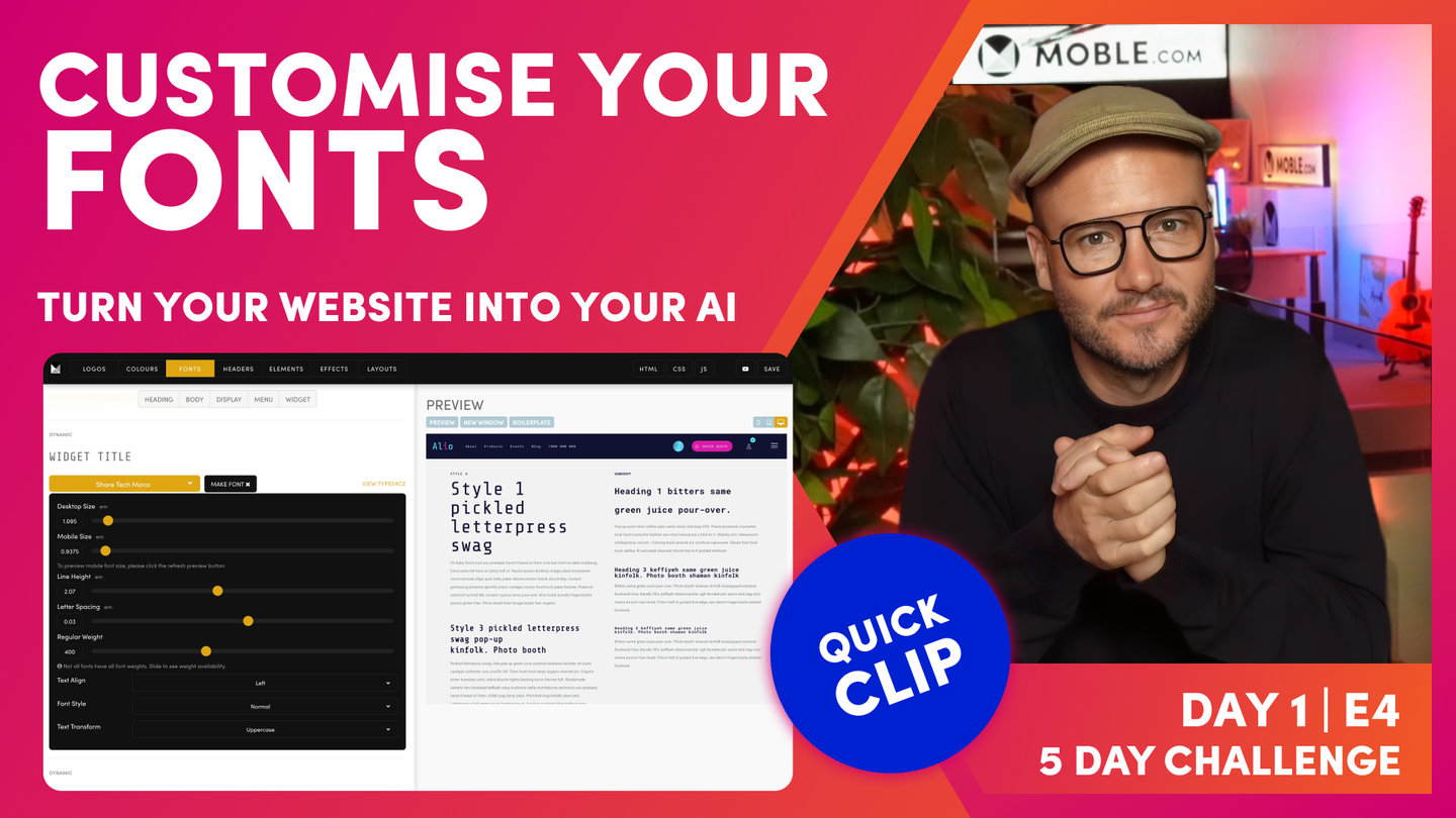
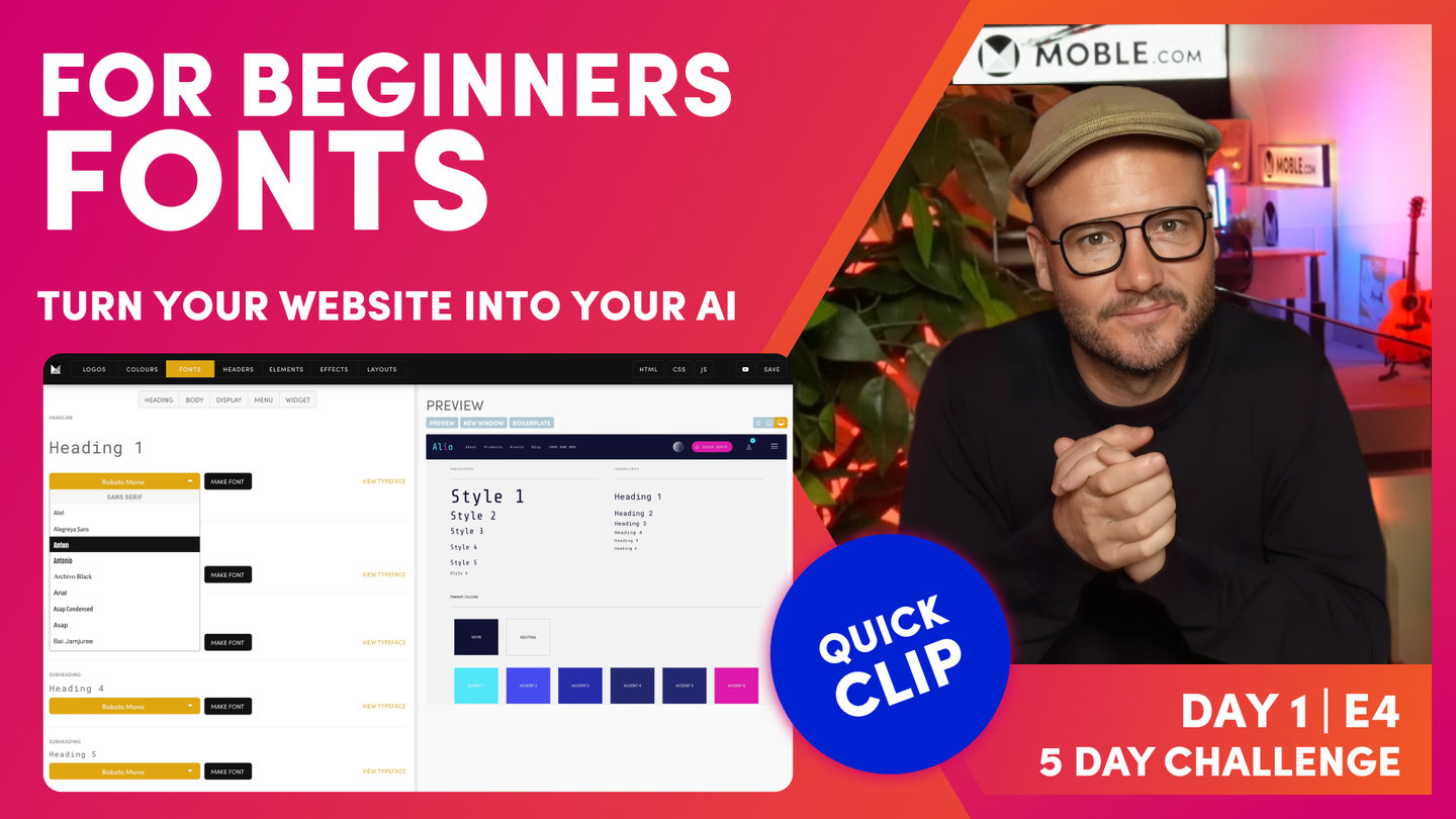
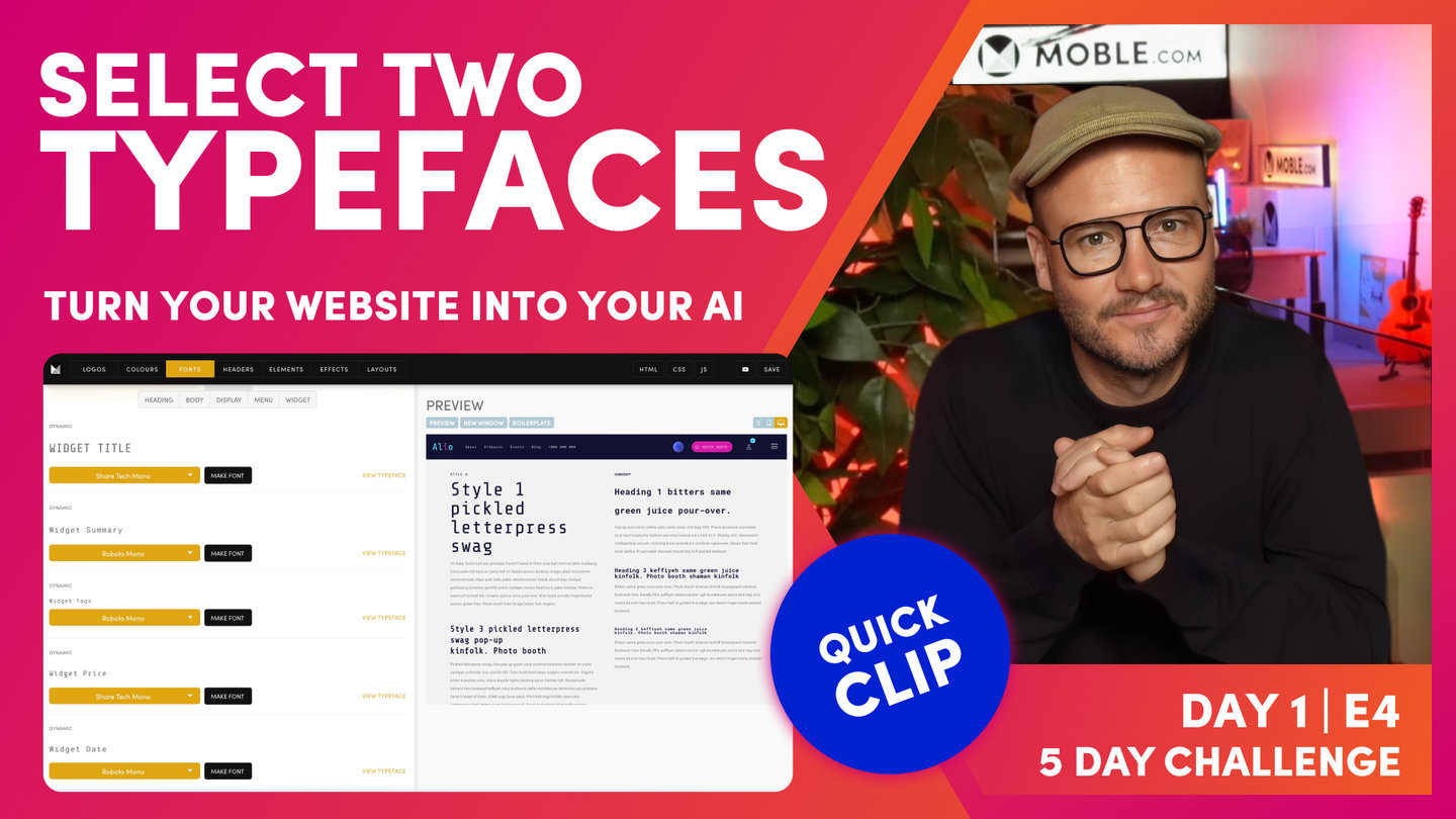
"So now, we're going to go over and make the fonts. So you can see, once we've got a typeface, we want to turn it into a font. So this is when we change the size or, we've referred to it before, the line height or the letter space and the weights. So in the page Editor, we've got a weight for regular and also for bold. So by changing these settings for each, we actually make that typeface our font.
So let's have a look here. We've got a desktop size. I can change this and as I change this, all the Heading 1s on the entire website will update at once. So if you did change a font style, you don't have to go into every heading on every page to update it. You just do it here in this master control panel and it's going to update everywhere. Again, the big advantage there is that we can do redesigns very quickly. So look, that's desktop font but of course, the font on the mobile doesn't want to be that big so we can also change the size of the font on mobile. Okay. So you can see here, I can change this and then go over to the mobile preview and you can see, I can see the font here in that mobile size.
So in a Theme, we've got these nicely styled for you right out the box. So often, you won't need to change the sizes of the fonts but you might just, in very particular instances when you're first doing the design, you might just say, "I might want to make this a little bit bigger." But I would say, wait until we get to Day 3 when we're designing the Layouts, and then we can make those decisions on sizes there and it'll just be tweaking them just slightly, maybe not on every font, maybe on one or two fonts as we go through. So my advice is just leave that now. Just be conscious that you can change the size here and when you do, it's going to update through every Layout, every page that would be, in this case, a Heading 1.
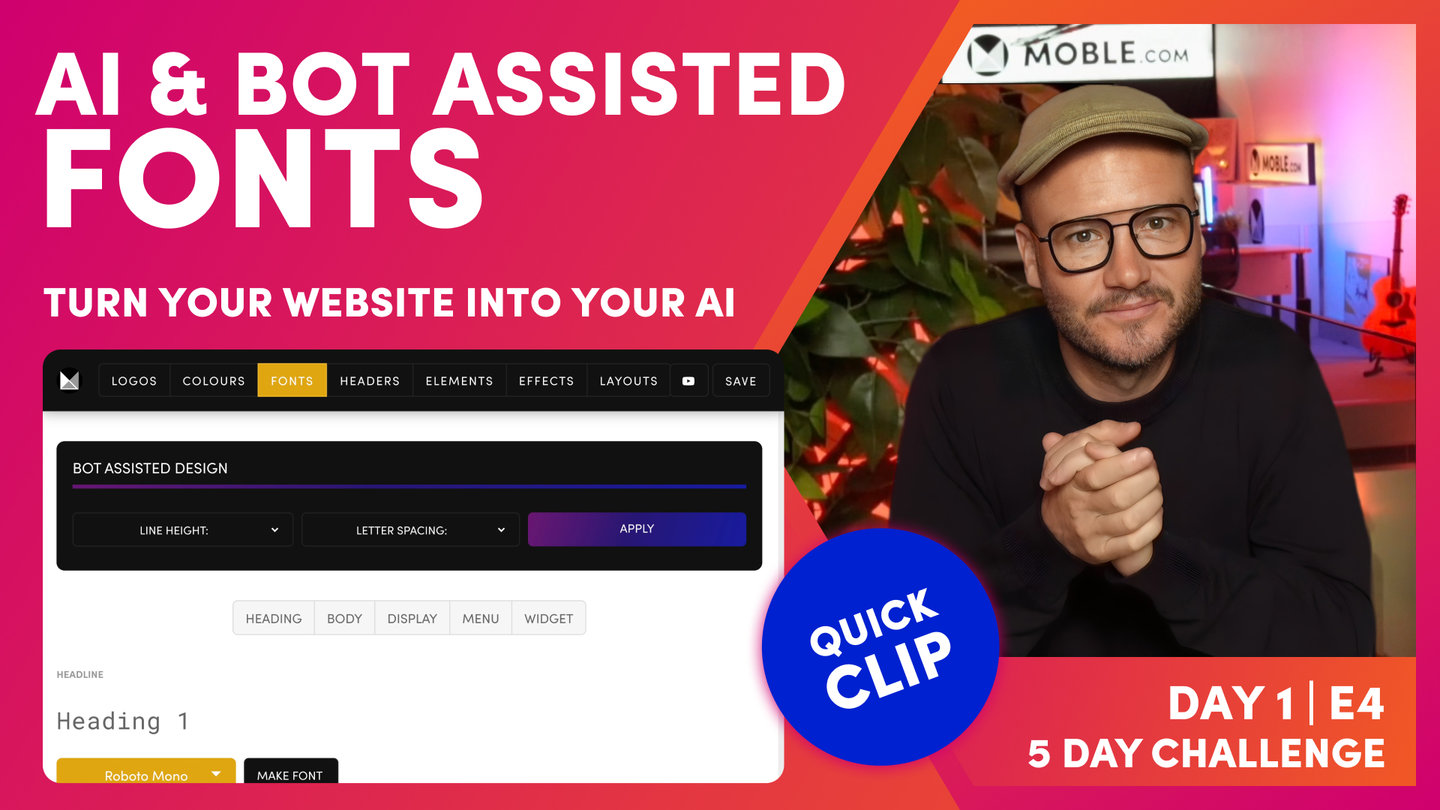
Now, once we've set the mobile... I'll just put mine back to how it was. Then, we can have a look at the line height. Well, the line height is the spacing above and below the actual characters. And then, the letter spacing is the space between the characters. And then, I think most people understand the regular weight and then of course we have the bold weight. And then, there's other particular examples here. We could lock down a particular font and say, "Right. This will always be italic," and that's often good for the brand guidelines. Maybe it's a particular quote or something like that that you always want to be in italic so keep that there in mind for now.
And then, we have what we call Text Transform which is obviously uppercase, lowercase, and capitalize. Often with uppercase, a common example is using that in the header font. Sometimes you want to make sure that the header is always in capitals. But again, if you're unsure, just leave that because people can control that themselves in the Editor or in the page or navigation area."