PICK YOUR AI THEME TO GET STARTED

DAY 01 | EPISODE 04 | QUICK CLIP 06
AI & BOT ASSISTED FONTS

Paul Davenport | 06:17
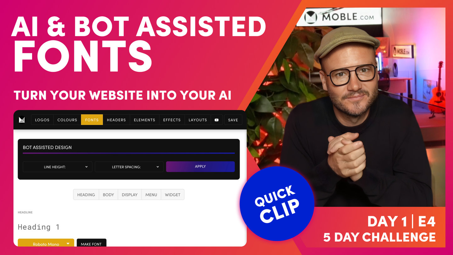
"Okay. At this point, I'm going to introduce you to line height and letter spacing. Now, if you're a designer, you already know this. But if you're not a designer, sometimes you'll be wondering why a particular webpage looks good and why on other times it does not. And that's often because when you've had a designer design a webpage for you, they understand subtle differences like line height and letter spacing. So like I say, if you're not a designer, we don't expect you to know this because we've got AI Website Bots that are going to take care of it all in seconds.
But it's also important in this episode just to show you what we mean and why this can make such a difference. So I'm just going to explain this now and then I'm going to let you play with the bot so that you can choose yours in a particular preference. So let's look at this and to explain this, I don't think there's any better font to explain this on than your paragraph text.
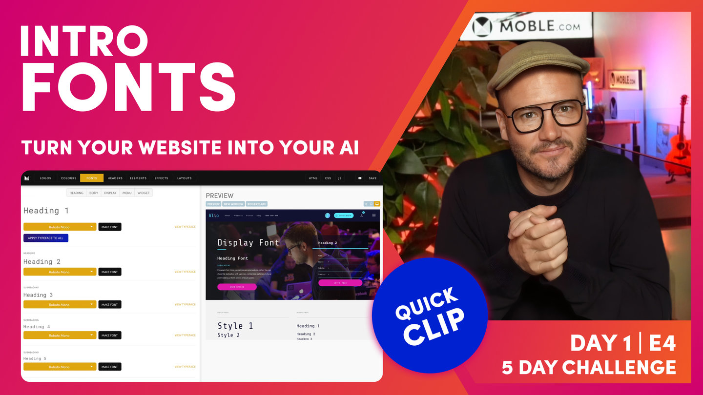
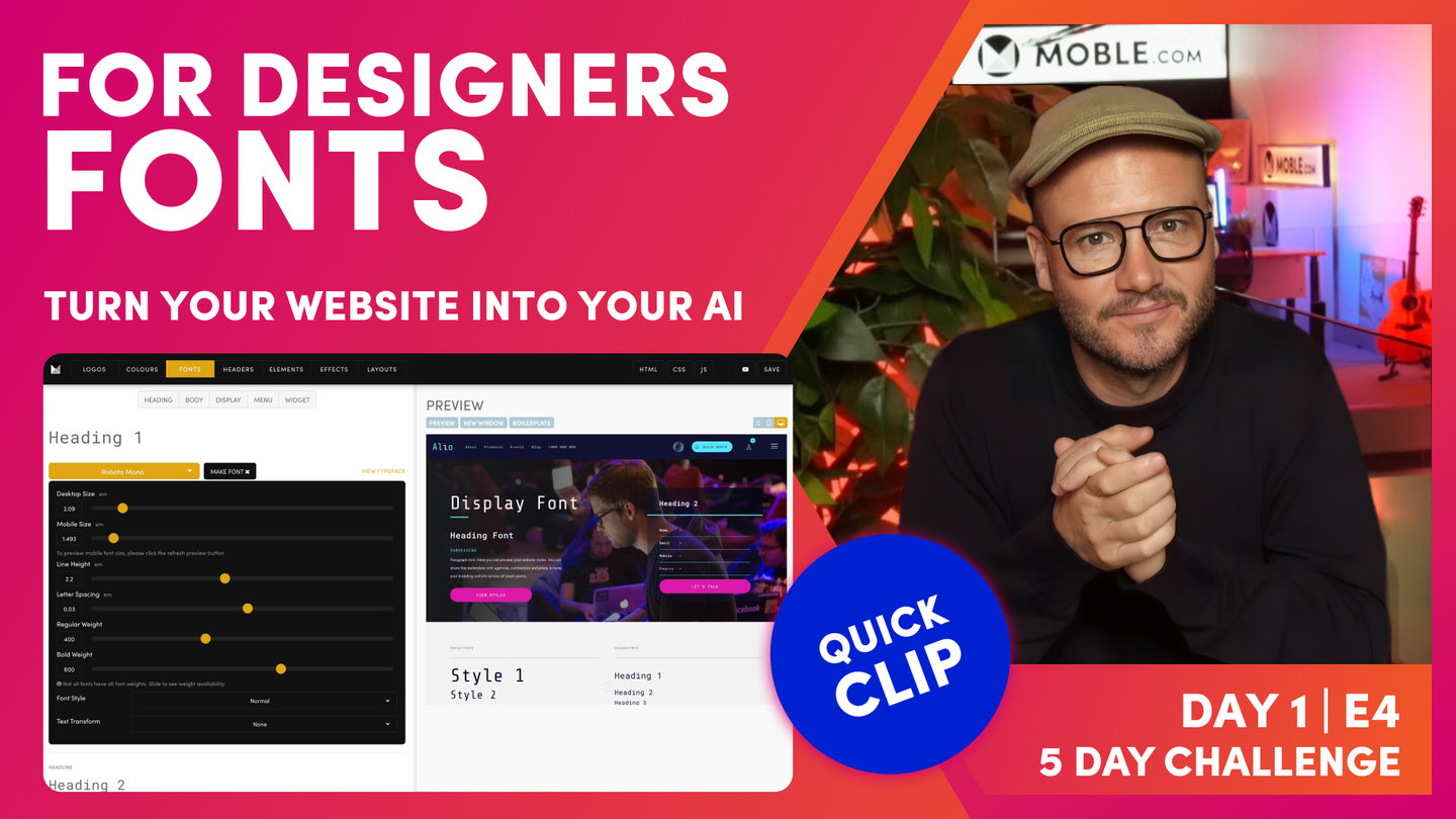
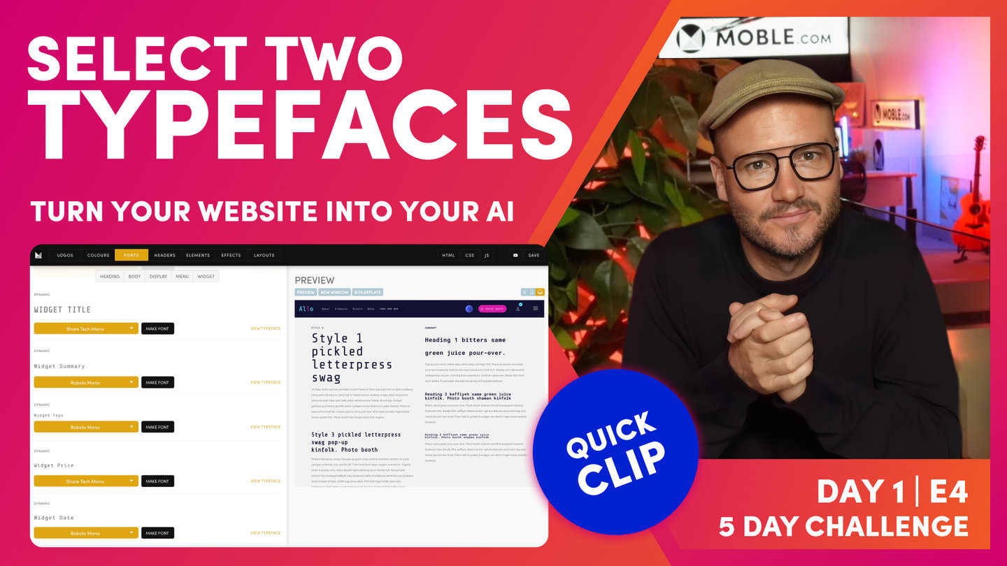
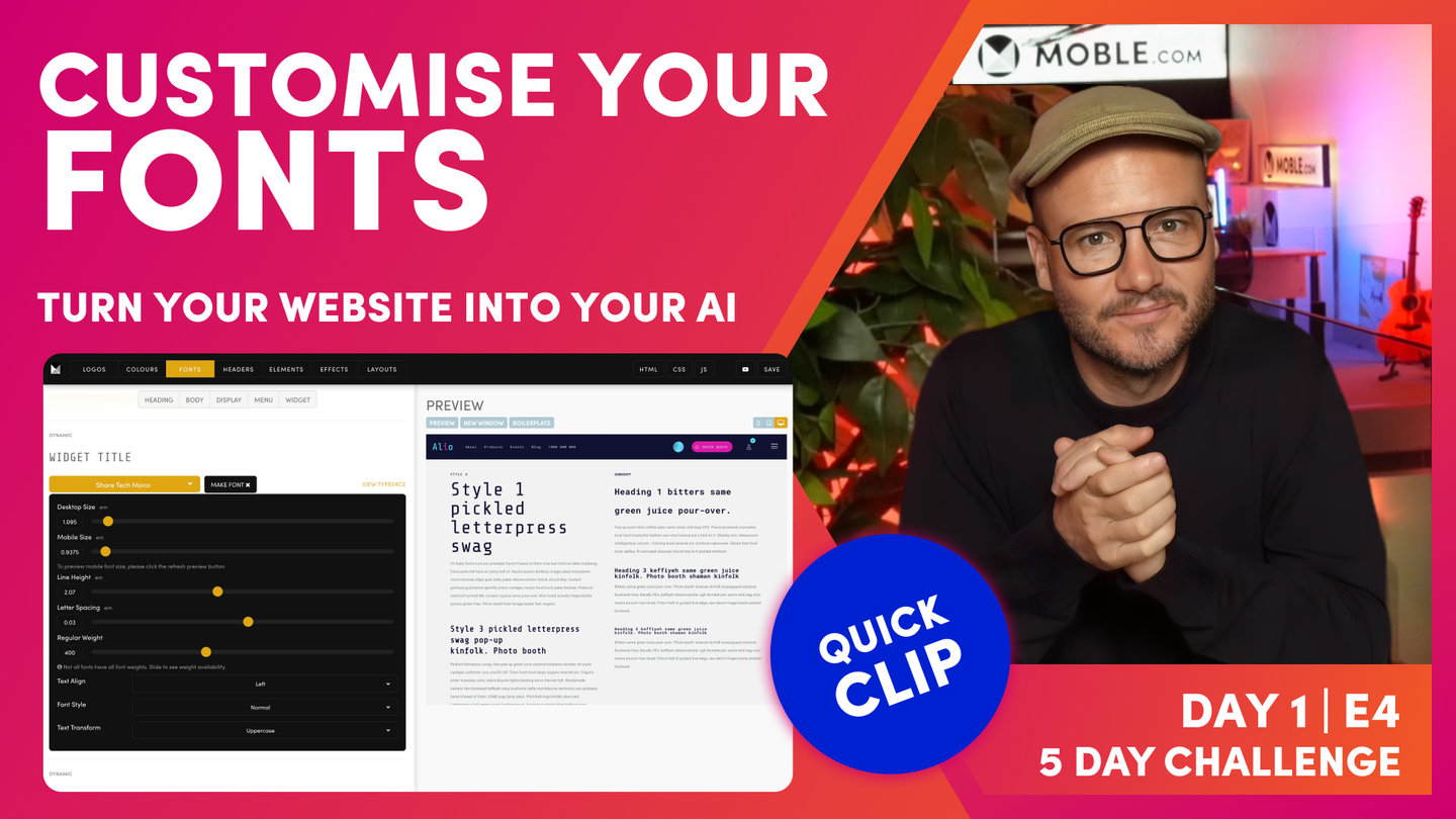
Okay. So let me just click Body and let's go to Paragraph Text, Make Font, and you can see here I've got my line height. Well, it's set to 1.6 here and in my preview, I can see what 1.6 means there. So let's change it to 2. Well, 2 is actually the double line height. So to view that, I need to press Save. Now, once I've saved, now I can hit the Preview just like refreshing. So now, look at my paragraph style, it's double height. So that should make sense there because it's doubled, 2 is double. So now, you've got your eye in. This is double. It's what we call loose.
But we could also change the letter spacing and make that more loose or we could make it tight. So you can see here a tight, we could go to minus or I could set it to zero. Now, imagine if we had to go and do that for every font because different sized fonts in a ratio are going to have different line heights and letter spacing according to how big they are.
And if you're a newbie, you're not going to understand that, right? Even a lot of designers don't understand that. A lot of designers will go actually individually into the page and change that. Imagine how much work that is. We've already got the Fonts area here that's doing a lot of the work for you. As you update one font, it goes and updates that entire font across the website. That's already a quick win.
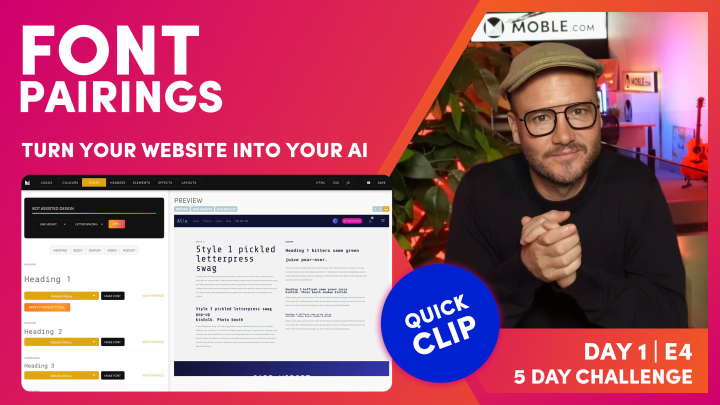
But now, we use AI Website Bots for an even quicker win. So look at this, look at the bot at the top. My line height, I've got some presets which are Tight, Regular, and Loose. So if I just select a particular one here, let me choose Loose, and then with the letter spacing, let's say I could choose Loose as well. I could always have less spacing tight and the line height loose like this. We'll start with tight so I'll make them both tight so that you can see. And then, if I have a look in here, you can see how tight that is. I've got really tight space between the characters and really tight spacing between the lines. So in changing that, our bot goes and changes that across every font and then updates it across every page. So we'll do the same with regular, so you can see the difference. So you can see, it's a little bit more generous and you can see here between the spaces and then between the lines, right?
Okay. So I think you're starting to get what's happening here. So what I can do next is go and make them both loose. So if I look at this and press Apply. Then, watch this, now they are looser. Well, character spacing, that's quite loose. And then, we've got the line height which looks pretty good in loose. So I will just say there that right now in 2023, I would say that it is becoming quite contemporary to have a loose line height. It makes that text feel a little bit more legible.
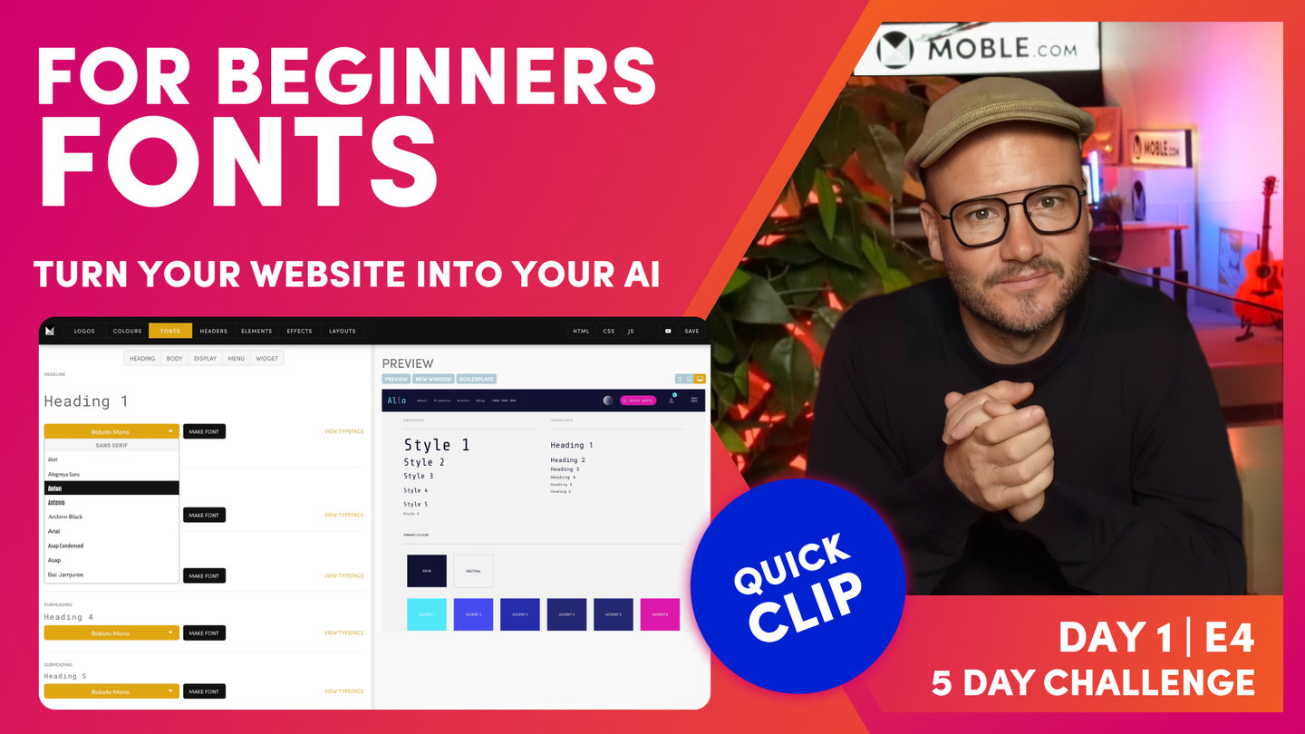
But with the letter spacing, it can be nicer depending on the font that you have to have it a little bit tighter. So that's where I want you to have a play now. All you need to do in this episode is go and first of all, put in your main font, your main typeface, and you're going to click, apply that typeface to all. Then, you're going to think about that display font. Do you want a more poppy one? You're probably going to put those to the first six and then you're going to apply it to maybe the widget title and maybe the price and you're going to press Save.
Then, all you're going to do is go to the bottom and choose a particular line height. If you're unsure, I would start with Regular or Loose. And then, you're going to choose a particular character spacing and that really is depending on your preference in the fonts and once you've applied that, press Save. And really, in the time I've even said that, in that one minute, you could have really completed all of your fonts in really an absolute masterclass with not understanding anything and just relying on our AI Website Bots to do it all for you. So we'll wrap that little bit there. And now, I'm going to go on to tell you a little bit more on how we can look at choosing font pairings."