PICK YOUR AI THEME TO GET STARTED

DAY 02 | EPISODE 04 | QUICK CLIP 05
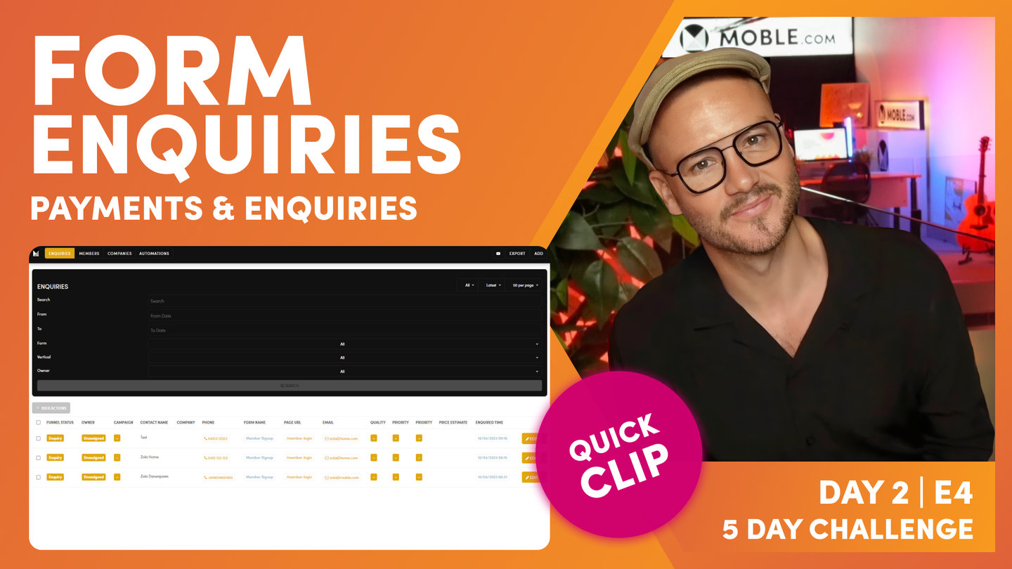
EDIT FORM SETTINGS

Paul Davenport | 05:57
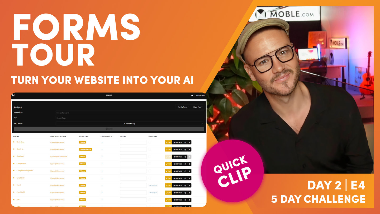
"So, what we can do now is we've just looked at the edit page. So, we can also click the settings page, which as you know now will go to a black screen where we've got that meta information. But I'll just show you something else. So, what I'm going to do here is click edit, go back into our form and I can access the settings here, which takes me through to the settings in exactly the same way. I can click view also and I can see the page of where this form lives. If it is living on a page, I can see the complete list of pages where this form lives, which helps me go and test. So, if I click one of these, again, it opens up in a new tab. So, a few top tips on just getting around and making that testing a little bit easier.
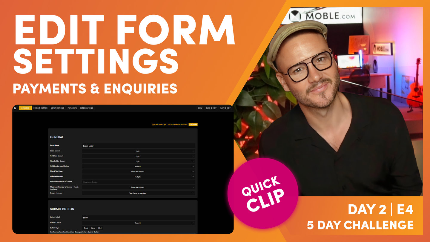
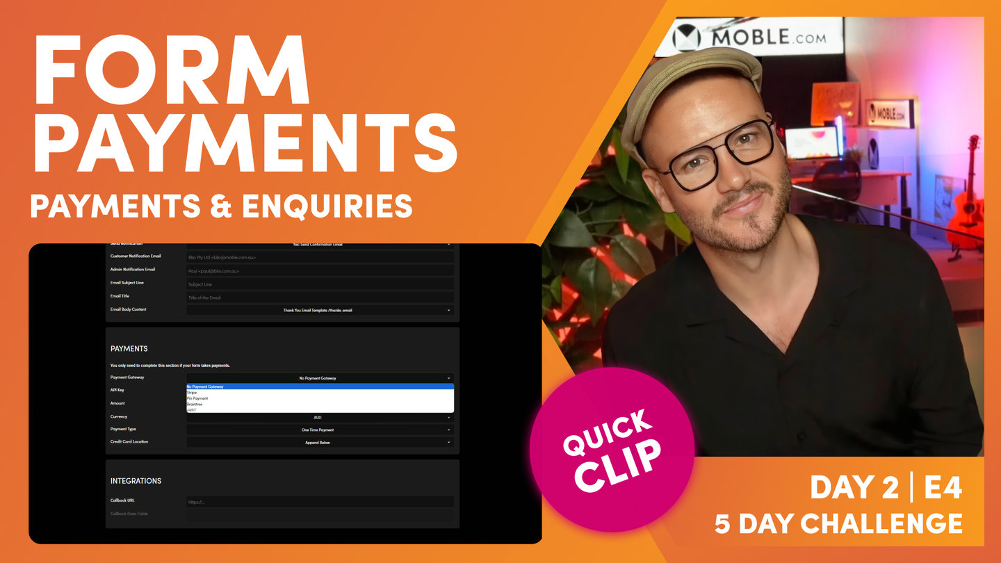
So, I'm going to click in settings here, which as you'd expect, takes us to the forms setting the area. So, let's just have a quick tour of here. We've got the general information at the top. We can anchor down to the submit button, we can anchor down to our notifications, our email notifications, and of course we've got payments which we've talked about. And at the bottom we have integrations. So, general information. Well, each form you can give a name. Now just remember only you and your logged in team see this name. And that's important here so that you can identify which form is which. Well, here we've got our event light, but if you are in marketing or if you are using a marketing agency, they might also create multivariate forms. So, they might want to test certain things like reducing the number of fields that you have.
Does it increase the conversion rates? That's a very common thing that people are going to test with forms. Less so these days is the button label. Historically we'd do a lot of testing on button labels. We worked out years ago that if you type in the words submit, you may as well just type in absolutely nothing, because it doesn't make a difference. But these days people know what a button is against a form. So, you don't have to be too verbose in your description, in your form label. You can just say RSVP, book, buy, maybe next, and people tend to know what it is these days. So, don't get wrapped up too much in your button label. I'd say just keep it short and sweet. Now the other thing is that you can see here we've got lots of Colours. Now we are replacing these Colours with swatches.
That's coming in the second quarter of 2023. Why aren't they there now? Well, as you know, MOBLE is a system that we built for our own agency and we're rolling it out now across the world so that the entire world can share these tools that we've built for ourselves. So, there's a roadmap of just tying up the last few things to improve the UI. So, what we've done is a temporary feature is we've just put a link to the Colours area up here so that you can see all of your accents. So, it's main neutral accent, one, two, three, four, five, six. And then you've got your light and dark. So, just use that as a reference for now. If you are watching this as from the second quarter of 2023, well, you'll see the Colour swatches here anyway, not a dropdown. Cool stuff. So, let's race through each of these Colours so that you know exactly what they are.
Well, here you can see we've got label Colour, which is obviously the main label Colour. Very straightforward. But we've got the field text Colour, so this is not the placeholder. Here you can see a placeholder. You could write some descriptive words in here in the placeholder, but when someone types in the text, this is the text Colour. So, we've looked at text Colour there and the placeholder. So, text Colour is after, placeholder is before. Then we've got the field background Colour. Now MOBLE, we've got a few different types of forms. So, sometimes we've got forms with an actual field with a full background Colour, but sometimes we just use an accent line. So, this blue accent is accent one, isn't it?
So, you can see here that our field background is accent one. So, pretty straightforward stuff there, and you can see it's the same with the button Colour that we can control. Notably with the button Colour, I'm on my pink, accent six. If I was on my accent one, which is that lighter sky blue, I might choose to have it in ghost. We know that in line is the size of the button text. Take in line off, and it's going to be the full width of the frame. And then mini is a smaller height of a button as well."