PICK YOUR AI THEME TO GET STARTED
WIDGETS COMPONENT
The Widgets Component is a key feature in achieving the following:
- Selecting which Widget to use, or swapping to a different type of Widget.
- Selecting the Tags that will be used in a Widget.
- Configuring settings such as the sort order of the Widget items.
- Designing the look of the Widget, such as columns, effect and aspect ratio.

WIDGET TYPES
As a pre-requisite to understanding widgets it's a great idea to read the following Guide:
There are several types of Widgets on MOBLE CMS. These are:
- Grid - Grid is the most flexible Widget Type, it can be split into any m=number of column widths and works with all settings.
- Slider - Transitions content from right to left. Read the following page for more info:
- Multi-Slider - Transitions content in a carousel. The carousel has 4 columns and slides from right to left.
- Masonry - Masonry has 4 columns, the height is dependent on the number of characters in the summary text, to create a masonry effect.
- Mix - Mix applies filters to your widgets, in a presentable "mix" effect that refines the items on display.

TYPES OF CONTENT THAT CAN BE PULLED INTO WIDGETS
You may select the type of content that you wish to display in your Widgets. Types of content are Pages, Images and Files.
Depending on the widget, you can also consider selecting a combination of different content types, such as Images and Pages.
DESIGNER TIP:
When you upload a new file in the Files area (e.g. a pdf), consider adding a File Icon in addition to the file itself. This will ensure that your file has an image when it used in widgets such as Grids and Masonry.

TYPES OF PAGES
Page: Unless otherwise assigned all pages are created as a 'Page'. A 'Page' is the default, however to assist with page management, common types of pages can be grouped together. We cover these below:
Landing: Used largely for conversions you can drive traffic to your Landing pages to test aspects that converts better. You can create many variations of your landing pages to identify your optimum designs and messages.
Within the 'Page Settings' area of your 'Landing' pages, you can elect to hide the 'Header' and 'Footer' of your website. The aim is to remove distractions away from your visitors and focus them towards the content that matters.
Blog: Blog pages are added just like any other page. When you change the 'Page Type' to 'Blog' the page will automatically appear in your Blog. Within the 'Page Settings' area, remember to set your Blog 'Page Icon', the 'Display Date' and 'Author'.
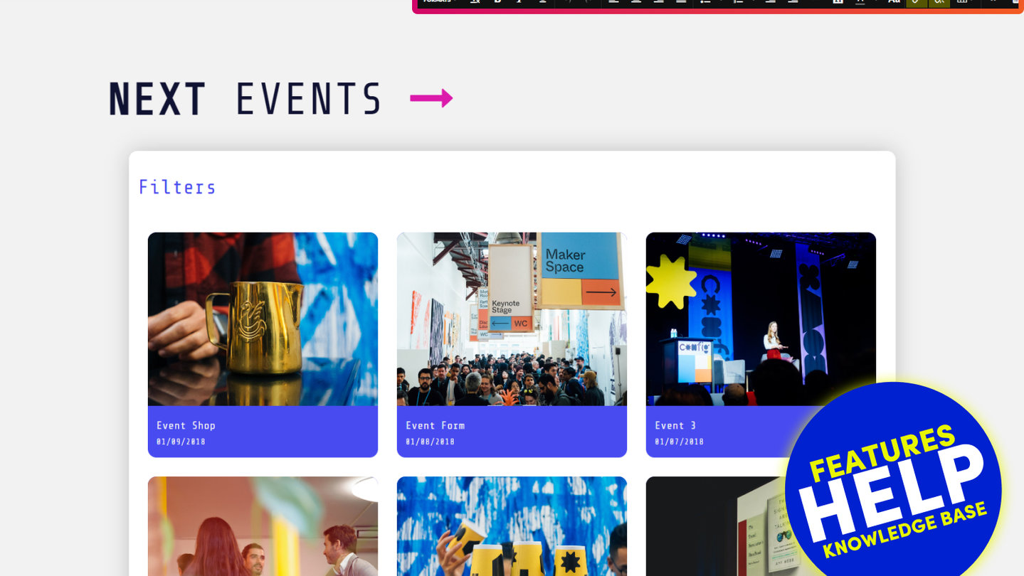
Event: Events are also just like any other page. You can keep your admin area neat and tidy by grouping your events. Within the 'Page Settings' area, remember to set your 'Page Icon' and the 'Display Date'.
Product: Much like 'Events', 'Products' are also just like any other page. You can keep your admin area neat and tidy by grouping your products. Within the 'Page Settings' area, remember to set your 'Page Icon'.
Section: Sections are special pages that can sit inside other pages. I.e. they don't have a page URL, but they are managed with the same flexibility as any other page. An example of this might be Sliders, Testimonials or even your Footer. By treating the editing of Sections just like any other page, you have full control to edit the content giving you more flexibility to design your website as you wish. Imagine a footer with a background video, a photo gallery or even a slider, by treating these elements as pages, you have the power for uninhibited editing in a familiar page editing environment.
HOW TO ADD TAGS TO A WIDGET
Tags are the driving force behind Widgets. They are the determining factor by which content displays in your Widget. The process is as follows:
- Tag a Page, Image or any File.
(For convenience, you can Tag any content from anywhere it appears in MOBLE CMS) - In the Page Editor open a Widget
- Select the Tags that you applied in step 1.
- Save your Page
- Your tagged content will now appear in your Widget.
EXAMPLE:
Imagine that you are a Furniture Store. You would like to show a Grid Widget containing all of your pages for 'Chairs'.
- In the main Page list area; or in the Tags area, you can quickly tag all of the relevant pages with the tag for 'Chairs'.
- Now back in the Page Editor you click to open the Widget Component.
- You select 'Grid' from the Widget Types.
- You select Page' in the content Types.
- You select the Tag 'Chairs'.
- Now when you save the Widget, your page will now show all Pages that are tagged with 'Chairs'.
GRANULAR TAGGING:
It is best practice to be as granular as possible when tagging your Pages and Files. In the Furniture Store example above, it would have been a good idea to add extra Tags to the Chairs Pages. This is because you may wish to display a Page that has all Furniture, therefore you should have a Tag for 'Furniture' also. Similarly, your Furniture Store may contain lots of different types of Chairs.
In this case, the Page that you were Tagging was for Chrome Office Chairs. When tagging you would not tag like this:
FURNITURE | CHAIR | CHROME-OFFICE
You would tag in a granular way like this:
- FURNITURE | CHAIR | CHROME | OFFICE

TAG COMBOS
Tag Combos are a great way to filter what displays in your widget more precisely. In addition to showing 'all' the Pages containing the tags that you have selected, you can also adjust the conditions, so that what displays must match every tag, otherwise, it will not show. Let's explain Tag Combos:
- Can Match Any Tag: Shows any Pages or Files that contain any of the Tags that you have selected.
- Must Match All Tags: Shows only that Page or File that matches all of the Tags that you have selected.
EXAMPLE:
You can see in the previous Furniture Store example, that 'Chrome' and 'Office' are split into two separate tags. There is good reason for this. In same Furniture Store, you also have Chrome Bar Stools. Therefore, for the Chrome Bar Stools category, you would tag in the most granular way, like this.
- FURNITURE | CHAIR | CHROME | HOSPITALITY | BAR STOOL
Now imagine that you would like to run a promotion on all Chrome Chairs. You add a new Page called Promotions, then drag in a Grid Layout onto the Page. You open the Widget and select Tags for 'Furniture and 'Chrome'. Your Grid Widget will now display Pages for all Chairs that are Tagged with 'Chrome'.
However, you now look at your page on the front-end and you quickly realise that your Page Widget is also displaying Chrome Tables. This is because your Tag Combos are still set to 'Can Match Any Tag'. This means that it can match all Chairs and Tables that have the tag for 'Chrome'.
You quickly change your Tag Combos to 'Must Match All Tags' and click Save. Within an instant, your Page Widget is now showing only Pages that are Tagged with 'Chairs' and 'Chrome'. This is because there is no Tag for 'Tables' in your selection. You are now happy that your Promotion is ready to go and displaying all Chrome Chairs in your store, and no Chrome Tables.

DISPLAY FROM
Any content may be given a 'Display Date', this is the date that you would like your visitors to see in relation to that piece of content. E.g. the date of an Event; or the Date that a Blog post was published.
'Display From': In your Widget, you can select a date range of content that you wish to show. If you add a 'Display From' date, any content with a Display Date before this date will not show in your widget.
EXAMPLE:
An Event Page has a 'Display Date' of 24 January 2016. You set the 'Display From' date as 7 January 2016. Your Event Page will appear in your widget.

DISPLAY TO
Any content may be given a 'Display Date', this is the date that you would like your visitors to see in relation to that piece of content. E.g. the date of an Event; or the Date that a Blog post was published.
'Display From': In your Widget, you can select a date range of content that you wish to show. If you add a 'Display To' date, any content with a Display Date after this date will not show in your widget.
EXAMPLE:
An Event Page has a 'Display Date' of 7 January 2016. You set the 'Display To' date as 24 January 2016. Your Event Page will appear in your widget.

NUMBER OF ITEMS
'Number of Items' determines the number of items (Pages & Files), that you would like to display in your widget.
EXAMPLE:
In a Grid Widget, you would like to show 24 Pages in your widget. You set the 'Number of Items' to 24.
EXCEPTION:
When a Grid Widget is used for a Photo Galley 'Number of Items' displays the total number of images that appear in the popup Lightbox gallery, not the number of thumbnail images on the page. As standard the Gallery Widget displays 2 rows of thumbnails, you can choose how many columns you wish your gallery to have.
Therefore, if you set the 'Number of Items' to 24, and the number of columns to 6, then 12 (2 rows of 6) thumbnail Images will appear on the page, then when you click on an image to open up the Lightbox, then you will be able to scroll through all 24 images.

SORT BY
'Sort By' allows you to organise the order by which items will appear in your Widget. Therefore, 'Sort By' is an essential feature as it allows you to control the exact priority order that you wish your visitors to see your content.
TYPE:
Latest: Displays items with the latest created at the top of the list.
Oldest: Displays items with the oldest created at the top of the list.
Title: Displays items in alphabetical order.
Display Date: Displays items with the oldest Display Date at the top of the list.
Display Date Latest: Displays items with the latest Display Date at the top of the list.
Sort Order: Displays items by sort order, with the lowest sort order at the top. 'Sort Order' for files can be applied to files in the 'File List', the 'File Settings' and also in the main 'Tags' area.
Tag Sort Order: Displays Tags by sort order, with the lowest sort order at the top, 'Tag Sort Order' can be applied in the main Tags area.
Custom Sort Order: For each widget, you can manually sort your content. In either Grid View or List View simply drag your content into position. Please note it's important to set the number of item in your widget before you set the Custom Sort Order.

HOVER EFFECT
A Hover Effect is the animation that appears when you hover your mouse over an item in a Widget feed.
For example, in a News widget, if you hover over a news item, then an animation will appear, often with a text summary informing you a little bit more about what is within the news article, to entice you to click for more.
MOBLE CMS enables the Hover Effect of your widgets to be changed. This can either be done by a front-end developer in the Styles area using the HTML and JS tools. Or, you may wish to contact MOBLE for more information.
Typically, a website will have one standard Hover Effect, that is used for a consistent site-wide look and feel. MOBLE CMS comes with at least one animation as standard and this is set to the 'Primary'. Depending on your package/plan, you may have more than one Hover Effect, you may use this feature to flip between Hover Effects and also turn them Off and On.

ASPECT RATIO
Often a Widget feed will include an image that offers more of an insight of what is included within the page. Aspect Ratio determines the dimensions of the image tile within a widget feed.
The Image that is used within the Widget feed is the Page Icon (if they destination a Page), or the File Icon (if the destination is a File). This is selected in the Page Settings area and Files Settings area respectively.
MOBLE CMS will automatically size the original image to the selected Aspect Ratio, you do not have to re-size images when changing the Aspect Ratio.
The options for Aspect Ration are as follows:
Original: Displays the original image dimensions. If using this setting please note that you should consider ensuring the Page and File Icons are the same dimensions, for a nice consistent size across all items in the Widget.
1x1 (Square): Automatically sizes all images in the widget feed to a square shape.
4x3: Automatically sizes all images in the widget feed to an aspect ratio of 4x3.
16x9: Automatically sizes all images in the widget feed to an aspect ratio of 16x9.

VIEW HEIGHT
View Height quite simply enables you to determine a fixed height for the 'View'. The word 'View' is used to define the specific tile. Therefore, you can simply consider the height to be equivalent to the height of a specific row, not the total height of the Widget.
E.g. If the widget was a Slider, the View Height would be the full height of the widget. However, if the widget was a Grid with 4 rows, the View Height would be the height of one row.
Common use cases are to change the dimensions of the widget, for example:
- Rather than show a Slider with an Aspect Ration of 16x9, which might naturally display at 1440x810px, you could fix the height to 500px height. Therefore, on the same screen, this would now display at 1440x500px.
- With a Multi-Slider you might decide that a tower shape looks better than a square. Therefore, you could select an Aspect Ratio of 1x1 (Square), then set the Height to a much taller height e.g. 800px height. You will now have a column, tower shape for your Multi-Slider.

RELATED HELP
PRICING PLANS
MINI
12 PAGES
70 AI THEMES
5,000 AI LAYOUTS
90 MINUTE CHALLENGE
5 DAY CHALLENGE
WEBSITE BUILDER
CMS
BUG FREE MAINTENANCE
ONLINE SHOP
AI HELP ASSISTANT
AI COPY ASSISTANT
AI PHOTO ASSISTANT
AI AGENTS
AI AUTOMATION
AI CHATBOTS | Unlimited
AI VOICEBOTS | 5 Agents
AI VOICEBOTS | $0.08 min
AI VOICEBOTS | Calendar Bookings
PLUS
50 PAGES
70 AI THEMES
5,000 AI LAYOUTS
90 MINUTE CHALLENGE
5 DAY CHALLENGE
WEBSITE BUILDER
CMS
BUG FREE MAINTENANCE
ONLINE SHOP
AI HELP ASSISTANT
AI COPY ASSISTANT
AI PHOTO ASSISTANT
AI AGENTS
AI AUTOMATION
AI CHATBOTS
AI VOICEBOTS | 5 Agents
AI VOICEBOTS | $0.08 min
AI VOICEBOTS | Calendar Bookings
PRO
500 PAGES
70 AI THEMES
5,000 AI LAYOUTS
90 MINUTE CHALLENGE
5 DAY CHALLENGE
WEBSITE BUILDER
CMS
BUG FREE MAINTENANCE
ONLINE SHOP
AI HELP ASSISTANT
AI COPY ASSISTANT
AI PHOTO ASSISTANT
AI AGENTS
AI AUTOMATION
AI CHATBOTS
AI VOICEBOTS | 10 Agents
AI VOICEBOTS | $0.08 min
AI VOICEBOTS | Calendar Bookings
ELITE
UNLIMITED PAGES
70 AI THEMES
5,000 AI LAYOUTS
90 MINUTE CHALLENGE
5 DAY CHALLENGE
WEBSITE BUILDER
CMS
BUG FREE MAINTENANCE
ONLINE SHOP
AI HELP ASSISTANT
AI COPY ASSISTANT
AI PHOTO ASSISTANT
AI AGENTS
AI AUTOMATION
AI CHATBOTS
AI VOICEBOTS | 15 Agents
AI VOICEBOTS | $0.08 min
AI VOICEBOTS | Calendar Bookings
AI AGENCY
40% PLATFORM PAYOUT
100% SERVICES YOU SELL
AGENCY SITE ($199 ELITE PLAN)
PARTNER LICENSE
MY SALES DASHBOARD
MY CLIENTS DASHBOARD
LOGIN TO CLIENT SITES
STAFF PERMISSIONS
TEAM LAYOUTS
NORMALLY $199 /month
PROMO $99 /month
PARTNERS & INTEGRATIONS
70 Award
Winning AI Themes
GETTING AROUND
SUPPORT
AI SALES LINE
AI SUPPORT LINE
GET A QUOTE
A Web Builder for Design. A CMS for Business. We serve all businesses from SME's to Enterprise. Talk with us for AI development, custom website design, website development, ecommerce websites, directories, intranets and social networks.


