PICK YOUR AI THEME TO GET STARTED
BUTTON COMPONENT
Feature-by-feature help for styling your buttons, determining their destination and their behaviour.
LABEL:
Add the words that you would like to appear in the Button in the label field.
The button field is case sensitive so considered making your words UPPERCASE, is preferred in your design.

LINK LIST:
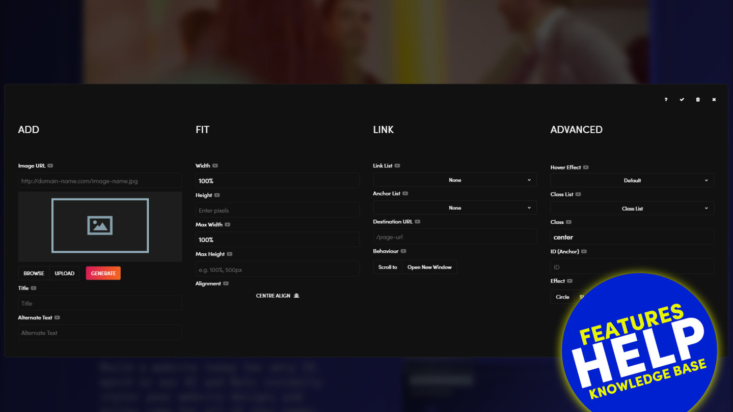
Link List can be used to link a Button to any page on your website.
- Link List will display a list of Live and Hidden pages.
- Link List will also display Draft pages.
- (PLEASE NOTE If you link to a Draft page and the page is not live, this will create a broken link. If you are not logged into the CMS, or if your visitors click on the link, this will link to your 404 page). Therefore, only link to Draft pages if your website is not yet live).
- Link List also displays documents (e.g. pdfs).
Pages appear at the top of the list in Alphanumeric order. Then, below the list of Pages, the list of Documents will appear in the Link List, also in Alphanumeric order.

LINK:
The button Link serves two functions:
- To display the URL of objects on your website that your button links to. Objects include Pages, Documents, and Images.
- To allow you to paste and display the of objects on external websites. Objects also include Pages, Documents, and Images.
YOUR WEBSITE:
You do not need to display your domain name, only the path is required, beginning with a forward slash. E.g. /your-page-name
When selecting from the Link List or Anchor List, the URL path will display here.
EXTERNAL WEBSITE:
You must display the full URL. E.g. http://www.domain-name.com/page-name
If using images from an external website it's important to remember two very important points:
- The object may be removed, or it addresses may change. If so, your object will no longer display on your website. Therefore, it might be better to download the images and files, then upload them to your website.
- If using images and documents located on external websites, you need to ensure that you have the rights/ license to do so. Always check the terms and conditions of all websites where you link from and also contact the website owner if you are unsure. It is important that you adhere to the legal requirements set by the image/document owner at all times.

ANCHOR LIST:
Anchor List allows you to link a button to any frame or image on your page. This can be set up as follows:
- Give the destination frame or image that you would like to anchor an to ID.
To do this:- Click the pencil icon on the frame tools, or click on the image.
- In the 'ID (Anchor)' field, give the frame an ID.
- TIP: ensure your ID is in lowercase and also with no spaces (use hyphens rather than spaces). E.g. #your-object
- Now return to the 'Anchor List' in the 'Button Component'.
- Notice that the Anchor List drop down will now display the ID that you placed in the frame or image.
- Select the ID from the dropdown.
- Ensure that 'Scroll To' is on.
- Now when a visitor clicks on your image the page will scroll to (either up or down) that frame position.

BEHAVIOUR:
- Scroll To: Ensure scroll to is on for an anchor link to be effective.
- Open New Window: Use open in a new window, if your Destination URL is linking to an external page.

COLOUR:
On MOBLE CMS you can choose from a range of colours for your Buttons. The colour of your Buttons use the accent colours that you set within your website Styles area.
To edit the colour options available to you navigate to STYLES > COLOURS then scroll down to ACCENT COLOURS.

STYLE:
The following styles can be applied to buttons:
- Ghost: 'Ghost' button applies a border around the button with a transparent fill, rather than a full colour fill.
- Inline: Selecting 'Inline' will contain the button to the size of the words. Unselecting 'Inline' will make the button stretch to the full width of the frame in which it sits.
- Mini: 'Mini' is the smaller variation of the button. The Mini button is smaller in height and also in horizontal padding on either side of the image.

ALIGNMENT:
You may set an alignment for your buttons. By default your button will be left aligned. Please note that you may also align your content (e.g. text, images and buttons) within the frame of which it sits.
- Left Align - Aligns your buttons to the left.
- Centre Align - Aligns your buttons in the centre.
- Right Align - Aligns your buttons to the right.

ICON:
Icon allows you to select an icon font to sit alongside your button Label.
ICON POSITION:
Icon Position allows you to select the position that your icon sits alongside your button label. It may be positioned to either the left or right.
CLASS LIST:
Class List is a tool for advanced users to browse through available CSS classes and then apply them to a button.

CLASS:
Class displays the classes that have been applied to the button.
Did you know? A class is used in code to hook a particular style to an object. There is only ever one instance of a particular Class, therefore if the Class is updated, all objects that have been assigned with this Class will automatically be updated.

ID (ANCHOR):
There are situations when you may wish to give your button an ID. The most frequent use case is when you wish to anchor a link, an image, or even another button to your button.
This can be set up as follows:
- Give your button an ID.
- TIP: ensure your ID is in lowercase and also with no spaces (use hyphens rather than spaces). E.g. #your-object.
- You may now create an anchor link in the following locations:
- Another Button. Use the 'Anchor List' drop down in any other button.
- An Image. Use the 'Anchor List' drop down in the image.
- A Text Link. NB for a Text Link there is no 'Anchor List', however in the URL field, use a # before your adding your ID. E.g. #your-object.
- In Buttons and Images, notice that the 'Anchor List' drop down will automatically display your image ID.
- Select the ID from the dropdown.
- Ensure that 'Scroll To' is on for Images, Buttons and Text Links (For Text Links, select 'Scroll' from the 'Class' dropdown).
- Now when a visitor clicks on the Button, Image or Text Link containing the image ID, the page will scroll to (either up or down) your button.

BUTTON REL ATTRIBUTE:
The rel attribute can be used by advanced users to specify the relationship of the button link and the destination link/document.
EXAMPLE
rel="nofollow" Links to an unendorsed document, like a paid link. ("nofollow" is used by Google, to specify that the Google search spider should not follow that link)
el="alternate" Provides a link to an alternate representation of the document (i.e. print page, translated or mirror)

RELATED HELP
PRICING PLANS
MINI
12 PAGES
70 AI THEMES
5,000 AI LAYOUTS
90 MINUTE CHALLENGE
5 DAY CHALLENGE
WEBSITE BUILDER
CMS
BUG FREE MAINTENANCE
ONLINE SHOP
AI HELP ASSISTANT
AI COPY ASSISTANT
AI PHOTO ASSISTANT
AI AGENTS
AI AUTOMATION
AI CHATBOTS | Unlimited
AI VOICEBOTS | 5 Agents
AI VOICEBOTS | $0.08 min
AI VOICEBOTS | Calendar Bookings
PLUS
50 PAGES
70 AI THEMES
5,000 AI LAYOUTS
90 MINUTE CHALLENGE
5 DAY CHALLENGE
WEBSITE BUILDER
CMS
BUG FREE MAINTENANCE
ONLINE SHOP
AI HELP ASSISTANT
AI COPY ASSISTANT
AI PHOTO ASSISTANT
AI AGENTS
AI AUTOMATION
AI CHATBOTS
AI VOICEBOTS | 5 Agents
AI VOICEBOTS | $0.08 min
AI VOICEBOTS | Calendar Bookings
PRO
500 PAGES
70 AI THEMES
5,000 AI LAYOUTS
90 MINUTE CHALLENGE
5 DAY CHALLENGE
WEBSITE BUILDER
CMS
BUG FREE MAINTENANCE
ONLINE SHOP
AI HELP ASSISTANT
AI COPY ASSISTANT
AI PHOTO ASSISTANT
AI AGENTS
AI AUTOMATION
AI CHATBOTS
AI VOICEBOTS | 10 Agents
AI VOICEBOTS | $0.08 min
AI VOICEBOTS | Calendar Bookings
ELITE
UNLIMITED PAGES
70 AI THEMES
5,000 AI LAYOUTS
90 MINUTE CHALLENGE
5 DAY CHALLENGE
WEBSITE BUILDER
CMS
BUG FREE MAINTENANCE
ONLINE SHOP
AI HELP ASSISTANT
AI COPY ASSISTANT
AI PHOTO ASSISTANT
AI AGENTS
AI AUTOMATION
AI CHATBOTS
AI VOICEBOTS | 15 Agents
AI VOICEBOTS | $0.08 min
AI VOICEBOTS | Calendar Bookings
AI AGENCY
40% PLATFORM PAYOUT
100% SERVICES YOU SELL
AGENCY SITE ($199 ELITE PLAN)
PARTNER LICENSE
MY SALES DASHBOARD
MY CLIENTS DASHBOARD
LOGIN TO CLIENT SITES
STAFF PERMISSIONS
TEAM LAYOUTS
NORMALLY $199 /month
PROMO $99 /month
PARTNERS & INTEGRATIONS
70 Award
Winning AI Themes
GETTING AROUND
SUPPORT
AI SALES LINE
AI SUPPORT LINE
GET A QUOTE
A Web Builder for Design. A CMS for Business. We serve all businesses from SME's to Enterprise. Talk with us for AI development, custom website design, website development, ecommerce websites, directories, intranets and social networks.

