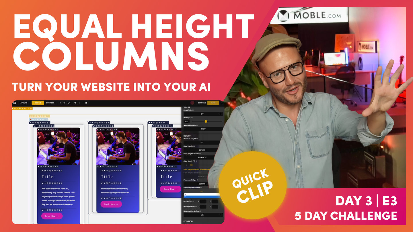
PICK YOUR AI THEME TO GET STARTED

DAY 03 | EPISODE 03 | QUICK CLIP 2
CHILD HEIGHT

Paul Davenport | 14:09
If you set a Fixed Height to a Parent Frame you can use the Child Frame % tool to give your Child a vertical position. Combine this with Width % and Width Alignment and you can design Blocks to be positioned anywhere on your page.
TROUBLESHOOTING RULE
Lots of Text: 'Desktop'
Short Headline Text: 'All Devices'
"Well, let's explore your first parent and child relationship. Well here we've got a common setup. We can see our outer padding, max, we've got our inner padding and then our component. Okay, so what we're going to do now is look at this child and its positional element on the page. We're actually going to put it as a headline down at the bottom of the page. So let's look at our parent first of all, and so we can see these frames a little better. Let me just change the gradient so we can see this is our max-width frame. Let's go and have a look in the frames area, we've got max-width. Well, I did allude to before on max-width that you don't always need a max-width on the page. So just because we haven't looked at this yet, I'm actually going to remove it.
If I wanted to add it, I would click the add a frame on the outside and I could then go and change this at any time to a max-width. So we can actually use the minus icon to get rid of it. So here now we have a classic parent and then it's child. So let's explore. Well here you can see is our outer padding set as normal. And now this is the first thing I want you to learn when we're talking about parent and child in any relationship, we need a fixed height. It's not a minimum height. I'll show you why just in one second, okay. First I want to draw your attention to this child height devices area that's greyed out, but if I click into the child, it lights up. So the system knows already that we've got a parent and a child just always works when we've got a fixed height, that means we can have a child.
If this isn't a fixed height, then this cannot be a child. And this is because what I'm going to show you now. Well look, it's lit up and it says child height percentage. If I move it down to 100%, it moves it to the bottom of the page. Pretty cool. Okay, so this is a percentage width, a percentage height of this fixed height. That's why it has to be fixed because the child height is a percentage, and this isn't just the mobile platform. This is how CSS and markup on the internet works. So this is all websites. So this is our child height, this is our child with a percentage height, and this is our parent with a fixed height. So that's the lesson number one. And if you're troubleshooting, why isn't the child height? Why isn't the child percentage lighting up? It's because the parent isn't a fixed height.
So let's make this look a little bit better and a little bit more pronounced. So we'll go to our child frame here and let's give it a Colour. We could give it a full Colour, but in this case we are going to give it a background. But what we'll actually do, actually we'll do a little bit different. We have been using this gradient at 130, haven't we? Okay, so what we'll do here is combine this with an overlay and what we can do is we could potentially change the percentage width here if we would like to so that we can explore the gradient angle. But for now, because I'm working with 130, I'm going to keep it at 130. Okay? Now this has got opacity in it, meaning it's a percentage of 40%, meaning if this was a background image, we can see through it.
So some people on headlines don't like to always just use gradient, they'll just use a straight opacity and you can make it light and dark. In this case, I'm combining opacity with a pretty cool gradient. So we're going to come back to this in a moment. So what we've got now is our parents and our child. While we're in here, we know that this is going to be a headline, so it's in a banner, so it's most likely to be heading one. So I could put it in style one, but I know my content users are going to have all different lengths of text. So I'm going to gamble there and make it a logical style three. I'll actually put an arrow in there because, so let's go to our insert icon tool. And I could type in arrow, which you can see this is my arrows, here is our right, but I could also type in right and there's our arrow.
Now, if I wanted to Colour this in, let's say pink, I wouldn't highlight with the space. I'm only going to highlight the actual arrow itself. We're going to keep our markup nice and clean. This is a masterclass. So now we've got our nice headline for SEO it's a H one in style three with an arrow. So now let's explore a little bit further. So I'm going to go to my child and I'm going to change its width, but I could also change its height so I can start to change the position in here. With the width, look at this, I could put it into the center. I'll flip this over and I could also put it to the right. So I can control the positional element now within that parent and child. But in this case, we're going to put a headline down at the bottom of the page.
So we'll make it 100% width, and then what we'll also do is make it 100% higher. So the first troubleshooting, why isn't it at the bottom? Okay, well this is because the parent has got padding in, so you're just thinking logically all the time. So there we have our first headline. So now let's do a bit of troubleshooting. And what I'm going to do is have a look at our beautiful headline banner here on mobile. So we'll preview this on the mobile, and this is weird. Here's our banner. You can see it here at the top. This is the form from the footer, but why is banner not the fixed height? We've set this fixed height to 700. So logically now let's go to the parent and see why that isn't 700. So in the frame, let's go down to our 700 and look below it, it says fixed height devices. This is desktop only.
So that's strange. Why would desktop only be default? Why would on the mobile platform desktop be default? Surely you would want that fixed height on all devices. Okay, I'm going to put it on all devices and now I'm going to go to mobile to have a look at what we've got. Okay, well you can see now it's on all devices. We've got our 700 pixels, but now two things are weird. One, why is desktop only default? And two, this is our headline here. Why is it at the top when we've got the child height to 100% at the bottom? Well, let's explore the child height first. Troubleshooting, we're exploring child height, so let's go to child and we're in frame and we'll go to height. Okay, so now you can see that we've got our child height at 100%, but this is also desktop only.
Again, so why is desktop only the default? Well, let's just humour ourselves here. Let's put it to all devices and then let's go and see mobile. Okay, great. So now we've got our 700 pixels and we've got our headline that is now a hundred percent on the bottom. So we've got a parent 700 and a child with a hundred percent bottom. That's pretty cool. So what's going on? Why have mobile decided to make desktop only the default? Okay, well quite often you have got a child with lots of content. So imagine if my content on mobile was greater than the height of 700 pixels. What would happen? If a content editor just goes and puts that in and hasn't done this advanced masterclass then they're never going to know that. So we always want their content to work. We always want to display all the text all the time.
Very simple, but let's go and explore this and show you this visually. So what we'll do now is just go and put in a lot of text in here. So I'm just going to paste in some text. I'll hit this and put in a paragraph and just so we can see what's at the very top of the page, I'm going to make this one... we'll make it the sky blue so it really stands out. And actually we'll make this second one sky blue so we can see where that is and I'm going to here. So the content user now has just put in a whole bunch of text. So much so there's more text even than what's on the desktop. They've just grabbed a whole bunch of texts and they've pasted it in and we've got a six height and now everything's freaking.
Out so much so I can't even see my tools, I can't even see my frame tools. They've gone off the page because the frame is set to 700 pixels. So this is where we've got our expand feature, so that expands that. So what I'll do here is just take out some text and we'll just make it a little bit nicer, easier on the eye. So here we've got this now, our child is at 700 pixels. So let's have a look at this on mobile. Let's have a look at this on mobile. Okay, well look, we're missing that main headline. And that's obvious now, isn't it? Because we've got a fixed height on mobile of 700 and we've got more content than 700, and it's also set to a hundred percent at the bottom. So it's pulling it to the bottom. So we've got two ways to fix that.
Now I would always say let's start with the child at this point. Okay, so with the child, we want to say the child height, let's only put that on the desktop only. So that's basically going to sort out that positional. So let's first of all go and look at the child with child height set to desktop only. And you can see our title is now at the top. So at least we've got the text at the top of the page, but if we look closely, all the text is overflowing over this form. So we've got a fixed height, but the child is now no longer 100% at the bottom, it's at the top and it's just rolling down all the way. So now we know that on the parent we need to make the parent not 700 pixels fixed high on mobile, but we do want it to be 700 pixels high on the desktop.
So obvious now we'll make that desktop only and we'll go and preview this. And that is why mobile always set desktop only as the default because we don't know on the content management system side of things how much content all of our clients and all of their teams is going to use in this instant. So we work with a probability that basically says at least you'll always be able to see the text that they put in there. They'll always see the text even if it's just a short headline. So that's why we want the default to be desktop only. So all you need to do now is basically say if there's a lot of text desktop only, if there's not a lot of text then child type or devices and the fixed height all devices. So all you're thinking is the fixed height is the less text than the fixed height.
So I'll just say that again, if there's a lot of text, it's most likely to be desktop only. And if it's not a lot of text, it's most likely to be all devices. So in this case, we are building a banner with a headline with not a lot of text. So we're going to take that out and we now know what we're going to do here. Well, we want this to be fixed height on mobile too because we're always going to see that text. So let's go and make that on all devices with that fixed height and let's look at the child and we want that to be on the bottom always on all devices. So there is your first parent or child relationship. Now one last FAQ I sometimes get at this point is when there's only one lot of padding on the page, such as here we've only got inner padding, we haven't got outer padding. How does our bot know what to do? Well, let me just tell you that in this instance this would be the inner padding.
So if you had your inner padding set on the bot to 16 pixels, drag this in, it would change it to 16 pixels. So let me show you what I mean over to layouts. Let's go over to our bot. If the outer was 64 and inner was 16, in this case it would just change this from 32 to 16, it would know it was the inner padding. So the algorithm works from the bottom up in this case in case you're wondering. So all you need to know is it just works. Now the second thing I should say is this wouldn't be a masterclass if I wasn't encouraging you to save your layouts and capitalise on your work. So in which case we could click the pencil icon here, put this back to our blue and save this. In this case I would call it something like banner headline gradient. Now we could capitalise on that further. I could clone this and now I could say for this one I would want a banner headline with a background image.
So what I can do at this point is explain another frequently asked question, and that is if we have background Colour and a background image, which one goes on top? Does the system put the background Colour on top or the background image, right? Well, let me just show you this, absolutely. What I'll do is go through the hierarchy, well background Colour goes at the back, and then background image goes on top of that. So let's have the image, we'll choose this guy lecturing and we've got a crowd of people down here. So we'll set this to the bottom. You can see all of the guy and you can see through the gradient now into the crowd, we'll set this as cover, no repeat, and it will be cool to fix this so that we can see the background fixed with it's scrolling on top. So we've got at the back, we've got our Colour, and then on top of that we've got the image.
And then on top of this, if we could put a gradient, well first of all, I'm just going to turn off the background Colour and only put a gradient on. So here you can see we've got this gradient on top. But watch this now, if I also now add a background Colour, this has still got a gradient, but now I'm adding a Colour so we can mix this background Colour with the gradient. So if we add a Colour, then the Colour comes on top. So it's background, Colour, image, gradient, but if we add a background Colour to mix the gradient, it will know that background gradient always comes on top. So that's the gradient hierarchy. So at this point, what I will do is actually turn off this one and then I could decide do we want a gradient on this or not? I might leave it like that. And on this opacity here, this is at 130, well 270 is from absolute left. So what I'll do is just change this to 270 and that looks a little bit nicer like this.
So if I had text over on this side, I might move this gradient over here. So I'll just show you that again, we're always using gradient to help us with text legibility. So I could move that over here or if I've already got a headline, I might not need any gradient at all. So in this case, I probably wouldn't, may as well see all of the image. And now I would save this one as the background image."