PICK YOUR AI THEME TO GET STARTED

DAY 4 | EPISODE 1
CONTENT

Paul | 22:43 | 4-6 hours
If your content team wishes to watch back some episodes we recommend the following classes:
D02 E01 Menus and Navigation
D03 E01 Essentials - Bot Assisted Design
LESSON PLAN
Welcome Content Team
Paul Davenport | 05:01
Day 4 is the day we add your content, and to help, you might be inviting some team mates to join you. Therefore, we align your team with a look back at your journey so far and then set the tasks for today.
"Well, day four of the five-day challenge. And today is the day that we add all of your content. And it might be that you have some teammates coming to join you to help you add all that copy to your pages. So what I'm going to do is just go through a bit of a run-through of where we've come from in the five-day challenge so far, and then set the tasks for today so that everyone can be aligned and know what they need to do.
Well, let's go through where we've come from because it's been a brilliant journey so far. On day one, we set up all of your styles, and that is mainly in relevance to today. We set up all of your Colours and all of your fonts so that they are now already styled in the editor so the content team can just pick those styles, they don't have to add any new styles, and they can always stay on brand. And then in day two, we set up your entire menus and navigation. And with that, at the same time, we created all of those pages. So right now, those pages are likely to be blank. So what do we do with the blank pages? Well, in day three, we set up all of your layouts that are now nicely branded. And those layouts can just be dragged onto the page, and then it's the job of the content team to go and swap the images and add the copy.
Well, in today's initial episode, all I'm going to do is go through some content formatting techniques. As designers, we have a particular way that we kind of like to style content. So I'm going to show you some top tips so that you're not just pasting in content, your content is going to look great. And that's all I'm going to do today in this episode. I'm actually going to go off to a couple of business meetings and then I'll be back for tonight's Sunset Talks, which is all about creating e-commerce pages. So if you've got an online shop, you might only have, let's say, five or a few pages with an FAQ. So it might just be that you just need to set up those pages and then you can come back as well for the Sunset Talks. And then tomorrow, let's say, or whenever you're going to plan to do it, add all of your e-commerce products. So that's kind of the way that we need to, well, that's the history of where we've come from. And this is the way that we're going to work today.
But now I'll just describe, you're probably in one of two groups. You're probably either have done day one to three, and you're just a one-man-team, and you are going to go on to add the copy. Fantastic. You should be able to get through a lot of that today, and really could be very much in a position to go live tomorrow.
But if you are a larger team, you probably want to put the brakes on a little bit and you might just take an extra week to roll out the project from here. It's up to you. You might just get straight into it and add all that copy. But what I would advise initially today is to go through that menus and navigation and have a look, talk as a team. Are those all the pages that you need? And do you need to add any more pages? In which case, content team, you can go back and look at the menus and navigation episode on day two. So day two, episode one, menus and navigation. You can see the different types of menu there that your designer, and we've got set up ready for you today. So that's the top tip there. Just go and watch the menus and navigation.
And then the other episodes of day two were a tour of the platform. So the pages area where I am now, it's going to go through what all of these bits and pieces are, including live draft and hidden. So go and have a look at that and make sure you understand all of the features and functionality that's there. Okay, so once you've done that, you've had a bit of a tour, you understand how the platform works, you've had a chat and you've worked out all your pages are there, and your navigation is in the order that you want it. Okay, so at that point, now you're ready to add your content. So what I'm going to do now, I'm going to actually go and create a brand new page over here, and I'm going to show you a few content formatting techniques. So we'll just get straight into it. I don't know, this could take 10 minutes, maybe 20 if it's long. And then that's it for me today. Like I say, then I'll see you at the Sunset Talks."

Add a New Page
Paul Davenport | 01:12
If you're in the content team and new to MOBLE, you might wish to create a new test page to play with, just make sure you keep it in Draft mode.
"So here I am in the pages area, as you can see. So the pages area, you access via the main menu and pages. Sometimes at this point we get the question, how do I create a new login for my team members? But we did that on day one, episode two. And you can do that via my account, go to the teams area. But now we're in the pages area and I'm going to go at the top and add a new page. I'm just going to call this one demo. Now content team, you can actually go and create your own demo page. Just call it Demo Sarah, or whatever you're going to call it, and then keep it in draft. Don't put it live because we're going live tomorrow. Well, I'll click create to spin up a new page."
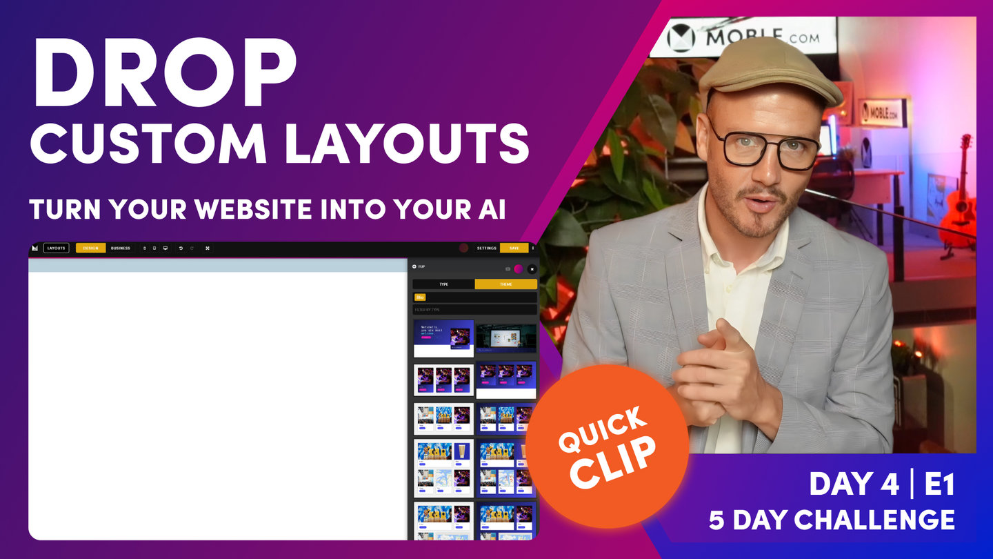
Drop Custom Layouts
Paul Davenport | 05:36
There are 5,000 Layouts to play with on MOBLE, though custom Layouts have been designed specifically for your brand. It's important you use these Layout so that you and your entire team will create consistent content and always stay on brand.
SHORTCUTS
Hold 'Shift' + 'click' drops to Top
Hold 'Alt ⌥' + 'click' drops to Bottom
"You see when the page opens, you're greeted with a blank canvas. What I want to do now is just draw your attention to the three buttons at the top. We've got layouts, design and business. Well, MOBLE is a web builder for design for designers, and it's a CMS for business for content editors. So designers can go and build anything, and content editors can go and edit everything. So we are going to be spending most of our time today in business mode, which makes sense. We're adding content. If you want to learn about design and design mode, go and watch day three, episode one, which is our essentials class, which tells you how all pages are structured so you can look and understand everything that's going on on the page. So jump back to day three, episode one. 15 minutes or so, it's going to tell you everything that you need to know.
Okay, so we've got layouts here. Well, layouts, notice we've got type and theme. Well, type is a collection of lots of different types of layouts for all different types of pages. There's actually 5,000 layouts on the MOBLE platform that you can just click and drop. When you drop them on the page. They'll turn into your fonts, your Colours, and also your padding and alignment for your brand, which is really cool. So you can go and use those others. But today what we're focused on is using these particular layouts under the theme. You can see here this particular theme is my theme. My site name is blio.Moble.site. Your site name will be, let's say yoursitename.Moble.site. So your site name goes in here. And then your site name is your theme name here, right? So my theme is Blio. My site name is Blio.
Now there are, if you click here, you can go and access every other theme and every other layout on every other theme. At the time of the five-day challenge Moble's got 70 themes, but we're adding lots more. And the speed at which we're going to add more is going to increase. So we intend to have hundreds of themes soon, and as we do, they'll all be added into your platform, so you'll get access to them as soon as they're released. Make sure you subscribe to our YouTube channel to be updated as soon as new themes and new layouts are released.
Okay, so here you can see my layouts that we designed yesterday. And at the top I've got two banners. I've got my main banner from my homepage, and I've got the internal page. Well, since this is an internal page, I'm going to drop this one onto the page now. So I'm going to hold shift and click, and that goes to the top of the page. So you can see here, here's my first layout. So what I can do in here, I'll just pop this back to business mode. And you can see this mustard question, sorry, pencil icon here. I'm just going to click it and I can see here the background image. So my first job is to go and change this background image. So all these images have been uploaded for yesterday, all compressed. So you can use these images. But of course, you can go and upload your own as well via the upload.
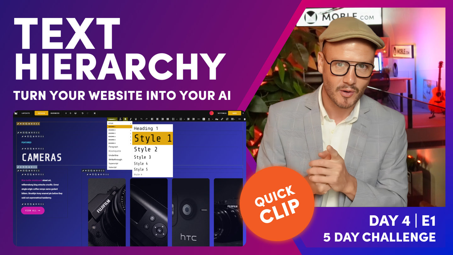
Now my first tip in terms of content editing, is just highlight the text and then you can just write over it. So if I type here, category name, you can see it preserves the styling. Now I can change the formats up here, which I'm going to talk about just shortly. But you can see, just like if you use Word or Google Docs, you've got your main headings. So that's heading one, that's heading two, that's heading three. You can see here this one is in heading two and it's in style three. But if this was the top of my page, I'd want to make this heading one.
So if you're a content team, you probably know this already, but think of your headings for SEO, for search engine optimization. So for search engine optimization, you only want one heading one, and that should have the main descriptive title for that particular page. So that's going to give it the most value. One heading one, like a pyramid, two heading twos, maybe three heading threes. You might not go into heading four unless it's a really long page. So you're dealing with heading one, heading two, and heading three.
But you definitely want to give this heading one a different style, in this case it's style three. But I could make this heading one, style one, and be a lot bigger. Okay? So this is still a heading one, but I can give other styles, which is pretty cool, right? So imagine if this was down at the bottom of the page and it was heading six, but you wanted it to be styled really large where you could still do that. So you're still getting the SEO benefit and you're getting the design benefit. So that's the first bit there. We've talked about text formatting. So this is going to stay in heading one, style three.
So I'm going to go back to the layouts drawer now. I'm going to drop another layout. So I'll go down here, lots of layouts that have been made for me. I'm going to use this particular one here, since this is a category. I'm actually going to drop this one in here. So this time I could hold shift to drop it to the top of the page, but I could hold alt on a PC or option on a Mac to drop it to the bottom of the page. So you can see that layout goes in there."
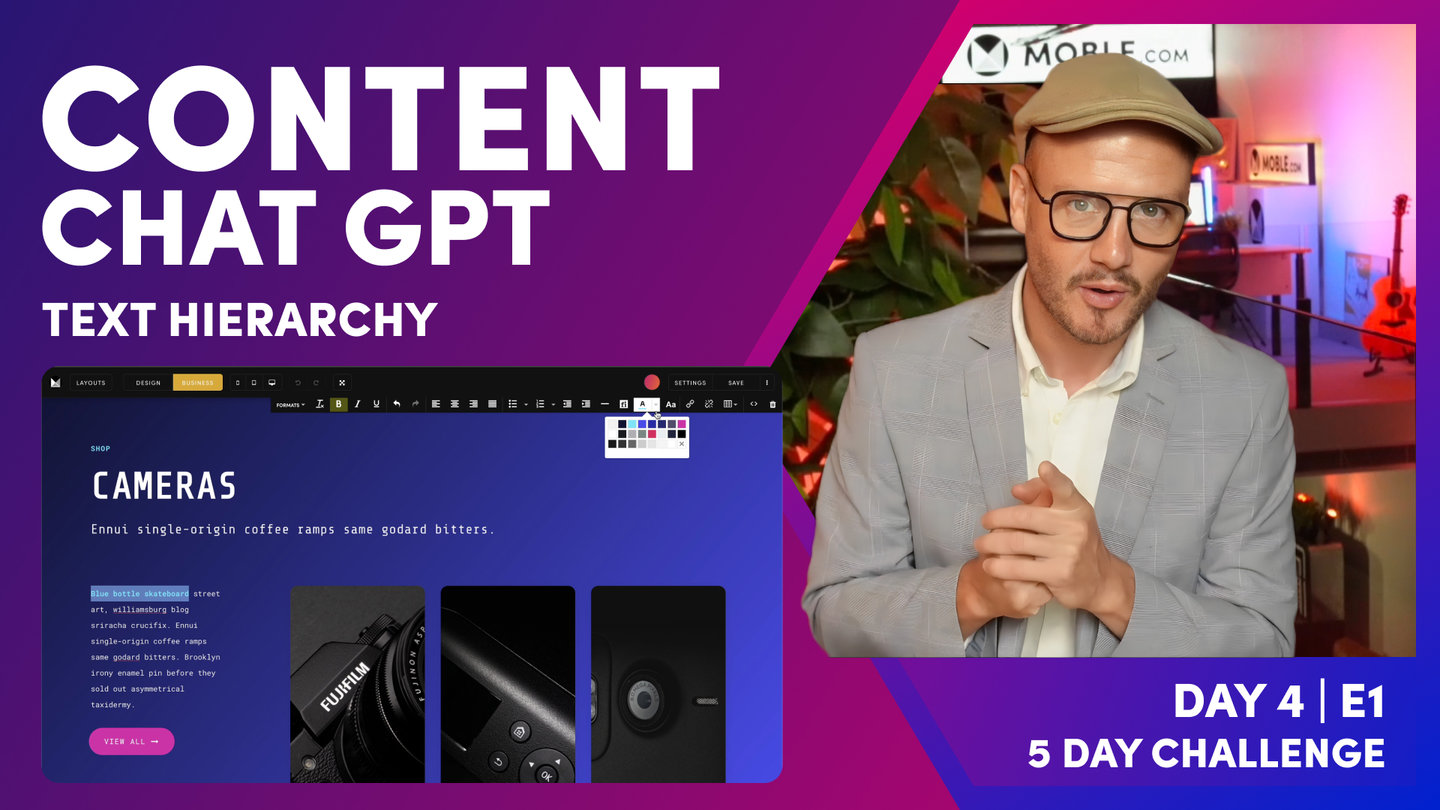
Text Hierarchy
Paul Davenport | 08:10
As a team, it's important to define your Text Hierarchy, here we look at some simple designer tips and best practice to keep you all on aligned.
"And the first thing we want to do here is just focus on the text here, what we call our text hierarchy. So let's break it down and let's have a look at what we've got. Look at the contrast between the sizes of this text. We've got our large, and then we've got our medium text here for the sub headline, and then we've got a smaller text. So the size difference between this large heading and this small subheading, and then we've got this headline here. So this is quite a nice text format. I want you to think about your text hierarchy and be consistent across all of your pages and get into that consistency. There'll be different edge cases where you go, but I want you, first of all, to create a text hierarchy. Maybe jot it down and think of it like this, and you can all work together as a team in that text hierarchy.
If everyone in the content team does the same thing, the website will look nice. If everyone in the content team does different things, it's going to start to look inconsistent and messy. Inconsistency is not a great thing, really. But if you're not a designer, you do just want to keep it consistent as possible. So let's see how this one's broken down. I'm going to just put my cursor in here to see what this is. Well, this is a heading two. It's the second layout down. So that's a heading two, which is nice. And then let's put the cursor back in there. Sorry. It's a heading two in style one. It's the big font here. So what about this sub-headline that's going in here? Well, this is a heading three in style five. And then breaking down the hierarchy here. What do we got? We've got a heading four in style six.
Now, I like style six for these category links. And look at that, it's always in a different Colour. So if your category, what we see sometimes with style six is it might be a bit bigger. So if you are the designer, it's a good idea now, if your style six is too large, maybe bring it down to 0.89 or something like that. So just do that now. And then everyone can use style six for this one. And then you're using these styles in this way. This is my style five, my style one, which I think looks okay.
Now in terms of contrast, you could in here, I'll just show you Colours actually. Let me show you what's going on in here. This is our neutral Colour, our off-white, right? And this is our white, our absolute white. And you can use these in pairings in pretty cool ways. So if white is the main poppy one, I could make this the neutral. On a dark background, you can't really tell the difference, but it is there, bringing more emphasis onto the white. And then this is less emphasis. So I could do that in here on this dark background. So I could make all of this off-white. And then I could just change the first few words in here to white. And notice these first few words are bold.
So even though it's not doing anything, it doesn't feel like it's doing too much. It is just bringing an extra bit of emphasis there. So what I'm going to do is just save, and then click view to open this as a new window. And let's go and have a look at that without the red line spell check so we can see that a bit clearly. You can see there, it's kind of okay, but I like that in the pink on this dark background.
So we've learned a few things there. Designing on a dark background, in this case, full Colour background, you're just working with the off-white, the neutral and the white in different ways, but you can have a punchy accent Colour. In this theme, typically, the way it's set up is this is our accent one, which is the kind of punchy one. But in different categories, then I use pink for the punchy one. So that's the way I'm looking at that. And for this particular theme, I actually like the sharpness of that white, because I don't think it's too overwhelming. I'm not looking to break that down anymore, but I'm just thinking about these rules.
And that's all I want you to do. I want you to think about what I've just said in terms of contrast between your main three headings and then how you want to introduce your text. And you can do that both on a light and a dark background. So what I'm going to do now is just jump in here. And in the layouts, they tend to come in light and dark, you'll notice this. So what I'm going to do now is get the light version, and I'll just hold the option, I'm on a Mac, or alt if you're on a pc. I'm just going to drop this one to the bottom of the page here. And you can see here that this layout already has some text styling for us. But what I'll do, I'll just highlight all of this. I'll just show you Colours on a light background. So I'm going to highlight all of this and clear the Colours, and then I can make it all lowercase. Well, let's just go and have a look, get our eye into some of these swatches.
Well, we've looked at the neutral and they're off-white there. Well, these two are also used for text. This is the main text one here. So you'll find that you're looking around this like sevens and eights. It begins with a seven and eight there. You can see the first letter is seven, like a high seven. Well, that's what we call a middle grey. So our bot has actually chosen these Colours for you in most cases. So this is kind of what we call a middle grey. It's called middle because it works on both the dark and a light background. You'll still be able to see it. And then this one as well just sort of works like a middle grey that you can see it on a light and a dark background, but it's a bit lighter. So you can actually draw contrast on a light background with the main and then this middle grey text Colour.
So let's just have a look at that. If we were to make this one the main, and then you've got the text Colour. But you could go down again with those two text Colours. So I'm just drawing your attention to that. I want you to think about those Colour swatches. These Colour swatches are not there by mistake. It's not like they've gone and been randomly chosen. Our bot has helped us design these Colours so it can work on both a light and a dark background. But so just get to know that styling.
In this particular theme. I'm not using the text Colour so much in these. If it was a big blog post, I'd definitely be using this text Colour. But in the titles, I'm actually being a bit more edgy. I'm going with main, and then I'm using one of our accent Colours just to pop the text there. So again, that's my choice for this particular theme. Now, for your design, it's okay what you choose, just decide what you like and then stick with it and then just keep running with it. And what you'll find is now you're looking at this for the first time, you'll start to see it everywhere and you'll get better.
So we're looking at the Colour contrast and we're looking at the font contrast. And that's all I really want to show you for this episode. We're looking at just thinking about our text styling and thinking about being consistent with it. So have a play with that. And if you're working alone, go and decide how you're going to start and what that text styling is. And if you're working as a team, maybe just decide some three different header types and then how you're going to set up your content and do that for light and dark backgrounds."
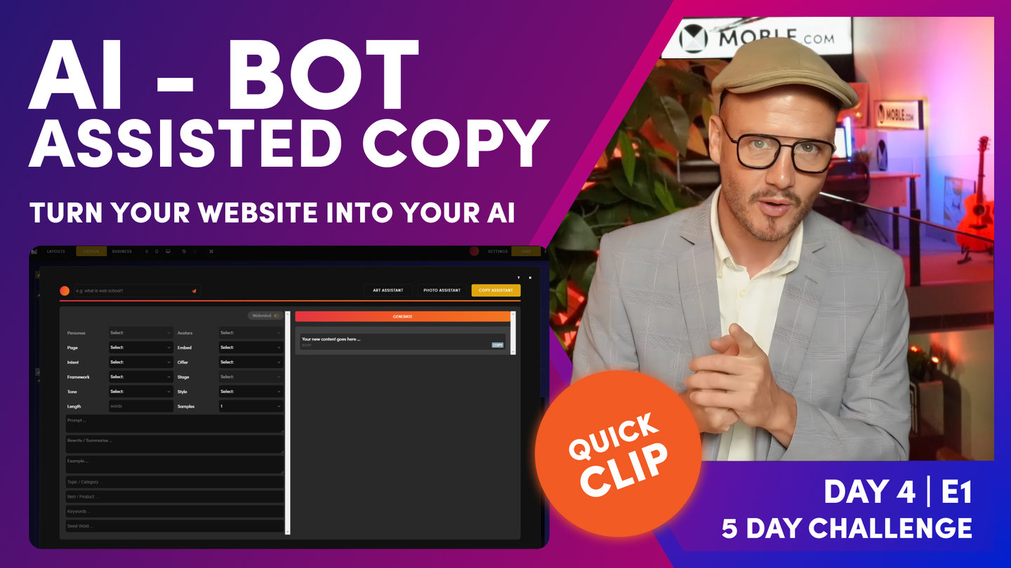
AI - Bot Assisted Copy
Paul Davenport | 03:03
AI's are perfect to help bridge the alignment gap between the Design team and the Content team. MOBLE has an AI inside every page to help you write your copy and ensure you can quickly go and add copy to all your pages.
"So now let's have a look at bot assisted content. I do want you to start adding content now to your pages. So if you've got content, great, put in your actual copy because that's going to start helping. Well, it's going to make sure that your layouts are designed correctly. There's always this, in web design, often the content team are wondering what should come first? Should they write the copy first? Or should the design team come first? And the design team are wondering, should they design or wait for the copy? So there is always this dilemma on what to do.
Well, today is the day to solve that. So we do need some idea on the length of this copy and what it's going to be. So the copy hasn't been written yet. This is why we have the bot in here to help you just get a feel for the content that's going to go in there. So what I'm going to do here, this is what we're doing here. We're selling these antique cameras. So I'll go in here and open up the bot in here. Now, this is ChatGPT, but it's not really chat, it's just given us that initial punch of the content. If you do want to really go and use ChatGPT, go over to that website and start to have that chat and build it out. But you can just do it here just by punching in a command line.
So let's just have a look. And I'm going to punch in here, "Write website sales content to sell antique cameras." I could say something like, "For a website called Blio in Sydney or whatever." But since in this particular point of the site, it's kind of deeper in there. I'm not trying to talk about the business, just really about these antique cameras. So let's hit this and see what the bot comes up with. And almost always, it's going to write something pretty cool. "So our collection of antique cameras is full of vintage gems, perfect for capturing and immortalising all your special moments." I mean, you can't really say further than that, can you?
So let's just take that for now. There'll be some call to actions in here and all the rest of it. It's a great place to start. It takes you to zero to one, particularly if you're not a content writer. It's often quite good. But just explore those prompts. Think about that a little bit more. This case, we're not saying this is all of your content, but what we are saying, it's good copy to bridge that alignment gap between the design and the content team. I think that's a healthy way to say that. "A collection of antique cameras is full of vintage gems, perfect for capturing and immortalising all your special moments." That's lovely, isn't it?"

Daily Wrap
Paul Davenport | 01:25
Remember to use the Navigation area for easy access to edit your Pages, and also view the Quick Links in the Navigation area to add copy to pages like your 404.
"So what I want you to do now is do the same. Go into each page. Don't forget those hidden pages, the 404s. I want you to go into every page now, look at your layout and get the content ready. And then at the end of the day, I want you to have a review as a team and see where you're up to, and then create a task list of everything that is left. And everyone's task list is going to be different at this point, but typically it's going to be, what content is missing? What do you still need to do? Are you happy with your images? It's just a general review of where you are at this point.
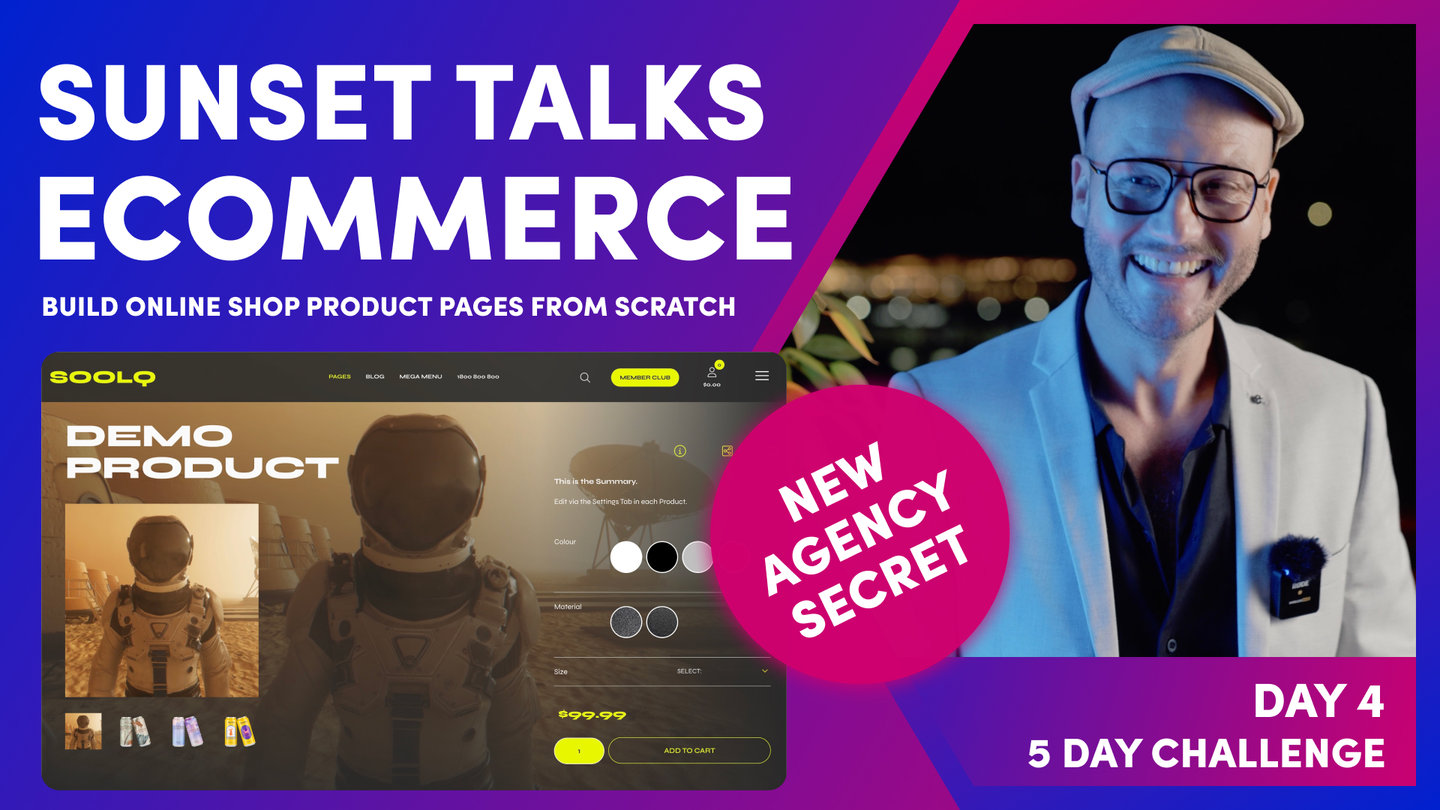
And I'm going to wrap there. I'm going to go off to a couple of business meetings, as I have said. And I will also be getting ready for tonight's Sunset Talks, which is on e-commerce, setting up those e-commerce pages. So if you have got an online store, I will see you there at Sunset Talks number four."
WHAT'S NEXT?
Tonight's Sunset Talks shows how to design your own online shop pages and use our bots to update your designs across every product page. The talks builds on from our tour of the 'Pages' area in Day 2, by showing you how to add product content without having to edit the page.
Play before you Pay?
GETTING AROUND
SUPPORT
AI SALES LINE
AI SUPPORT LINE
ENQUIRIES
team@moble.com.au
GET A QUOTE
A Web Builder for Design. A CMS for Business. We serve all businesses from SME's to Enterprise. Talk with us for AI development, custom website design, website development, ecommerce websites, directories, intranets and social networks.
PRIVACY | WEBSITE TERMS | PLATFORM TERMS | © 2026 MOBLE PTY LTD