PICK YOUR AI THEME TO GET STARTED

DAY 2 | EPISODE 1
MENUS AND NAVIGATION

Paul | 1:06:29 | 3 Hours
The objective of this session is to ensure you have all your pages and menus created. Then, to ensure your header is set up with your menus with links to all your pages.
LESSON PLAN

Menus and Navigation Intro
Paul Davenport | 03:04
This is the only episode today that has tasks, but it's quite a task, we're going to add all your Pages and your entire Menus and Navigation! Allow 2-3 for this episode.
"Well, day two, episode one of the five-day challenge and today is actually super simple because all of the tasks that you're going to do are in this very episode where we're going to build out your complete menus and navigation and add all of your pages. Now, there are three core decisions that you're going to make when choosing your menus and navigation, and I'm going to show you 10 different menu types that you can mix and match in any order. Now, our objective is to make sure that your users can get around your website in the minimum possible clicks. So there is a lot there, and I'm going to guide you through today's episode super slowly. So if I'm going too slow, you can either watch it on double speed or you can skip ahead to the date stamps. But the key thing is that we make the right decisions when choosing your menus and navigation.
Now, like I say, all the tasks are in this episode. The rest of the episodes today I've prerecorded. So you can just watch in the background when you're building out your pages or you can skip ahead and then come back to those episodes later when you need them. I suppose the only exception there is the forms episode where there's 10 forms already built for you ready to go, but you might want to go into some of the forms and swap and change some of the fields. But if you do want to build out custom forms, you can do that too. Just add about 10 minutes into the day to make sure that you set up those before tomorrow.
Now our objective here is to add all of your pages today in day two, and day three, that's when we're going to build your custom Layouts. So by the end of tomorrow, day three, you will be a website designer and I guarantee that. And then day four, that's when we're going to invite your content team to come and help you to add all of that content. So today we add the pages, tomorrow we do the designs, and then on day four, that's when we add the content. Now, if you haven't got a content team or you don't even have content yet, don't worry because that's when our AI Website Bots can actually go in there and help you write that copy for you, and I'll show you exactly how we're going to do that in day four.
Well, a few people mentioned yesterday that they saw my dog Zola walking around in the background of the shots and could you see more of her? So what we've done this morning is we've brought Zola into the shot. It's still actually really early here. It's about 6:00 AM so Zola's there on the, well, I forgot her bed as well so we've stolen some of the cushions from the couches and that's where Zola will live for at least the next hour where we now go and build out your menus and navigation, of course, add all of your pages."

Menu Types
Paul Davenport | 02:36
A quick overview of the types of Menus that come out of the box with your Theme.
"Okay, well let's kick off with a bit of a recap of where we were up to yesterday. But you can see here on the Blio website I have my header, which is in our nice Alio Colours, and here at the top we've got our header menu, which is living in the header. This is this navigation here, and in this navigation there is a dropdown menu which is multi-tiered, it's a multi menu. Now in your header, you can have as many multi menus as you want there, as many dropdown menus as you want, so this blog tag could have menus as well. But also in here we've got what we call a Mega Menu. This one, it needs a little bit of styling, what we're going to do towards the end of this episode as well. And then we have a Menu Section."

Menu Icon
Paul Davenport | 01:25
A Menu Icon is optional on Desktop but mandatory on Mobile and Tablet. Decide if you want you Menu Icon to display a Menu Drawer (standard) or and Menu Section (custom).
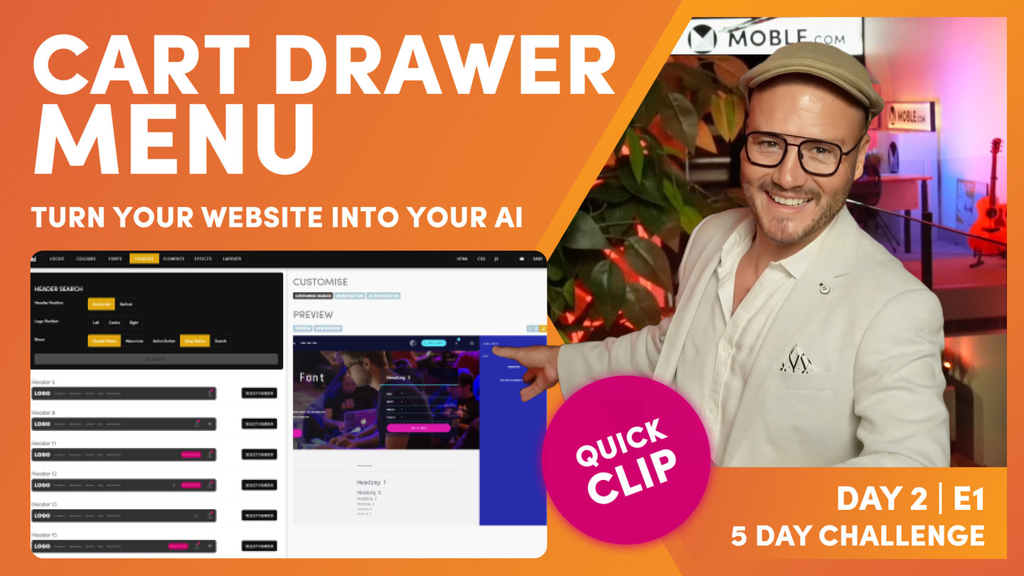
"Well, the first choice I want you to make today is on your desktop, do you want to have this menu icon? Do you want to have this menu icon? Because even if you don't have this menu icon, it will still appear on your mobile. So if you've got a small site, this might be overkill to have this menu rolling in and you might be deciding do you want your header to use dropdown menus and do you want multiple tabs here to have dropdown menus, or do you want your site to have Mega Menus? And maybe you could have three tabs all with Mega Menus in, and then a Menu Section from the icon over here. So this is the core task for today. We're going to be making the decision about what functionality and techniques we're going to be using for your navigation.
So I'm just going to jump over into the Editor now, and here I am in the navigation area, which you can access by the main menu and click navigation. Also, I've got the header's tab open over here, and for convenience, if you want to open your header's area from the navigation area, you can click header and that will open up your headers area as a new tab. But it also lives, as you know from yesterday, in styles and headers in the top bar.
Well, we'll start here in the header's area because now the first choice that I want you to make is do you want this menu icon in your header? If you've got a big site, I'd probably suggest that you will, but knowing that even if you don't have it on the desktop, it is going to appear on the mobile anyway, okay? So that's the first choice. Do you want a menu icon to open up a Drawer or a section? And to do that, all you're going to do is say, if you do want a menu icon, you're going to hit search in here as you did yesterday and you will decide which header you want with a menu icon in. Pretty simple stuff."

Drawer Menu
Paul Davenport | 03:34
A Drawer Menu is a standard option and needs no customisation, it just works. Update the Pages in the Drawer Menu and they will automatically display, complicate with unlimited menu tiers. This is the best option for beginners and is also the best option for Mobile if you decide not to have a Menu Icon on Desktop.
"Now, we're going to move on now to the second choice, which is if you have got a menu icon on a desktop, do you want it to open what we call a Menu Section or a Drawer menu? So here you can see my Menu Section, which a Menu Section is a page that we can build from scratch. We can fully customize it, or as you saw yesterday, we can drag in pre-made Layouts of our Menu Sections, which we do via this tab here. That's where we go and fully customize this page. So yesterday we changed the Colour and the gradient in here. We'll look more on this and how we go and build those from scratch later.
But now I want to show you what a menu Drawer is, what a Drawer menu is. So here you can see slide in menu type. This is the section which slides in from the top so let's go and have a look at that. Here's our Menu Section sliding in from the top. I could also choose to slide it in from the right. Let's have a look at that, so it slides in from the right. So let's see what a Drawer is now. If I change this section to a Drawer and press save and I click here now, this opens up the Drawer. Now the Drawer slides in from the right because the menu icon is on the right. If I chose a header with the menu icon on the left, it's going to open up from the left.
Now the advantages here with the Drawer, it just builds itself. As we add pages and navigation, the pages are automatically added into this Drawer. There's no custom styling at all. In fact, the only thing we need to do is choose the background Colour and the text. So if you are a beginner, a Drawer menu can be really advantageous. To style this all you need to do is jump back into the Colours area, which I'll just do here. I'm going to open it up as a new tab, and then in our header we can see here we've got a Drawer background Colour. I could change this to another Colour, so let's just change it to something like this for now, and I can change the text Colour. If I press save and look at my preview here, I can see that that Colour's updated. So I'm quite happy with the Colour that we've got here in this instance so I'm just going to press save and put that back. And that's decision number two. Would you like a Drawer menu or a Menu Section?
Now if you're a beginner, you can just start with the Drawer menu because it doesn't require any more styling than what we've got here. Or if you are more adventurous, you can choose a Menu Section and I'm going to show you how you go and upload the links for both of these now. So we'll start off with the Drawer menu, and I'm going to jump back over into the navigation area. Now you can see I've just changed my Menu Section to Drawer menu. So now I'm just going to hit refresh in my browser and you can see that it updates for us in this black Colour. This is indicating to me that I've currently got the Drawer menu selected. If I change it to Menu Section back in the header's area, this one will be indicated in the Colour black. Pretty straightforward. So let's now go and edit the Drawer menu."

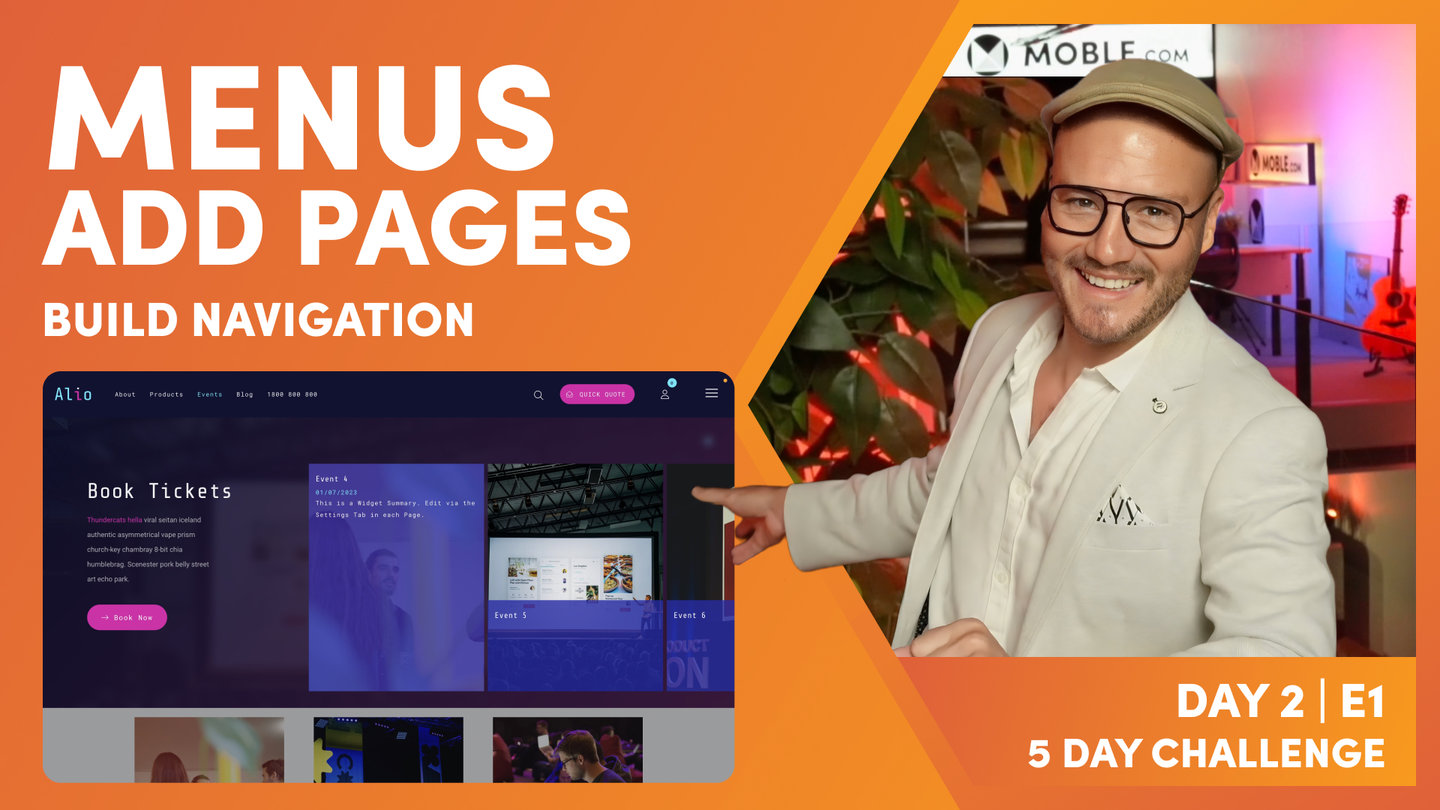
Edit Menus, Add Pages
Paul Davenport | 05:39
Add Pages to your Menus to roll out your website navigation. Either choose to add menu labels only, or choose to create pages as you add your menu labels (highly recommended).
"And here you can see all the pages that currently live in the Drawer menu that came out the box with the Theme. So what if I want to add a new page? Well, first of all, I can just go to add at the top, and one of the pages that we need to add is events. So if I want to create a new page, I can click here, create as a new page, and that will, while I'm creating this menu label, it will instantly create a new page for us. Quite obvious. If it's a product, I could indicate that this was a product, and if it was a product category, I could indicate here it would be a product category, and that's going to automate a lot of that for us. We'll look more of this on day four. If I just uncheck this now, I could also link this to an existing page. For example, if I was creating a menu label and the about us page already existed, I could click, I could write about, and then link it to about us page. So those are the two things there.
In this case, what we're going to do is not link to an existing page. We're actually going to create a brand new page called events. So look at this. It gives it a name and also the URL creates it for us. So if I just put events pages, it will put a hyphen in the URL for us automatically. Now, I can also choose to put my page in live or hidden. When you create a new page, it makes most sense to keep it in draft. There's really one exception, and that's where, like now, when you are creating new pages and your website isn't live yet, we are not going live until day five. So I could put this live now and then when we delegate our domain and put it live in day five, this will automatically live to save me having to change it from draft to live later. So that's a decision that you've got. For this demonstration, I'm just going to leave this in draft at this stage.
Now, hidden, if you're just wondering what hidden is, we're covering that in the next episode. But basically hidden is when you have pages that you want to, let's say, hide from the search engines. People can still access that via a link, but the search engines won't index them. So for example, it might be one of your adverts with pricing or your ads are going to run to this hidden page but you don't want that hidden page to be found so only people with a link can access it. And then draft pages, only people who are logged in to the platform, i.e., your staff, can see draft pages. We'll cover more on that later.
So in this case, I've got events, created a new page. Fantastic. I'm going to add that. Now that adds that page to the top of the list for me. Now I can drag that into position wherever I would like it to go. So I might just want it here. You can see which are the parents at that point. See, that that is not a parent. So if I want to drag it in, you can see I've got parent navigation there. If I wanted to put events below pages, I could just drop it in below pages here. So you're just using the drag handle to move your pages around. So that's creating a new page. So we've looked at creating a new page, and we've also looked at creating a label and linking it to an existing page.
So you should be able to go and add your pages now with that information. But when we've got a Theme, it comes with a whole bunch of things that we don't need. So in my brain guidelines, I didn't have sort of landing pages here or anything like that at this stage that I wanted in my navigation. I've got a Beer Club subscription over here, which, this I don't want in my Drawer menu because this is going to be navigation only for logged in members, people who've subscribed. They can get all these pages, so I don't need to put that in the Drawer menu. There's a special menu over here, we call it member Drawer menu, which I'll show you towards the end of this episode. So I'm just going to build home, about, products, and then sub-category with blog and contact.
So in this case, I might just remove this whole bunch of pages. I don't need those, just remove them in one hit. And now with these events, I could decide to drop them into position, like so, and at this point, you've got enough info there to go and add the pages to your website. I would add your pages via the Drawer menu for now. That's a top tip because at some point you might change between the Menu Section and the Drawer menu, but this is a really nice way to get going. So if all you did today was going add the pages to the Drawer menu, I'd be pretty happy that you've had a good day knowing that we'll naturally be building on your pages as we go through to tomorrow's session."

FAQ: Can I Rename Pages from a Menu.
Paul Davenport | 05:57
Yes, you can rename pages from inside a Menu, but you can not add duplicate URL's. This clip is for Beginners.
"Well, I'll just show you now a bit of troubleshooting, something that I see first time users get into the trap of, and that is here we've got a category page that comes with the Theme. This is an events category page. It's got the mix it up widget on there, which we'll look at later. But here I've created a new page, and this page has no content, it has no Layouts. It's just a new page that we've created. So if I was to edit this page, what I would go and do is edit and drag in one of the Layouts that we've created. But in this instance, what if I wanted to rename this page? So it was the events page. Well, what people tend to do is try and duplicate that.
So as an example here, I'll go into the settings area for this particular page. Now here you can see our page name. Now, if I went to rename that to 'events', it won't let me save that because that page already exists. So you'll often get into this situation where people will go things like events, new, and then if I save and exit, you can see here we've got the page that we don't want, this is the new page with no content, and now we've got the page that we've changed the name, but it's got the wrong URL. So at which point, what you would do is delete this one first. Remember how I said I was going to leave that in draft? Well, this is clearly the new page that we created. It has no content. So I'll just hit the delete icon there, and now we can see our events new. So now I will just change the URL in the settings to events, and now that will save, okay, so I can save and exit there.
So back in the Drawer menu, you can see that this page no longer exists. We've just deleted that page. And so you can no longer access the page to edit it and you can no longer access the page settings. So when you see no page and no settings, it really means that that page doesn't exist. So at which point, I can just remove this and we've got a nice clean Drawer menu. So please remember when you've made changes just to hit save at the top. So that's super important. But I would now go and build out the Drawer menu. Like I say, I like to start adding the pages to the Drawer menu. Even if you're going to use a Menu Section, it can be good to put all the pages in here because you can create pages at the same time so there's nothing wrong with coming into the Drawer menu and just adding all your pages, and when you add them, click the blue tick to create new page, and there's no quicker way to spin up pages.
Knowing that tomorrow we're going to build all the Layouts, once we build all the Layouts, we can go in and just drag those Layouts onto the page. And in fact, that can even be an exercise for day four when we invite your content team. We'll have all of our pages set up and they'll be blank and they can just come in and drag the Layouts onto the page. So it's a really nice way of working. So that's the first task for today. Go into your Drawer menu, add all the pages that you're going to create for your website, and then what we'll do is I want you to decide whether you're going to use a Drawer menu or a Menu Section."

Menu Section
Paul Davenport | 14:49
You can decide to use a Menu Section rather than a Drawer Menu. Please be aware the your Menu Section will appear on Desktop, Tablet and Mobile. Here we show you how to customise your Menu Section, more advanced design classes to follow in Day 3.
"All right, so I'm back over in the header's area and I've decided that I want a Menu Section, not a Drawer menu. So here we can see our Drawer menu, which, just to remind you also is the menu for our mobile. I'm going to change this now to the Menu Section. So I'll tick section here, and I'm quite happy for it to slide down from the top. If you design a particularly thin Menu Section, you can have it slide only 50%, but typically you're going to want that full screen and you're going to choose in a slide in direction. I'm going to have mine come down from the top. I'm going to press save.
Okay, so let's just have a quick look at that. There's our Menu Section, and let's confirm on mobile. Okay, it's looking good. So I know I covered Menu Section in the headers yesterday but I'll just give a quick recap of how you go and choose a Menu Section. You can click this icon here. Sorry, you can click this tab here, Menu Section, and that opens up a new window. You can see I've already got mine open here. So you're going to come into the Layouts Drawer, and then you can either search for Menu Sections via Themes, or you can search via type. So let's start with Themes as we're here. So I'll delete this, and what did we look at? Well, let's just go and browse. Maybe we'll look at Boswell. I think we looked at Senya, Dekker maybe, and I think we looked at Charly, right?
So these are all of the Layouts now for all of these Themes. I'm looking at all the Layouts from four Themes in one hit, but here I could just say, only show me the Menu Sections. So those would be the four Menu Sections from those particular Themes. I can hold shift and click and that will drop them onto the page. And then I can go and do things like maybe change the background image on this one or maybe change the gradient and change that gradient angle to what we are designing for. So I think even if you are using a Menu Section, you can be quite confident to go and choose a Menu Section from the Layouts Drawer. If I just delete that, in here, you can also search via type, and then you can type in Menu Section, and you can go and grab all of these Menu Sections that exist. Again, if I drop this one onto the page, I can then go and tweak to my particular style which I know I like this blue at 130 and I can take out that. So very quickly you can create a Menu Section.
Now, if you decide to use a Menu Section, then there's one important thing now I want to show you and that is that you need to go and do your own links. This is not using the navigation area, it's not using the Drawer menu to create these links for you. Because we're creating a custom page, you need to go in and add your own links. So let me just show you this because I want to show you there's three different types of links that you can make in the text Editor. So just like the Drawer menu, the first type is if you want to link to an existing page. So to do this, I'll go down to our events. We just created a page, a new page for events so that doesn't exist yet. So I'm going to highlight events here and go to our links icon in the text component. So I'll click the links here, and then I can link to an existing page. So if I go to E here, I can see I've got my page called events. And what I can do now is give it an SEO title in here, which I'll just call it something like events category to be a bit more descriptive for the search engines. So now we've got a link. We've created, number one, a link to an existing page.
So what happens if I want to link to a page that we know we want to build, but we haven't created that page yet? So what I'll do here is go down to our Beer Club, and what we're going to do is we're going to create a video library page so only store members, only people that have subscribed into the shopping cart, can see a video library. So I'm going to type in here video library, okay, and then I will click the link icon. Now, at this stage, I can't use the link list because there's nothing in there that currently exists. So I can just paste our video library. I might call this something like members only or something like that. But in here this time I'm going to call it video-library. So notice that I'm using the forward slash because this is a page within our website and I'm not using any spaces. I'm using a hyphen because it's a URL. So that's the format of the URL.
When I say I'm creating a page inside our website, what I mean by that is I'm not going over to the URL here and copying the site name. I'm not going to have blio. MOBLE.sites/video-library because when we go live, our domain name will be live, which will be blio.com.au, so we don't need to type in the actual URL here. It's just forward slash and that way this link will still work, whether it's linking to the site name blio.MOBLE.site or the domain name blio.com.au. So I've seen that mistake a lot. People just copy the URL of where they want to create a link to. But if it's an internal page, we just type in forward slash and then the URL. Now later, I'm going to go and build that video library page when we create a new page. That's in the next episode actually when we look at pages. I'll show you how to create a new page, but we're also going to password protect that page so that only our members can see it.
So that's the second type of link, linking to a page that we haven't created yet. So I'd click okay. Now, the third type of link is what if we want to just link away to a completely different website? Well, I'll just call this here new website. So you see here the styling. I could then go and change this styling, but if you want to preserve the styling, a good little tip is just put your cursor to the right and hit enter and in the source code now, that's just going to keep the same styling. So if you're a web designer, you'll know that, but if you're a business user, that might help you a lot in the text Editor. So now I've put in here new website and I'll highlight this and I'll go to the text link here. Now in this case, now I type in https:/ and then it would be new whatever the website is, so in this case, let's just type newwebsite.com, and then I would type in the path. In this case, let's call it, I don't know, video library. So now that was going to link away to that new page, that page on a different website.
But if we just leave it like that, what's going to happen, it's going to stay in the same tab in the same browser window. So what we want to do is make sure that opens up as a new window. That way when we click away, our website will still stay open. So that's a strategically advantageous technique there. So this is where we highlight the target to say new window. So that's the third type of link. So with that information, if you are using a Menu Section from one of the pre-made Layouts, you'll see a whole bunch of links in there, and so that's how you change your links.
Now, there is another type of menu that we have called body menu. So I'll just show you quickly what a body menu is while we're here too. So this is where we've made our links manually, but back over in the navigation area, so let me jump back over to navigation, and you can see these menus here, right? So I could jump over here and literally add any new menu. I could call this menu five or whatever and it's just going to create a new menu in the list here. So this Theme came with four menus, menu one, menu two, menu three, menu four. And if I click edit on this particular menu, I can go and add new pages to it in just the same way. Well, back over in my page here, I could just drop a menu here instead of using text. So to show this, I'm just going to put my cursor in here and I'm going to hit the delete icon at the top.
Okay, so that's disappeared. That was under home. But what you're going to learn tomorrow is the difference between Business Mode and Design Mode. Well, MOBLE is a web builder for designers and a CMS for business. So we can put it into Design Mode so we can go and build pages here. And you can see here this is the frame where that text lived before it was living in here. So in here I can hit the plus icon and I can actually embed lots of different types of components. Well, one of those was a text component. I could put in images or buttons, but in this case, I can drop in a menu. So watch this. I've dropped in a menu here. If I click on this placeholder, I can see a whole list of menus. Well, here's the menu one that we just looked at. So I'll click tick to drop it in, and you can see our menu in here. So this is a dynamic element, meaning it's pulling in content from somewhere else. In this case, it's pulling in a menu from the menus area.
Well, I could do all kinds of funky stuff with this, like change the padding and alignment and its positional elements. I can do all of this type of thing, but I'm just going to now just show you very quickly one thing, and this is the dynamic text Colour. Well, if I click here, it's going to change it to neutral, it's going to change it to the Colour that I select these different accents. So I just want to introduce there a feature that we have called dynamic text Colour, which overrides the Colour of our dynamic includes. In this case, it's overriding the Colour of a menu. Now that will also work for widgets as well. This is a cool feature because often on MOBLE you're going to be changing these background Colours. If I have a menu, and this is on a white background, I probably want my text to be a darker Colour.
So if you have a Menu Section, a lot of the Menu Sections we have in the Layouts Drawer don't have text. They have the body menu. So when you click on that, you're going to see this. You're not going to be able to edit that text. It's going to link to a menu. So if you choose a Layout and it's got a body menu, the only thing you might want to do in the Editor is just click the immediate, put it into Design Mode and click the immediate pencil icon of where it lives. So here's our menu, click the immediate pencil icon, go to advanced, and then scroll to dynamic text Colour and change your Colour. That's all you're going to need to do. Now, if you are using a body menu, then back over in the navigation area, you can add menu labels in just the normal way that you've learned there. And just keep in mind that your body menus are quite prevalent in Footer's Menu Sections and Mega Menus, which we're going to look at just shortly.
So where are we up to right now? Well, you've made a decision that are you going to include a menu icon in your header or not? And then we've made a decision now, are you going to use a Drawer menu, which as you can see is really good for first time users, or are you going to use a Menu Section which needs a bit more custom work? So if you are a new user, I would just add a Drawer menu right now and add your pages. Very easy. Knowing that, after tomorrow's session, you're going to learn how to build things from scratch anyway, so you'll be more than proficient to manage your Menu Section if you want one later.
Now, there's nothing wrong with a Drawer menu. From a UX perspective, they're totally fine. They work really well on both devices. So now you might just choose not to have a Menu Section or a Drawer menu at all on desktop, in which case I would definitely just use the Drawer menu. Keep it simple, because what we're going to learn shortly is, based in each tab, you can have what we call a Mega Menu. So if you're using Mega Menus on each tab, you might not need a Menu Section at all. So that's a really good tip to consider. And that brings us on to the next decision that you're going to make.
What we're going to do now is look at your header menu, and in the header menu, the navigation that sits in the header, you can have the normal dropdowns, which we're going to edit now, or you can have the Mega Menus, and that would be the next key decision that you make. For your header menu, if you've got subnavigation, do you want it to use the Drawer, sorry, the dropdown menu, or do you want it to use the Mega Menu? And it's much the same decision as with our menu icon. The dropdown menus happen automatically in the header menu, just as the same way the Drawer menu does, and the Mega Menus, you make them custom just in the same way we've done for the Menu Section. So there's a lot of terminology there but really there's two choices. There's the easy choice for the basic users that just rely on the navigation area and there's the more advanced option where we can customize everything in the page Editor. So let's jump onto that now."

Header Menu
Paul Davenport | 07:39
It is highly recommended to use a Header Menu for business websites. Though, some minimal websites choose to only display a Menu Icon. Try to key your Header Menu as concise as possible, ideally 3-5 links. A Header Menus allow you to roll down Drop Down Menus (standard) and Mega Menus (custom) from your Header, so decide on your most important pages and include them here. In this clip we show you how to Add Dropdown Menus and also alternative ways to Edit your menu labels.
"Let's go and add the pages to our header menu and then let's decide are we going to use the dropdown menu or the Mega Menu? All right, well let's add your header menu now, and you can edit your header menu, just like your Drawer menu here in the navigation area. But before we do that, we'll just jump over to the headers area where we can preview. You can see the header menu here. It's literally that. It's the menu that lives in the header and it's doing two distinct things. One, it allows us to either have dropdowns from a tab, or it allows us to have Mega Menus that dropdown from a tab. So those are going to be the key choices is for each of your main tabs in your header menu, if there is subnavigation, do you want it to be a dropdown menu or do you want it to be a Mega Menu?
Well, the dropdown menu is really easy to edit. It's just like editing the Drawer menu, so it just happens. It just works. There's nothing for you to do. But then the more complicated one, the more styled one is building out the Mega Menu. So that's going to be the key decision for you to make. But the other key thing about your header menu is the fact that there's only a small amount of space. There's only so many tabs you can have in your header menu. Now I always like to try and keep mine to four if possible. Best practice advice is six, but don't forget, I'm also expecting you to use an Action Section, and you might also have the menu icon that rolls down the Menu Section or the Drawer menu as well. So try and keep it down to five if possible. I like to go with four knowing that, with those four, we can build out dropdown menus or Mega Menus to make it nice, and that way people are only ever really a hover and a click away from any page.
The header itself is sticky, so as people scroll, it's going to stick. So if you're using dropdowns and Mega Menus and indeed Menu Sections and Drawer menus, then you should have a huge amount of real estate there to add all of your pages. I don't care whether you've got 1,000 pages, there should be enough here to put all of your navigation in. So that's going to be the key decision now.
So what we'll do is just jump back over into the navigation area and let's click edit next to the header menu. So here we are in the header menu, and what I'll do now is just show you a few alternative ways that you can update your menus. So here we've got a tab called pages. If I want mine to say products, I can literally write over the menu label and then also write into the URL. So I know this page already exists, so I'm going to type in forward slash products and then watch over here. As I move my cursor out of the box, it instantly creates that page. So it's now letting me, it knows the page exists, so it now lets me edit the page and edit the page settings.
Well, I can now go and remove pages that I don't want. So I'm just going to remove this page here. All right, I'll collapse this. But what we can do now is add a new page. So if I add a page called events, we know the events page already exists, so I could use the link list here. I don't want to create as a new page. So I didn't use the link list and it's created a new page but it hasn't put the forward slash in because I didn't use the link list, it's just typed what I typed in. So in this case, I could type in the forward slash here and there again it knows and it's created that page for me. So that's just a couple of alternate ways that you can sort out your header menu.
All right, well, look at this, our header menu. I'll just drag the events pages in here to create our sub-menus. So these are going to be, we've got two dropdowns now. We've got the products and the events dropdowns. So I'll take contacts out of there and I'll take about out of there too. All right, so that's pretty rapid, right? Once we've got things set up, we can make changes. I can change the order around here as well. I might move products down, might move events down. All right, it's looking pretty neat. I don't need that Mega Menu there because I'm going to add another one, I'll remove it, and I've got my phone number, which I'll leave in.
Now the key thing about your header menu as we've said is we want to reduce the number of tabs. Now the key thing about any MOBLE website is you've got the option to have the Action Section. Now the Action Section rolls down the form and that form is in the header which is sticky, so it doesn't matter where people go on any of your pages, whether they're low down the page, whether they're deep in an obscure page, your Action Section is always going to be there. And therefore the Action Section is the form that gets the most conversions on your entire website. So that can also include things like your contact form, right, contact information, and even a phone number in there.
So when we're talking about a header and we want to reduce the number of tabs, it seems obvious to me if we've got an Action Section, I'm going to take out the contact us tab. So I can just remove that if I don't want it. And for now, I think I'll leave the phone number in the header, so I'll just leave that in. And just like on the Drawer menu with the phone number, if we want users to click on the mobile phone, we don't type in forward slash, we type in tel: and then your phone number. So we'll just press save now and that's the header menu set up. Now header menus now set up with two dropdown menus. It's got the dropdown menu on products and the dropdown menu on events, all right, so now that's where we'll make the decision on if we want to change those to the Mega Menus, which we're now going to do.
I'm going to move on to change those to Mega Menus. But before we do, I'll just show you back in the fonts area where we go if we want the font to change in the header. So back over in styles and fonts, I can roll down to menu and you see the first one is header text. If I click make font here, I can change the size slightly. So I might make this slightly smaller in this instance, and you know what, I might decide to make that uppercase. So when anyone adds new menu labels to their header menu, it would automatically make it in uppercase. So that's a cool little trick for your header, and you can decide. You might decide that your header text size is too large and that is true when you have a Theme. Depending on what font you use, you might decide just to make it a little bit smaller, which you may well do. This is a nice size here, 0.8125. And then I'm not too sure if I like mine uppercase yet, so I might decide that later. But for now, we can just leave that and we can move on."

Mega Menus
Paul Davenport | 14:40
Now you need to make that key decision, as to if your website needs mega menus. To help you decide we show you some client examples and how to choose Mega Menus from the Layouts Drawer.
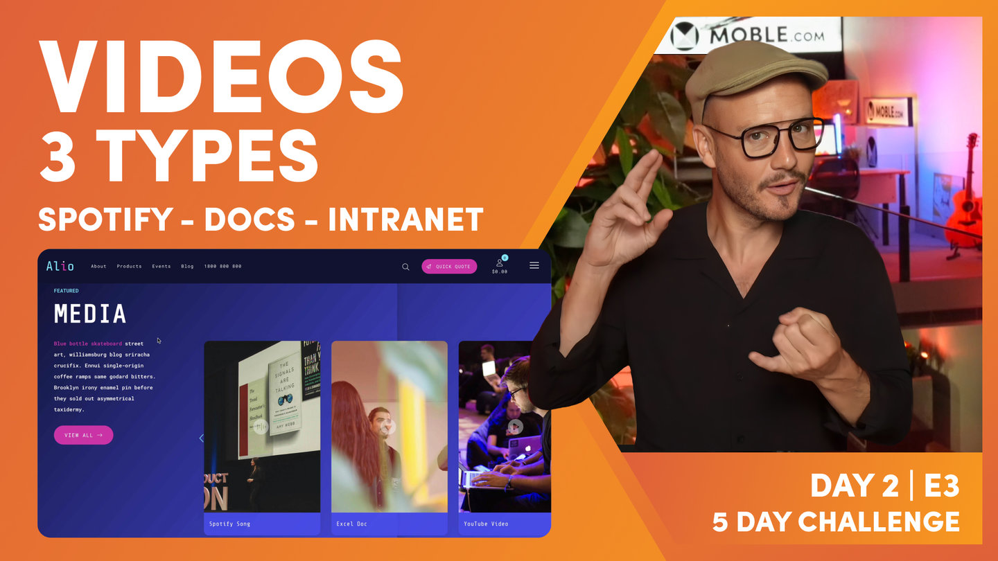
"Okay, so now we're going to decide if you want to add Mega Menus. We've just looked there in the header that you've got the choice of using dropdown menus to build out your navigation, but now we can replace those dropdown menus with what we call Mega Menus. And to describe that, as I said in the opening, let's go and have a look at some of my clients and some of our Themes to inspire you as to what's possible.
Well, the first example we'll look at here is a client called Artefact and they've actually got three Mega Menus that roll down from services, examples, and our team. So let's have a look at their Mega Menu. Well, you can see it here. We've got a description of what services is on the left, then we've got a body menu injected into the center column, and then on the right-hand side, that's actually a widget. It's pulling in a feed for the latest article, so as they update an article, it'll replace there via a widget, which you'll learn more on. And this is the same format as we move onto examples. So hover over examples, you can see exactly the same format. We've got the text, the injected body menu, and then the key link on the right, and it's the same hovering over our team.
Now there's so many pages there, as you can see. There's a huge amount of pages just in three hovers that we can access. Plus we can really talk a bit more about this main overriding category. But in this text description here, this could be a client testimonial or some other key information. On the right-hand side here, it could be a form or it could be an advert or a promotion or a special. So Mega Menus can work in really cool ways. You only ever hover away, we haven't even clicked anything yet, and we're showing this key information about your website. What it does, it allows our header menu to have the minimum possible links. Incidentally, the fourth link here is a map which opens up a map directory. I think there's about 600 projects in the map that you can search from so you can showcase the work that they've done.
But this particular client also has an Action Section to get those inquiries under let's talk, and also it has a really detailed Menu Section as well. So I don't know how many pages are on this website, I should have checked, but there's a lot, right? And all that has happened from how many links have we got here in the header? Well, we've got the four, services, examples, and our team, and then map. Three of those are a Mega Menu. Then we've got the Action Section and the Menu Section, and obviously the Artefact link there links back to the homepage so we don't need to write home in the header menu because we can always click on the logo and that takes us back home anyway. So that's the first example.
So now let me show you another example. This client is called Euroluce. Now this is a lighting company, quite a prestigious lighting company here in Sydney. Now they've actually got over 100,000 skews on this website. I don't know what it was up to on the last count, but on here we've got five main categories under products and these are, again, injected banks of body menus. So rather than making text links, we've chose to put in body menus. So if the client wanted to edit this, they could go into the menus and navigation area and in there, there's five extra menus. You know how we had menu 1, 2, 3 and 4? Well, there's says indoor, outdoor, brand, effect and application, and that's a really cool use of a Mega Menu with five body menus within it. So this has got a header menu and then it's got a Mega Menu and inside that Mega Menu, it's got five other menus. So you can see we can build out really huge websites. Incidentally, the search on this one has got quite an advanced search and filtering. It's really, really cool stuff.
So that's the kind of stuff we do in the custom development. If you ever need MOBLE to optimize your navigation, build out custom search, even if it's hundreds of thousands of products, you can just give us a call. Even if you build a website, you can contract us to do all that custom development on top, which is a really cool perk of working with us in this platform.
So what I'll do now is just jump over and have a look at the Alio Theme that we're building out. Well, the Alio Theme has got two Mega Menus, what we're ultimately building. So I'm giving you a preview here of where we're actually going with this. We're going to build out now our products and our events Mega Menus. You can see these two here. Look at the slight differences. One's got a blue accent and the other's got a red accent, so blue for products, red for events, which makes it look quite nice. And then the events is using a multi-slider widget, and the products is using a product grid. So this is all stuff that you will know how to do. This is tomorrow on day three, I think it's episode seven. You can actually see us building out these Mega Menus from scratch, so not using a pre-formatted Layout, actually building from scratch. So that's a really cool tutorial, takes about 15 minutes and you will be able to do it yourself. It's not hard what we're doing here, it's just you knowing our process, how we build from scratch and you can just sit back, we call it watch and learn. You can just sit back and watch and learn how we do it and then you'll find that you can repeat those actions quite simply.
Well, let's jump over and have a look at some of the Themes. What we've got here, Dekker, which uses quite a complex Mega Menu, you can see here this time we've got four banks of links, and then we've got key contact us information, location and hours, and then a newsletter subscription form. So again, that's quite a complicated one. That one you just saw before, if you want to use this one, you can just go into the Layout Drawer, type in Dekker, Menu Section, drop it in, and that'll work for you as well. Here, this is an interesting one with Aswad because this one's giving away a $20 free voucher. So if people hit the become a member button there, they can go to a subscription form for their online shop and then $20 credit will be added to their account. So you're basically saying, "Give us your email and mobile phone number and we'll give you $20."
But what we do in this case is say that $20 is only redeemable once your cart value hits $100. So what you're actually doing is giving $20 away for free, but it's only redeemable when people have got, let's say, $100 in their cart so that's a really cool way of building your database and your customer acquisition because you can say, "Here's 20 bucks, but it's only redeemable if you spend more," so you're actually increasing what people spend and getting more customers at the same time. So tricks like that, you're going to learn in day five. Why not put those in Mega Menus? Because that's a really cool promotion that anyone can apply to your website.
Here we'll look at this one on Sumer. Very simple. This one isn't using an injected body menu. This is simply text links, product 1, 2, 3, 4, 5, 6 as we looked at before, and this one is using maybe a staff quote, maybe a client testimonial to support that trust in the Mega Menu. All right, so that's a few examples there just to inspire you. So now it is time for you to be thinking, are you going to use a Mega Menu? Do you need a Mega Menu? How big is your website? But if you do need a Mega Menu, let me go and show you how you attach that section to the header.
So I'm just going to jump back into the navigation areas you can see here and I'm going to click the edit button next to the header menu. And you can see here under the products tab, there's currently a dropdown menu that we've created, isn't there? So what I want to do is remove those dropdown items because we are now going to attach a Mega Menu to products, to the products page. So there's our products page. As we know the page URL is forward slash products. So what I can do now next to products is hit their orange, or mustard as we say, edit button. And in the popup here, you'll see we can link this to an existing Mega Menu. So if that Mega Menu already exists at this point, we can just say, "Right, I want to link it to this one."
But we don't have a Mega Menu yet for products, do we, so what I'm going to do is hit this new window icon next to where it says Mega Menu and that takes us through to the pages area where all our Mega Menus live. So you can see here, this is the first Mega Menu that came with the Theme. It literally says menu, Mega Menu. What we'll do now is actually just go and replace that. But before we do that, sometimes it's good to leave a Mega Menu there. Just in the case of Artefact, their three Mega Menus were all the same, weren't they? So if they wanted to add a new page in the future, a fifth page and make that the same Mega Menu format, well, what they could do is just come in here and hit the clone button. So notice the clone icon here. When they click that, a clone is created, and we know it's a clone because it says hyphen one.
So we want to go and change the page name for that and the page URL. So I'm going to go over to the settings tab. So click settings and open it up. So the first thing I want to do here is know what the page is called. So I'm going to call this one products Mega Menu. Now, to attach that to the page, I just need to, in the URL, do a little trick and this is what it is. When it's a Mega Menu, it always starts with menu hyphen, and then it's saying, "Well, where do you want this menu to attach to?" Well, I want this one to drop off the products page, which URL is forward slash products. So to do that, I would simply type in menu hyphen here, then the URL which is products. So if I want to attach this to the products page, it's menu hyphen products, and the URL for the events page is slash events. So if I'd want to attach it to the events page, it would be menu hyphen events. So it's just menu hyphen and then the URL, and that attaches this Mega Menu to that tab, that page in the header menu.
So at this point, what I'm going to do is fast-forward in time, because tomorrow in episode seven, I'm going to show you how I build these Mega Menus from scratch. So there's no need to cover that now because you haven't had the learning that you're going to learn in episode one tomorrow. But look how cool this is. On my Mega Menus, this is the end game for the Theme that we're building. You can see here if I hover over products, I've got this beautiful menu which has got the title on the left and a description. That description, I could get the AI tool to go and write a little description if I don't want to use the kind of out of the box description, and it's got a buy now button and that buy now button links to forward slash products to all of the products.
And then on the right, I've got a selection of some key products that we're selling. So in this case, these are the products tagged with upsell, which you're going to learn a bit more about when we look at widgets later today. But it's basically a feed of the key products that I want to show or the products for this particular category. So that's a really nice way of doing a Mega Menu. And some of the cool design features in this one, you'll notice it's got a background image there, and the image is slightly blurred out so the text is more legible on top, and there's actually a gradient in the overlay, which is the same Colour as that button. So it marries it all together, which is really nice.
But when I move over to the events Mega Menu, as you can see here, this one has got the pink button this time, and it's got the pink in the background. Again, it's got the blurred background image and the pink gradient over it. Again, that's really nice for the text legibility. And as far as the widget, unlike the product which was used in a grid, this one is using the multi-slider carousel on autoplay. I could have it with arrows so you manually press the arrows, but this one's just on autoplay. So you're going to learn all of that. We're going to introduce the widgets later on today in one of the episodes. But this episode, pretty sure it's day three, episode seven where you'll see me build these two Mega Menus from scratch. That's going to be a really cool episode."

Top Bar Menu
Paul Davenport | 02:08
Top Bar Menus are not so fashionable since the kill vital real estate on your page. Only consider a Top Bar if you have an explicit reason to do so, e.g. such as showing links to a different part of your business for Stakeholders, rather than your direct customers.
"All right, so what I'll do quickly now is just show you the top bar menu. With so many menus available, i.e., menu options available, like having a Mega Menu or a Menu Section, it's unlikely that you're going to want to use a top bar. And now a top bar sits above the header menu and we've got a whole bunch to choose from. So to choose a top bar, you go back into the header and you scroll down. You can see they're currently positioned around header 32px and so on where they've got this top bar, so there you can choose a top bar. Now, a top bar has a small number of links in them. Typically, it might be for things like contact us if you really want that contact in addition to the Action Section, but it could be things like careers or media or news or something to do with the corporate structure or shareholders. Something like that is often a good use for a top bar.
With the top bar, you want to give it a Colour, you want to change the Colour. So you can do that back in the Colours area, and then you can, as you scroll down here, you can see top bar. So that's where you want to go and change the background Colour and change the text links. Often it's good to make that have contrast from the Colour of the header background, but not necessarily. You might want just a big header all in one Colour. So that's some tips with a top bar there. And to edit the top bar, you go back into the navigation area and you can see the top bar menu there."
Cart Drawer Menu
Paul Davenport | 01:55
If you have an online Shop the your Cart Drawer will display a summary of the items currently in your Shopping Cart. In addition, you may add a Menu inside your Cart Drawer which can link to key information, such as Members Area for exclusive members only content.
"I just want to show you the cart Drawer menu. So if we click on the shopping cart here, you can see that the cart Drawer slides out. Now the cart Drawer is when customers add items to a cart, it automatically adds to the cart Drawer. There's nothing that you need to do to change that. But in some instances, you might want to put extra links into the cart Drawer. Some people like to put login. Now as standard, all of our cart Drawers, if you are having online shopping, has the login and join button, which goes to a particular page, which is a member login. It has two forms on there because we want to get the members to log in and to sign up. So that's a nice page.
So as default, it's got that link at the top and it's already set up, but you might want to add other links below that. Sometimes people like to add shipping in there, or special terms and conditions or notes. So you can do this in the cart Drawer menu. Okay, so back over in the navigation area, if I click edit next to cart Drawer menu, you can see here our login and join link and that's linking to the member login page. So you could now use the add button to add more items to your cart Drawer. Probably not going to do that. I just want to drawer your attention to it so that you know that it's there."

Body Menu
Paul Davenport | 03:16
Embed Menus into your pages and learn where to change the colour of dynamic embeds with Dynamic Text Colour swatches.
"So in here I can hit the plus icon and I can actually put, embed lots of different types of components. Well, one of those was a text component. I can put an images or buttons, but in this case, I can drop in a menu. So watch this. I've dropped in a menu here. If I click on this placeholder, I can see a whole list of menus. Well, here's the menu one that we just looked at.
Member Drawer Menu
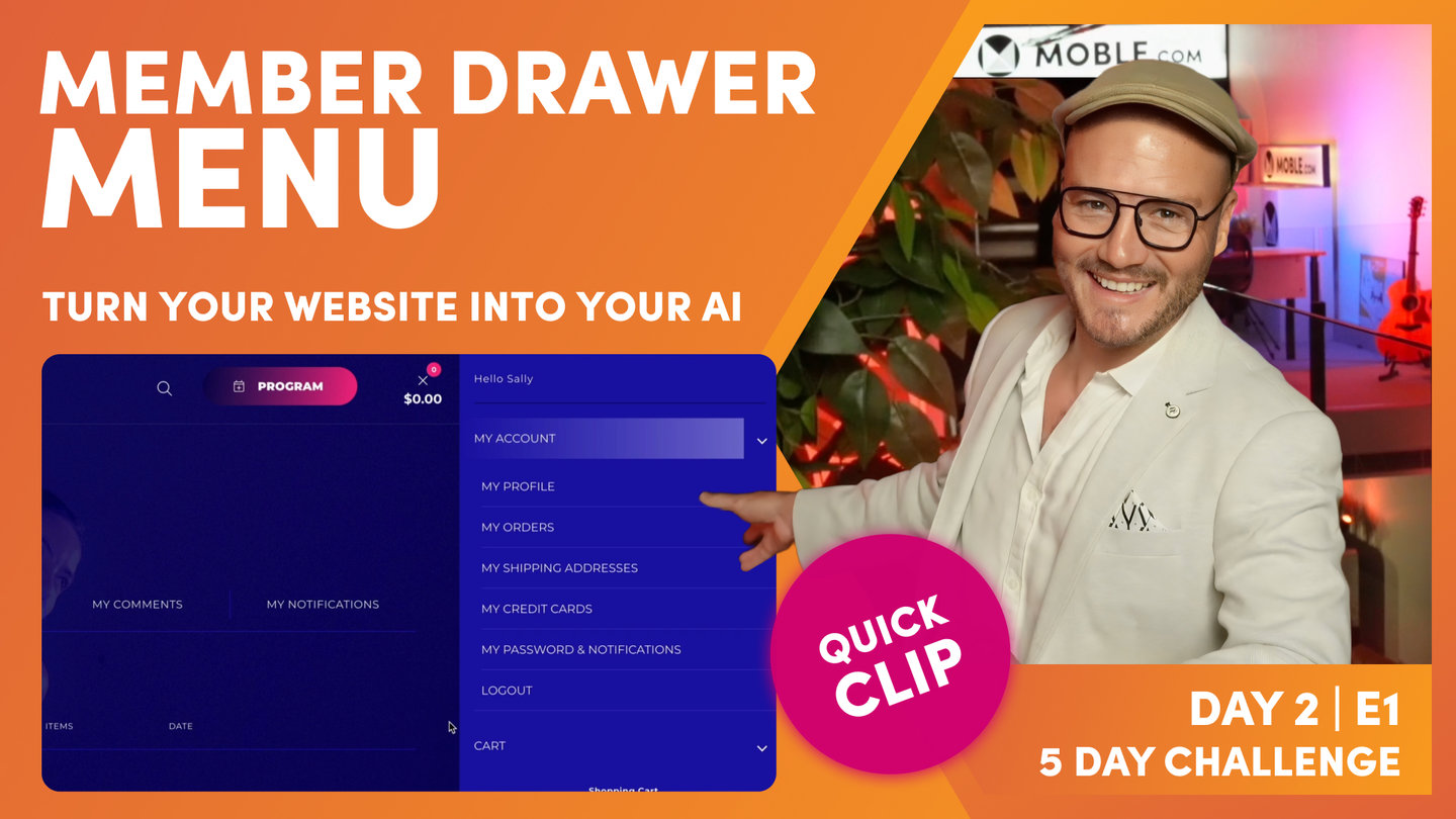
Paul Davenport | 03:27
A Member Drawer includes key pages for Members such as My Account, My Shipping and Billing Info, My Credit Cards and My Notifications. You can add to this menu with more specific page for your members. They will only see this menu when they are logged in.
"And similarly, we've got the member Drawer menu. Now, the member Drawer menu supports the cart Drawer member, but this is for, sorry, the cart Drawer menu for when our members are logged in. So the member Drawer menu includes all of those things, my account, my past orders, my wishlist, my shipping information, my stored credit card information. That's the menu so that when logged in members click on the cart Drawer, they'll see this extra bank of links. And what I like about the way that this works is because that one cart button, because we've got the Drawer for what's in the cart and then we've got the Drawer for the menu, they're all coming out from the same button, the same real estate. So that's basically maximizing the real estate that we've got in the header, which is a really nice technique.
That's why yesterday in the header's episode, I chose not to use the shopping cart icon. I used the member user icon because it's obvious that that's a shopping cart because we can see the value of what's in the cart and the number of items, so people automatically know that that's a cart button. So by having a user icon can also say to people, "This is where you go to either log in or see your account." Now on the member Drawer menu, you can also add extra items to that menu. So back over in the navigation area, if I click edit next to the member Drawer menu, you can see all of those links there. Now, I highly recommend you do not change the URLs in here because these are preset going into system pages. These system pages, you can go and edit what they look like, but a lot of the things on them are automated because it's to do with member login. But if you go into the pages area and click pages and search hidden pages, you can see a lot of those system pages there.
Now, here is where I might add my video library. Remember before we created that page called video library. If I wanted that video library to be accessible to all of the shop users, so everyone in the entire shop, this would be a good place to put it because anyone that's logged in, we know they're logged in and now everyone can see this link and it's a good place to put those pages. There are certain instances where you'll have password protected pages for only certain types of member groups, so only if you're in this group will you see this particular link and be able to access the information on that page. So we'll cover more on that when we look at members on day five. But at this stage, there's nothing you need to do with either the cart Drawer menu or the member Drawer menu. I just want to drawer your attention to them at this point so that you know that they're there.
Okay. Now that is a wrap for day two. That is really all I want you to do is make those key decisions that we've talked about. The first decision was are you going to have a header with a menu icon? The second decision is are you going to have a Menu Section or a menu Drawer? And then the third is in your header menu, are you going to have dropdown menus or are you going to have Mega Menus? And there should be enough there to build out your entire navigation. My top tip is to go and add your pages now into the Drawer menu.
The good thing is about the Drawer menu. You're going to add pages, and that's instantly going to make those pages in the pages area too. We're moving onto a tour of the pages area next, so that will explain that. But there's no quicker way to go into the Drawer menu, add a new page, hit the create as a new page blue checkbox, and that'll create the page instantly. So you can just race through and create a whole bunch of pages very quickly and then in the Drawer menu, you can drag them, drop them into groups. And so even if you're going to, that will put them into dropdown menus, it's great, but that's in the Drawer menu, remember, it's not in the header menu. So we can leave those dropdown menus there. So it's created the pages and even if we choose to have a Menu Section, it's not a bad idea just to leave that Drawer menu there anyway, you might want to change back to it at some point in the future.
So that's my top tip. Go and add your pages using the Drawer menu, and then you can make those decisions later on if you need to, and that will keep you in good stead for when, next, tomorrow, we're going to go and create all of these custom Layouts. And then on day four, we're going to drag these Layouts into the blank pages we create. So if we can create those pages now, by the time we get to day four, we're just literally going to drag in the Layouts and add the content. And our content team or your content team are invited to join us to add that copy. Many hands make light work. But even if you haven't got copy ready yet, we're going to, on day four, use our AI Website Bots to write the copy for you. So you're going to add a few prompts, write me some content for an about us page and about your business, and the AI Website Bots will write that for you. So either way, by the time we get to day four, we'll have Layouts dragged onto these pages and content added to these pages too.
Okay, that's it. Go and add all of your pages. Really have a think about what you want to use for your navigation, and then what you might do is just watch the rest of the episodes today in the background. Depends on how, if you can concentrate while doing two things, but that might be a nice thing to do. Just have the other episodes on in the background while you're building out your navigation, and it should be done in no time at all."
TEXTBOOK
A user guide to Menus
MOBLE CMS allows your website to have an unlimited number of menus. If you're familiar with just having one main menu on your website, you might well be wondering what you need all these menus for...
This article is a practical session to show you how to create your Header menu. Then, we'll look at how you create other types of menus, such as slide-in Menu Drawers, Mega menus, Footer menus, Sidebar menus and even menus in your Body Content.
HOW TO CREATE YOUR HEADER MENU:
The Header Navigation Menu is the menu that sits in your header. This menu can have multi-level dropdowns menus, also referred to as sub-menus.
In Series 2, Episode 2, we learn how to create and customise your Header. When creating your Header if you select a Menu Navigation, it will automatically include your Header Menu. It's perhaps also worth pointing out that your Header doesn't only need to include your Navigation, it can also include your Logo, Action Button, Search, and even a Hamburger Menu icon to open your Menu Drawer, jump ahead to Series 2, Episode 2 at any time.
To create your Header Menu, you'll need to head over to the Navigation area:
- Click the Main Menu icon in the top left and select Navigation.
- Notice a range of Headers that have been created for you and Click 'Edit' next to the 'Header Menu'
- Click the '+ Add' button in the top right to Add a new Menu Label
- Notice that you can Link to Pages that already exist, or if you are creating a New Page, you can create it here and it will automatically be created and located in the Pages area.
- Once you create a new Menu item, notice that you can drag it into position.
- You can also drag it into another menu item, to automatically create a dropdown sub-menu.
- You can easily Rename Menu labels and remove any menus that you do not require.
- It's best to have a play as you should find it intuitive and very quick to play around until you are happy.
Drag and Drop pages into position
PRO TIP
You can save lots of time by using the Navigation area to initially create the bulk of your website pages, when you are first setting up your website. Sure, you can also create new pages in the Pages area, one at a time, but here in the Site Map area, you can create many new pages extremely quickly to reflect the pages that you decided on in your Workshop.
Now that you are familiar with creating Menus let's look at the different types of Menus that are available to you to consider for your website.

Header Menu with a Dropdown Menu. Unlimited Sub Menus are automatically created.
DRAWER MENUS
Drawer Menus are 'Off Canvas' menus that slide onto a page. The functionality initially came to the fore for mobile apps, when designers realised they would also be incredibly useful space-saving tools both on mobile and desktop websites.
Drawer Menus are loved by marketers too, since now we can conceal less important pages in the Drawer, allowing to only display the most important pages in the prominent Header Menu. This technique has an incredible effect on conversion rates and we strongly urge you to consider using your Workshop data to select the most important pages (and perhaps a telephone number) for your Header. Then, use a Drawer Menu for your other pages, that will still only ever be one click away.
A Drawer Menu on MOBLE is either used to slide-in from the Right, Left or Top of the page.
A Hamburger Menu icon has universally been used to open Drawer Menu. It inherited its name since the icon is three stacked horizontal bars, that look rather like a hamburger .
On mobile devices, the Drawer Menu automatically replaces your Header Menu, as standard, therefore still consider placing pages from your Header Menu into a prominent spot in your Side Drawer Menu, so that they are always easily accessed.
SIDE DRAWERS
Side Drawers slide in either form the Right or the Left of the page. A nice technique is to create your Site Map as a Side Drawer, since Side Drawers are multi-tiered (you can have as many sub-tiers as you like), it's a great idea to include all of your website pages to make a Site Map to make all your pages easily accessible on all devices.
Site Map Menu, shown here as sliding in from the right. Again, unlimited Sub Menus are automatically created.
MENU SECTIONS
As we learned in the last Episode, Sections are special types of pages and one of the most popular is the Menu Section. A Menu Section allows you to use the Visual Page Editor to design your own menu exactly how you like it. Therefore, you can include Images, Forms, Videos, whatever you like. You have the complete unrestricted creativity to design as you wish.
Menu Sections operates much like the Side Drawer Menu and if selected, it will automatically replace the Side Drawer Map Menu. You can decide to choose either a Side Drawer Menu or a Menu Section as follows:
- Go to Styles, via the Main Menu.
- In the Headers Tab click the 'Customise' button on the right side of the Page.
- Now select Menu Section, the default is set to Side Drawer Menu.
In the Video below, we reference the Menu Section for www.dirtyfeet.com.au.
Notice that this Menu has 4 columns and 2 rows, it includes a special tiled background and even includes a donation form to optimise conversions. Every time somebody goes to the Menu, they see the donation form which continually and intuitively promotes donations without ever having to ask directly.
This demonstrated the power and flexibility of Sections on MOBLE, to create anything you like.
To access your Menu Section and Edit it:
- Go to 'Styles', via the Main Menu.
- Click the 'Sections' Tab and 'Edit' the 'Menu Section'. *
- When you click 'Edit' the Page Editor will open. Notice that the Layouts Drawer will automatically be open with a selection of pre-made Menu Sections for you to select from to get started quickly.
- You can come back to these Layouts, by opening the Layouts Drawer at any time. Simply open the ' Layouts' and search for 'Menu Sections' either by Theme or by Type.
* Such is the importance of Sections, that for your convenience, you can also access the Menu Sections and other Sections via the Navigation area, plus via the Sections Tab in the Pages area.
Top Drawer! A Menu Section on www.dirtyfeet.com.au is used as Top Drawer.

A selection of Menus, are available in the Layouts Drawer, Search for Menu Sections and Mega Mens in the Type and Themes Drawer.
Sidebar Menus can be extremely useful to display categories of pages. An example of a Sidebar Menu is on this very page, where you can see a Menu for Series 1 on the right of the page.
You can set a Sidebar with a Menu as follows:
- Create a new Menu as normal, and give it a relevant Name.
- Next, create a new page.
- Notice that there are Sidebar Layout Pages already made for you. Simply open the Layouts Drawer, select 'Layouts', you can search for 'Sidebar' either by Theme or by Type.
- Click on the Sidebar and the Menu Component opens up. You will see your new Menu Name in the list, select it and your menu will appear in the Sidebar.
To add new Menu components on to your page:
- Select the Block mode.
- In the frame where you would like to add the Menu click the '+' icon in the Frame tools.
- Select the Menu Component
- Now you will see a List of all your Menus, select the Menu that you would like and it will automatically drop onto your page.
Drag in a Sidebar from the Layouts Drawer, then pick your preferred Menu.

Adding Menu a men components to a Frame in a Sidebar.
When you create sub-menus in your Header Menu, as standard a dropdown menu will display the sub-pages.
Mega Menus are special Menus that replace the downdown menu with a series of columns, images, and/or forms, as you can see in the example image below.
Like Menu Sections and Sidebar Menus, there are many Mega Menu Layouts to choose from in the Layouts Drawer.
You can create and assign a Mega Menu to the Header Menu as follows:
In the Navigation area:
- In the Header Menu create and name a new Menu Item e.g. "Services".
In the Pages area:
- Next, in the Pages Area, add a new Page via the '+ Page' button in the top right.
- It's very important to name the page with 'Menu' followed by a space, and then name them exactly the same name as your Menu. Like this: "Menu Services".
This ensures the new page has a URL with "menu-" prefix, and the URL for the new page will be created as "/menu-services" - Now your new "Menu Services" page will be automatically linked to the corresponding page in your Menu.
I.e. The 'Menu Services' mega menu page, with the URL '/menu-services', will be automatically linked to a menu label that has a page called 'Services' with the URL '/services'. - Finally, ensure you group the new Page as a "Section" and "Hidden" (as shown in the image below)
- Click 'Create'.

To create a new Menu Page, ensure the page is named as "Menu Name", and is grouped as "Section" and "Hidden".
- Now in the Page Editor, open the "Layouts" drawer from the top right.
- Select "Layouts", and search for "Mega Menus" either by Type or by Theme.
- Drag your preferred Mega Menu Layout on to your Page, and customise it as you wish.
- Save and Exit your Page. Your Mega Menu page section is now linked to your Header Menu.

A Mega Menu slides down a section rather than a traditional dropdown menu. You can customise the Mega Menu just like another Page, with Menus, Forms and Widgets offering vast flexibility for bespoke navigation.
BODY MENUS
Since menus are so easy to create on MOBLE CMS, there is no reason why you can't include menus in the body of your website pages.
Now that you know how to create new menus and add a menu component to a page, there is no limit to the creative options. The possibilities are endless and give you enormous power to help users find what they are looking for.
Possible uses for Menus in the body of your page include:
- Top Features
- Best Sellers
- Quick Links
- Most Popular Pages
- Link Banks
- Help Information
You can add a Menu anywhere on an any page.
WHAT'S NEXT?
Next we take a tour of the Pages area where we show you around how the MOBLE team like to use the tools, while answering some frequently asked questions, like... "Did somebody delete my page?" !
DAY 2: EPISODES


Play before you Pay?
GETTING AROUND
SUPPORT
AI SALES LINE
AI SUPPORT LINE
ENQUIRIES
team@moble.com.au
GET A QUOTE
A Web Builder for Design. A CMS for Business. We serve all businesses from SME's to Enterprise. Talk with us for AI development, custom website design, website development, ecommerce websites, directories, intranets and social networks.
PRIVACY | WEBSITE TERMS | PLATFORM TERMS | © 2026 MOBLE PTY LTD