PICK YOUR AI THEME TO GET STARTED

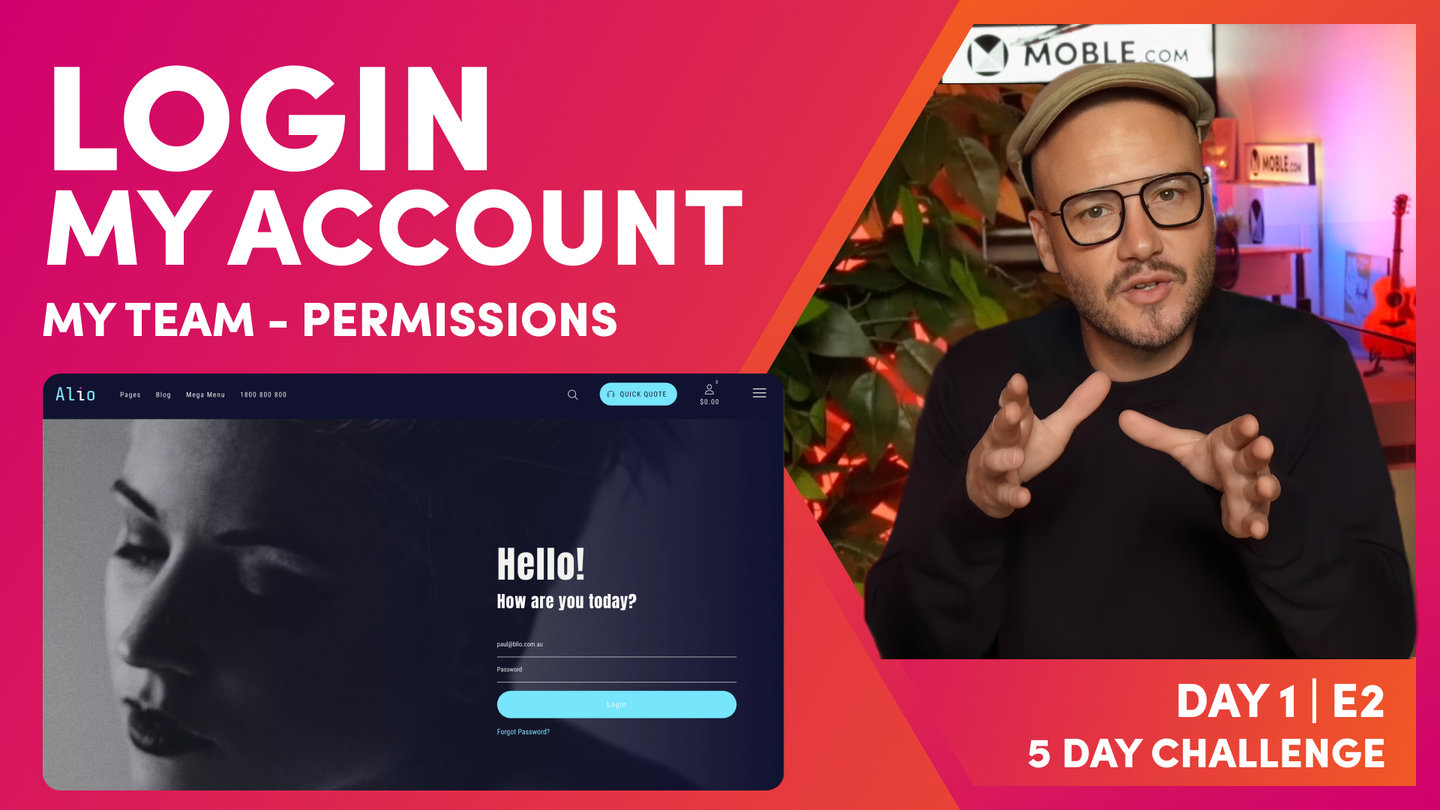
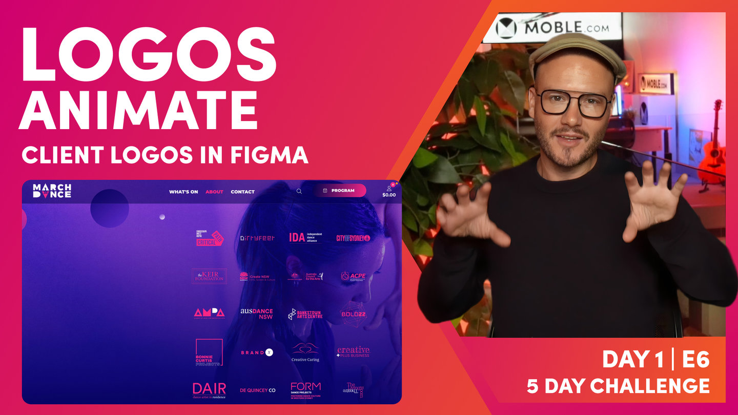
DAY 1 | EPISODE 7
IMAGES

Paul | 25:47 | 60 mins
At this stage of a website build our client normally fall in to one of three camps. You either have images ready to upload, have no images and need some new ones, or have a few images and need to build on your library. At the end of the episode we'll address this. We'll show you where to get new images and how to pick a collection of snaps that all work seamlessly together.

LESSON PLAN

Images Intro
Paul Davenport | 01:44
Preparing and managing your images can be one of the most important aspects of a beautiful website design, though traditionally it could soak up huge amounts of your time. Luckily out bots are here to assist.
"In this episode, we're going to put all of your images into a folder, zip it up and upload it, and our AI Website Bots will go and compress and optimize all of your images in an instant. And that is as simple as this episode is going to be. Our AI Website Bots are going to do all of that compression for you.
What I need you to do is a couple of things: one, we're going to decide if we're going to rename your images before we upload them. That way your content Editors will be able to find your images if they search for them. But we can also decide to tag your images, so we can put them into different folders as we upload them and tag them. And when they upload them, they'll automatically be tagged, and our users can search by a tag as well. Those are two things that we're going to do immediately. And then, what we're going to do is show you how you can replace all of the existing images that came with your Theme. We chose a bank of images in the onboarding. Now those images are all over the website. So we can just go and simply replace those images with our new images, and your Theme will be looking like your brand at the end of this episode. So that's it, let's get on with it. Let's go and update all of your images right across the website."
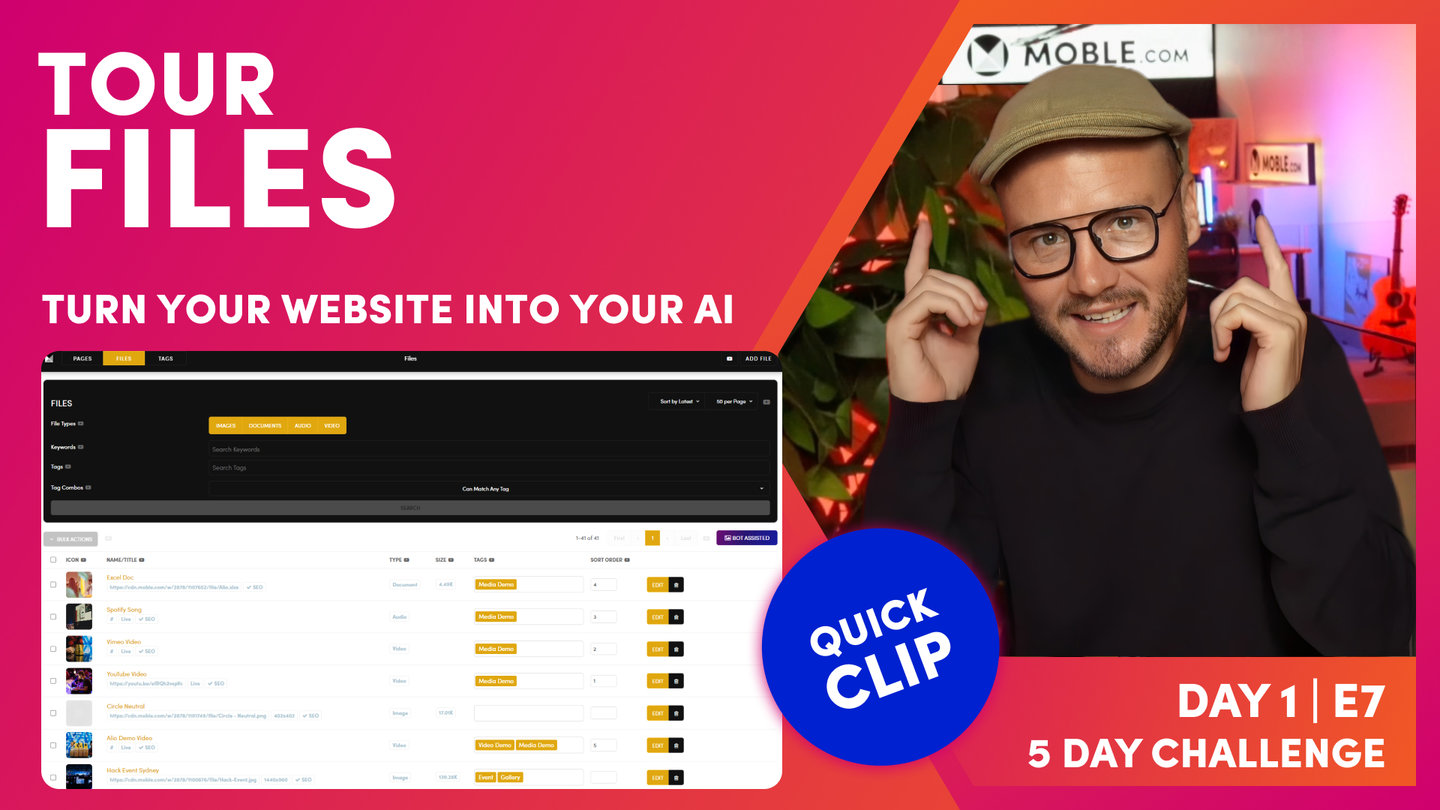
Files Area Tour
Paul Davenport | 06:13
Here we take a quick tour of the Files area in case your need help getting around.
"Here I am in the files area, and as you can see, I can access this via the main menu and files. And you can see the images that we've uploaded in the Logos episode are at the top of our list. And here are the images that came with our Theme in the onboarding. But we've got a whole bunch of other images in here as well, which we might not need. These are the images that came with the Nanshee Theme. If I just click these now, first off, I'm going to decide if I'm going to delete them. Well, all of these other images, these product images that you'll see there, leave them in for now because you might need those for your e-commerce episode. So just leave them in there now and we'll remove those on day four. But I would be quite tempted to clean these up.
The first thing is we can click the tick icon here and we can go to Bulk Actions and hit delete. And then when we delete, it's going to make sure that we do want to delete. So we hit the Delete Items in the top, and then absolutely, yes we do. So now there's going to go and clean up all those images that we don't want.
Next, I'll give you a quick tour of this files list. Okay, so we can actually search for images, files or documents in here. We can search by keyword or by tag and just hit search. And you can put your images into sort order. So often you might want to search via tag. "Show me all the images that are tagged with Melbourne Cup," let's say. Okay, so what we will do now is just look at what we've got going on here. Well, we can click on the icon and that will show us the image. It will pop up. We can actually click on the link and that will show us the image in a new tab, and then we can copy the URL there. We can also copy the URL to a clipboard by pressing the blue link.
Now we can see here the dimensions. This is our fav icon that we just uploaded before. It's 600 by 600 pixels. That's very good reference to see there. But we can see this has got an SEO cross tag. Well, what's that mean? Well, let's go into edit. So this is the settings area for this image, what we also refer to as the meta information. And you can see here it's showing me that this is an image. It could also be a document, a video or audio, but I can actually upload a new image to replace this one here. Now if I tick yes on here, everywhere that this image exists on the entire website, it will replace it. You don't have to have the images of the same name. You can just simply press yes and it'll go and find and replace that image with a new one that you upload.
Really cool feature, and we'll be looking at that later on in this episode. But for now, I just want to drawer your attention to the title and alt text. I'm going to give this a new title because this one doesn't look very nice. If this was going to feed into a photo gallery and you opted to also show the title in that photo gallery, we wouldn't want it to be saying this PNG. So we'll give it a title, and we can also give it an alt text. Now the alt text is for SEO. Well, SEOs often refer to it as alt tag, which you may have heard is actually called alternative text. Now this came from... It was really useful for people who are visually impaired. When they have a reader, this would actually tell them what the image is about. So you can actually be quite descriptive in there. And of course, search engines realise that could help with the description about their image too. So that's why it's important for SEO.
So that's all you need to do at this stage is any images that you want in galleries, you might want to go and change the name. And that's why I'm going to encourage you to change the name before you upload the image as well. Once you've done that, you can press save. I'll just drawer your attention to the other things that are on this page.
Well, these are often to do with the widgets. So let's say this image was going in a photo gallery, or let's say it was a thumbnail for something else, and it was feeding into a widget. In this case, we'll describe it as a photo gallery where this photo gallery, you do want to have a title and a description about the image. Well, you could also give it a date. You could also put it in a sort order of which it appears, maybe the photographer and what we call author. And you could put it into categories. But summary is the one that you might often use if you decide your photo gallery wants a description of the image, this is where you'll put it. Like I say, this information isn't often used for your images, but interestingly, you can have a different icon as well. This can be useful when you upload a video. The video might want a thumbnail, so this would be where we use a file like...
More on this later. But I will just drawer your attention to the destination URL. Sometimes in your image gallery you might want to have a link that goes somewhere else, maybe to an internal page within your website. So you can see here, if you want it to go to a login page in this example, /login or /about-us. Someone's going to click on the image, it's going to go to the About us page. Or if you want to it to go to a new website, you can put in that destination URL here. Always remember you need the https-//, and that will link to a new website, which is a pretty cool feature, but it's an edge case. In fact, all of this is edge case stuff. All I want you to do now is maybe consider changing your title and alt text, which is very good common practice, and then press save. And what you'll see is when we press save, is that now our red cross has turned to a blue tick showing us it's now been optimised for SEO."
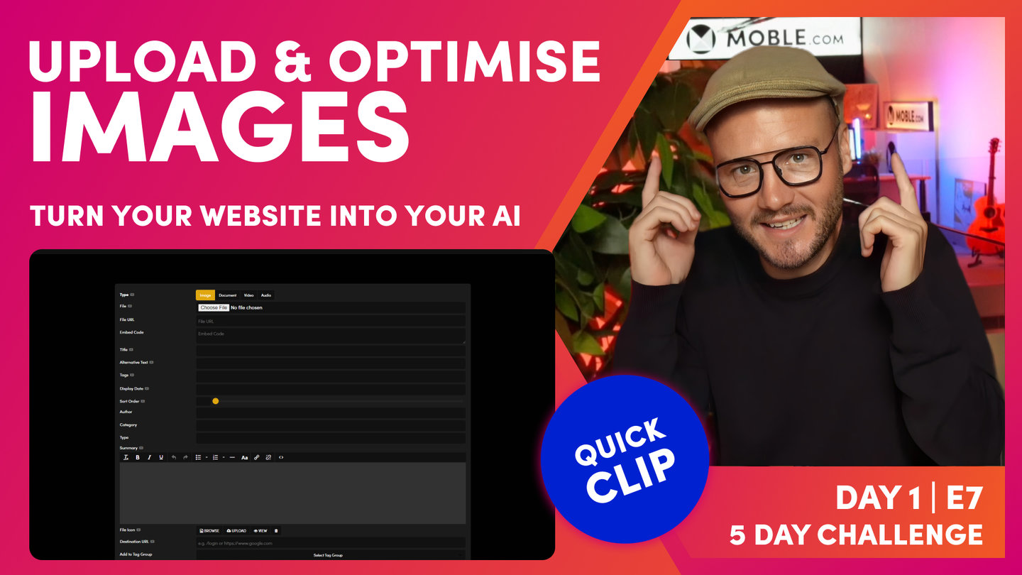
Upload and Optimise Images
Paul Davenport | 08:21
Our bots will assist in compressing you images when you upload them, which goes a long way to pleasing Google and aiding your site speeds.
"Now let's upload all of your images. And here you can see we're on my local computer. And what we're going to do is take some images, we're going to upload them and let our AI Website Bots compress them and optimize them in an instant. And you can see here I've got a whole bunch of images that I've been working on for the Inko Theme. And you can see when I name images for Themes, I always call them image-1, image-2. That's because they're being used in the Theme, and that's part of the standard images that all Themes get. But that's not great naming convention. So what I want you to think about is naming your images so that future users can find them when they're editing in the platform. But that also helps your search engine optimization as well if you've got some descriptive keywords in your image names.
There's two things. One, is changing the names of your images before you upload them. And the other, when we upload them, we'll put them in tags so that people can find them via tags too. You can see here this particular image I've downloaded from a website called Unsplash, which you're going to learn about that at the end of this episode. Well, here you can see it's got the photographer's name, and Unsplash. So it's given that particular credit. Well, on the MOBLE website in each Theme, you can go to the features & FAQ's area and you can see the photo credits, where you can see the names and access all the images for the photographer and get the credits there. So think about giving credits if you are using license free images.
So by giving credits, you don't really have to use the name of the photographer and Unsplash, because that's not going to give you any benefit. In this case, I would go in here and I would change this to... Let's call it image-11 or something like that. But this might be Town-in-sunset or something like that: but no spaces, use hyphens, and then you can capitalize them as you wish. So that's just naming convention, really good practice, and that's best practice. But what we'll do here is just go and look at the size of this image now. So what I'm going to do is click Get info, and you can see that this particular image is over 5 megs. That's a whopping high res image. Well, we don't want to have high res images on a website. Again, from an SEO perspective, you're going to get penalized for that. The search engines don't want huge whopping images on the internet.
So what the MOBLE system is going to do is compress that automatically for you. There's nothing that you need to do. It's going to bring that down below 200 kb and it's not going to lose any quality of the image, which is absolutely fantastic. In the old days, you might have had to go and change each image one by one or use a program like Photoshop or Lightroom, something like that, which is quite expensive. You don't need any extra software, you don't need to pay for any extra software. MOBLE is going to compress those for you when you upload them.
What we're going to do now is upload a zip file. And when you upload images in bulk on MOBLE, we need to call that zip file a very exact name. So what we'll do here, I'll just take these particular images that we are going to upload. I'm just going to highlight these... Or you could literally highlight them all, however you want to do it. You're going to decide which images you're going to upload. I won't upload these. And what I'm going to do now is put all these into a zip file. I'm just going to... On a Mac, you press compress. And so on a PC, you're going to save it as a zip. In here, this is the name and convention. If there's any typos in here, it's not going to work, it's not going to compress them. This is case-sensitive: import_files, all lowercase. So you're going to name your zip file import_files.zip. It's probably the most important thing about this episode because everything else is kind of self-explanatory.
Here we've got our zip folder. Now I'm going to jump back into the Editor, and we're going to upload this and let our AI Website Bots compress it for us. Here I am back in the files area, which as you already know it's via the main menu. And then we go to files. Now in the top right here, we can upload new images. Now we can upload images one by one. You just simply choose an image because we're going to upload an image. Go to your local computer, choose the file, and then give it a title, an alt tag, press save. So we covered that already, but in this case we're going to upload a zip file. I'm going to open up my local computer. So you can see the images here on my local machine. We've got a zip file, which is 58 megabytes, and our image-11, which is over 5,000 pixels wide and 5 megabytes. And all the other images that we've selected are here.
Now I'll choose this zip file. Now with zip files just to know that browsers don't really like your uploading files bigger than a hundred megabytes. So a good tactic when you're uploading files is to put them into different zip files, and then we can tag them when we upload them. And that will automatically tag them, so we really only have to tag once. I'll just show you what I mean by this. I'm going to select this file, and then I'm going to leave out the title and alt text because we're uploading many images. And then on the tag here, I'm just going to tag this one, I'll call it Inko Images just for now. You can change tags later. At this point, I'm going to press save.
Now while that's uploading, allow about a minute for this page to upload. And what that's going to do then is progressively upload and compress all of those images systematically into your files area. You can leave your files area, go and do other things and come back in about five minutes, and you'll see that your images are uploaded. But if you are impatient, you can just hard refresh and just see them all uploading one at a time. That's the top tip there for uploading zip files. Well, let's have a look at our 5 megabyte image-11. You can see here it's been uploaded. Let's click on the thumbnail. It's looking pretty good. No signs of any pixelation there. Quite crisp. And look at this, it's 192 kb. That's a huge compression and optimised for the search engines. But let's put it to the test. Let's go and have a look at this in the Editor. I'll slide over to the Editor, and you can see here one of the images from our Charlie bank of images, which is looking great, really crisp.
But let's go and swap it for one of the ones that we've just uploaded. So we'll go to browse. And here in the search, I can actually search by the tag. We tagged it, I think, Inko images. So what I'll do is just start typing in here: Ink, Inko, and it filters down as we type. Very nice, easy way to search. And I'll look at image-11 here; let's click that. And you can see this image was a huge portrait, but what I've got it here is fixed in the background. We've got this cool effect that as we scroll over. So even that's a really long image, 1440px wide, we can still see that's performing brilliantly for our page. That is the power of compression, and that's the power of using our AI Website Bots to do it for you. We can just take a folder of images, tag them, upload them all in one hit, and have them compressed and optimised in moments."

Replace Images
Paul Davenport | 05:27
Let the bots update your website with your new images and instantly replace the stock images that came with your theme.
"All right, well now let's put those AI Website Bots to the test some more. And what'd be cool is if we got the AI Website Bots to replace all of the images around our current Theme. So let's just go and remind ourselves what images are on the pages. We'll go up to the top, and we'll open up the website with the View Website link. So here you can see is my Theme: work in progress so far. We chose the Nanshee Theme in the onboarding and we chose the images from the Charlie Theme. So you can see that here. Here's the images from Charlie. And what we want to do now is go and replace these. Could you imagine if we had to go into every page and start swapping these images one by one? Well, we don't need to do that. We've got quite a few pages in here.
Let's go to the pages area and let's look where there are a lot of images in the product category. So let's go and choose this one for now. And you can see here, this is actually a slider. So there's quite a few images in here from the Charlie images. And let's scroll down here, and we've got these product images here. So what we'll do now is go back into the files area. I'm going to drawer your attention to the Bot Assisted button over here. So let's go and click the Bot Assisted button. And you can see here, here are all of our demo images. Look at this, these come with the Theme. So that's what I was saying earlier, why we name these in this way. But they're all tagged demo. So what I'm going to do now is get the bot to go and replace these images.
So let's just start on image-1. And notice where we've got Replace File here, it's checked to yes. That's the key thing. As long as you've got that check to yes, it will replace this image everywhere, every instance on your website. And the cool thing is when we do it this way, we don't have to rename the images. So watch this. Here we've got the image that I'm going to use for the Theme, which is going to be my image-1. And you can see this has been downloaded from Unsplash. It's got the photographer's name and says Unsplash. So what I'm going to do here is just click this image, and I'm going to go straight over to press save. Now pressing save is also not just uploading it, it's also compressing it. So you do want to allow a little bit of time, and typically allow about 30 seconds for a 5 meg image. And so you can see our image there. And what we've got here is compress it down to 1440px wide, which is excellent and 177 kb.
So that's fantastic now, but the key question is, has that uploaded everywhere on the website? So what we can do is go back up and view the website, and you can see that's now uploaded. Well, let's go back to our test, which was on the product category page where there was quite a lot of images. And let's have a look at this, this was our slider. And you can see it's also uploaded in the widget as well. Well, that's pretty cool. So what I can do now is jump back into the files area and actually go now and replace all of those images one by one. And so now all of my images have been replaced. That's lovely.
The final thing that we can do now is go back to our Theme, which I'll hit the View Website link. And as I slide here, the slide has been updated, but look, our guy is still there in the widget. Well, a widget is a dynamic feed. Sometimes that might need a little bit of assistance. I've actually been on this page before, so my browser's remembering the previous version that I had seen. If it was a new user who'd never been to this page before, they would see the new version. So at this point, I'll hard refresh again: shift command and R on Chrome. Let's have a look at our slider. It's got all of my new images, and of course in the widget, that's got all of my images too. So we've just made huge steps there. We've uploaded all of our images in bulk. We've actually gone now and used the AI Website Bots to replace all the images on the Theme.
Now we've just had a question, which is, can the replace file feature work on other images? You've uploaded an image in the future, it's across 25 pages, and you want to go and replace that one image everywhere just in one hit. Well, yes, it works just the same way. Here I've just searched Hack, and I can see this hack event image. If I click edit, you can see that the feature is still there, it's just not pre-selected. When the bot goes to do it for you, yes, it's pre-selected. But I could simply now go and tick yes, upload a new image. It doesn't matter what it's called. When you've got replace file, it always keeps the same name. So it will go and replace those 25 images right the way around the website saving a lot of time. This is also a good feature for your content Editors to be aware of in the future."
Stock Images
Paul Davenport | 05:00
Need some help acquiring images? Here we offer some tips to choosing Stock photography.
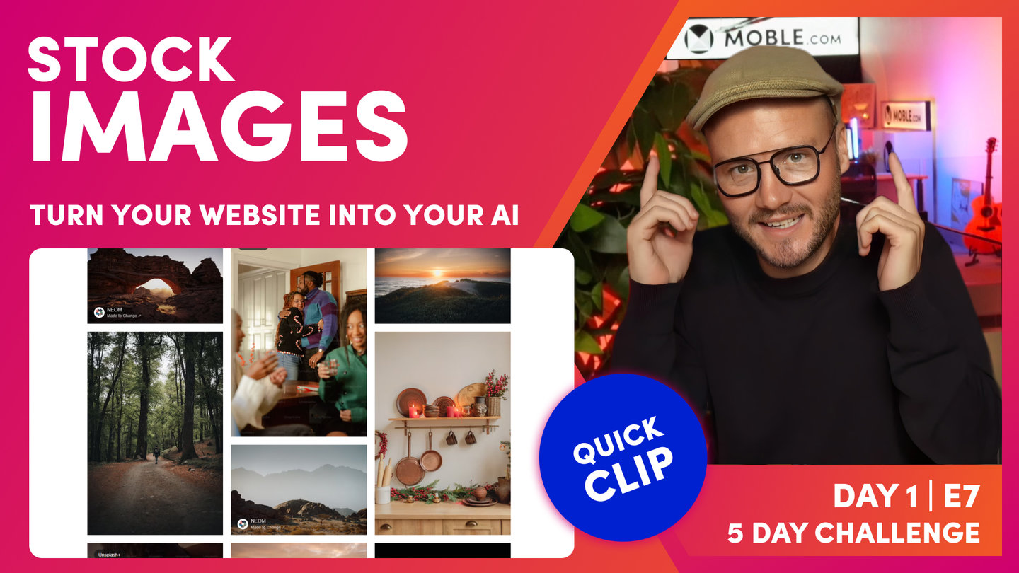
"Now the only thing to address is, what if you need some images? What if you need some inspiration on where to get images? Well, typically you are in one of three camps. Your brand's either got lots of images and you don't need anymore. You've either got some images already, but you need to update them a little bit and add a few more images to your collection. Or you don't have any images at all. Well, historically in web design, we've relied on stock libraries. Those stock libraries could be free or they could be paid libraries. Well, today we're just going to look at Unsplash. It's a bit of a mix. There's some free on there, lots of good free stock on there, which are license free. And then some of those you can buy. But then there's other libraries you've heard of: Getty Images, Adobe Stock and so on and so forth. You can go and buy those images as well.
I'll also show you the MOBLE website and where you can go and look at all of the images that we've used for the Themes, and click a link and then go and download those images as well if you like them. That's a good level of inspiration there to get some good free images if you can't afford to pay for them. And then in the session after this, we're going to look at using AI to generate images. That's a pretty cool technique to learn as we are in 2023 now, and the AI is they're getting a lot better at generating images. I'm going to show you a few prompts on how to create images with AI that are totally license free and original. You can be sure with the AI ones that no one else will be using those. And that's one of the things with stock library is you just have to be conscious that other people could be using your images, but you have got that benefit that you get the license from them.
So look, we're here on Unsplash. There's loads of stock image libraries. Free ones also like Unsplash, like Pexels. But then you'll get the paid ones like Adobe Stock, Getty Images, iStock. So you don't have to just use Unsplash, jump onto Google and you'll be able to search for many stock libraries. The first thing I'll do here is search. Well, we've got an events website on Alio, so I'll just type events. It's always good to look for people as well, so we'll put in events and people. And then these are the images that is filtered in this search. Now if you recall, the Alio website that we're building out is blue. It's got a bit of sky blue, dark blues, and then the poppy pink. So that's what I'm looking for immediately in the images here. Are there any images that are blue with hints of pinks or reds?
Well, you can see here this first image that we'll look at. You can see here in the image, in the lady's dress, there's sort of pinks and reds. There's also a bit of blue in the chair and on the screen. So that would be a good image to use. I could put that into my collections, my wishlist essentially by hitting the heart. But then in the bottom right, I could also hit the download button, and that's going to download it to my computer. And it also says that you can say thanks to the photographer here as well. You'll notice throughout this video, every time we've used stock images, we've tried to show where that image has come from, like who took the photo, to give that person credits. But we also do that on the MOBLE website as well.
And this is where you can access all of our Themes, but you can also drill deeper into the Themes to see the collections that we've used. So if you like some of these images, you can use them yourself. And then here, you can see our photography credits. Click in the link, you go back to Unsplash, and this is where you can see the entire collection for the Alio Theme where you can now download the images. And remember that when I downloaded these images, they were about 5 meg and 5,000 pixels wide, where you're going to get that high res one. And then of course, as you upload it, our AI Website Bots will compress it for you. Okay, so where is this page on the MOBLE website? Well, look, if you just click the Built By You button in the top and click Themes, that's when you can see all of the Themes, and you can browse through these and get a feel for what those image collections are.
Okay, so that's a wrap for this episode, and we'll be onto the next episode where we start to look at using AIs to generate images for us."
TEXTBOOK
A user guide to Website Images
UPLOADING IMAGES
There are 3 main ways to upload images on your MOBLE website. Let's have a look at each.
1. IN THE FILES AREA
- Go to the Files Area
- In the top right '+ Add File'
- Upload an Image from your computer
- Assign the 'Type' to 'Image'
- Ensure you apply your Image Properties
- 'Title' this will display in the Widget if you choose to display 'Title'
- 'Summary' will display this in certain Widgets, if you elect to display Summary in the Widget Component
- 'Alternative Text' is important for SEO as it lets Search Engines know about the Image. Though also, Screen Readers for the Visually Impaired will read the Alternative Text.
- 'Tag' your Image, if you would like to group it or assign it to your Widgets.
- 'Sub Heading', 'Display Date', and 'Sort Order' are again important for your Widget preferences.

To Upload an Image Choose a File from your computer at set the image properties such as Tag and Alternative Text.
2. UPLOAD IMAGES IN BULK
- On your computer place all of the images that you would like to upload into a folder.
- Compress the folder as a .zip file:
- PC: Press and hold (or right-click) the file or folder, select (or point to) Send to, and then select Compressed (zipped) folder. A new zipped folder is created in the same location.
- Mac: Right mouse click and select "Compress Folder Name". A new zipped folder is created in the same location.
- Rename the zipped folder to: import_files.zip.
- Go to the MOBLE 'Files'
- In the top right hand corner click '+ Add File'.
- Choose the zip file named import_files.zip.
- Assign the file 'Type' to 'Image'.
- Tag the Images. All images will be tagged at once.
E.g. If the images are a Photoshoot, Tag the images once and all images will automatically be tagged and assigned your Photo Gallery Widgets, without you having to even go to the page! - Click 'Save' in the top right, and your images will now start to upload.
- Depending on the size of your file, uploading images in bulk might take some time. Wait until the file has finished uploading. Do not close your browser.
- Once uploaded, your images will now appear in the 'Files' area. Refresh your Browser if you don't see all the images. Again it might take a minute or so to upload them all.
- You may now edit images individually, should you wish to.

Upload Images in bulk by compressing your files into a zip file called import_file.zip.
3. UPLOAD IMAGES IN THE VISUAL PAGE EDITOR
First, in the Visual Page Editor:
- Add an Image Component to a Frame via the '+' icon in the Frame Tools
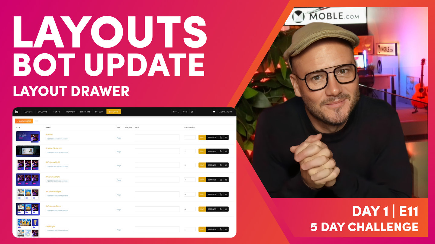
- Note, you can also drag in an Image Component from the 'Build' tab in the 'Layouts' drawer. Though, we find the '+' in the Frame tools is much more efficient than drag and drop, every second counts!

Second, when the Image Component pops up:
- Upload a new Image from your computer.
- The Image and Image Properties such as Title, Alternative Text and Tags will be automatically added to the Files area, and therefore used as the Default Properties for the image.
- Browse an existing image from the Files area. Now you can override the Image Properties such as Alternative Text, so that it is customised for this single instance of the image, even though it is the same Image. A great solution for saving space, site speed, and SEO. You keep one image but optimise specifically in different instances.
Did you know?
- In addition to adding an Image Component, you can also and an Image to the Background of any Frame. Learn more about Background Images here.

Uploading a new Image from the Visual Page Editor will save it to the Files area so that it can be used again later.

Once you've uploaded a File, you can override the Properties in the Image Component.
WHAT IS THE FILE URL AND WHAT IS A CDN?
When you upload an image or file, it is uploaded into the cloud and is given its own URL. You can paste the URL into a browser just like any other web page.
Your MOBLE website has a Content Delivery Network to store images on Amazon Web Services (AWS).
A Content Delivery Network (CDN) is a distributed network of servers and your images are mirrored across these servers. The advantage with your images across so many server locations is that they can be distributed to your users in the quickest possible time, no matter what country your users are located in. This is particularly important for images since they are larger files, shaving precious time off your page load speeds.

An image URL on your MOBLE CDN.
IMAGE COMPRESSION
If you take a photo on your camera or purchase a new image, chances are that the image is far too large for the web. This is because images might be used for other reasons such as print or video that require many more pixels than computer screens.
Smaller images that are compressed, are smaller more and compact and therefore will load quicker and increase your page load speed. Faster page load speeds are pleasing for your customers, and customers will not stick around waiting for slow pages to load, meaning you could be losing business. Such is the importance that we save space on the internet and improve user experience. Google will penalise slow pages, so it is absolutely critical that you optimise your images as best you can.
Thankfully, your MOBLE website attempts to do a lot of the hard work for you. The inbuilt compression engine is the first line of defence to ensuring your images are optimised as soon as you upload them. Let's look at how this works.
AUTOMATIC IMAGE COMPRESSION
When you upload an image to MOBLE that is larger than 1440px your MOBLE website will automatically compress it for you down to 1440px. The end result is a file size that has been optimised for you.
Even if you upload images in bulk, as we learned in the last Episode, all your images will automatically be compressed for you, saving hours of preparing images in offline tools.
There are, however, some things to consider:
- If you are conducting SEO or further optimising your page load speed, you can go through image by image to manually optimise even further. Nothing can beat optimising each image individually, though this can be a painstaking exercise, which comes with a labour cost. MOBLE's compression engine is an excellent first line of defence to get you started and quickly, saving you money and huge amounts of time.
- The compression engine is meant for photographs as jpgs, not for photographs as pngs. A jpg is the correct file format for an image. A png should be used for graphic files or images with a transparent background.
- MOBLE will still attempt to compress PNGs automatically, though Google will penalise you for this.
OPTIMUM IMAGE SIZE
The objective of sizing images is to have the crispest, most beautiful looking image at the smallest possible file size.
If you have an image from your graphic designer, camera, or stock library chances are it has not been optimised. Its properties might look something like this:
- jpg, png, tiff
- 5324x3549px (aspect ratio 4:3)
- 300dpi
- 5000kb
For the web, it is important to optimise the image more like this:
- jpg
- 1440x810px (aspect ratio 16:9) or 1440x960 (4:3)
- 72dpi
- 150kb
Notice that the size of the image is reduced from 5000kb to 150kb. This is much more the size that is acceptable for the web and for search engines, for an image that is 1440 px wide.
SIZE IMAGES TO 1440x810px or 1440x960px
When sizing your own images in bulk, or if you are ever asked how you would like an image prepared, perhaps by a photographer or brand designer, then we would recommend sizing your images as follows:
- jpg
- 1440x810px (aspect ratio 16:9) or 1440x960 (4:3)
- 72dpi
- ~100-200kb
As a rule of thumb, a width of 1440px works perfectly for Background Images and Widgets on all devices. A 1440px image displayed as a full width image on 1920px Desktop, will only loose slight quality, therefore you can consider this rule of thumb as a pragmatic balancing act between page load speed, devices, and quality.

Here we see a Background Image that is 1440x810px.
Screens are most often 16:9, and therefore this nicely covers the entire screen.
SIZE SQUARE IMAGES TO 1000x1000px
For square images, size images to 1000x1000px. This is tactically a great idea as your square images will have the same height as your main image. This can become useful in the occasional instances where widgets will display the 'Original' height.
- jpg
- 1000x1000px (aspect ratio 1:1)
- 72dpi
- ~80kb
IMAGE SIZE FOR WIDGET FEEDS
Your Widgets will display the File Icon or Page Icon in the feed. This is a thumbnail that appears before you click to open the image or go through to a page.
Your Widgets can have an Aspects Ratio of 1:1 (Square), 4:3, 16:9 or Original. When you upload an image MOBLE will automatically prepare the variant for your widgets, so there is no need for you to do anything.
As a rule of thumb, you can be confident always using 16:9 images, unless you require a specific size in the page editor. In the images below we see an example of where a square image is better than a 16:9 image.
A fun tip is that you can turn square images into a circle. To do this, in the image component apply a Class for 'circle'. You can also apply a class for 'shadow' to lift the image off the page.

Square Image
Circle + Shadow Image

Image Component showing how to add a 'circle' and 'shadow' class to a square image.
JPGs versus PNGs
A common question is when to use a jpg or a png on your website.
- JPEGs are for photographs. They are a 'lossy' compressed file format, making them smaller in size
- PNGs are for graphics and drawings. They are a 'lossless' compression file format, meaning that photographs in this format will be much larger.
When to use a PNG?
You should use PNGs when you have photographs or graphics that have transparent backgrounds. Therefore, you will be able to see the backgrounds behind them when placed on to your web page. If you have a fixed colour background, then you can consider making the image with the same colour background and saving it as a JPG. This will reduce the size and improve page load speed.
JPG or JPEG?
There really is no technical difference and the file extensions are interchangeable. Way back when Microsoft limited their file extensions to three letters, they shortened JPEG to JPG. Mac isn't limited to 3 characters and can still use JPEG.
FILE SIZE HEALTH CHECK
It's often best practice to frequently run a health check on your website and one of the most important things that you can do, is an Image Size Health Check.
- Go to the 'Files' area.
- Notice the 'Sort File' drop down towards the top right of the page.
- Select 'File Size Largest'.
- Select 'Image' and click search.
- Now your images will be listed by File Size from largest to smallest.
- If you were to optimise your images you could start from the top and work downwards.
- Quick improvements would be to replace any PNGs with JPGs

The Files area displaying Images sorted by File Size Largest
STOCK IMAGE LIBRARIES
Quality images are so important to high-quality website design. It is often the creativity and relevance of the images that develop the crossover between brand, custom engagement, and conversations. In this tutorial, we look at some of the best free resources to get high-quality photography.
Other popular paid stock image and videos are:

UNSPLASH
Unsplash is more diverse than Pexels for a broader range of images, especially more corporate, business shots. Photos are also under a Creative Commons Zero (CC0) license.
Find out more details on their license here: https://unsplash.com

PEXELS
Pexels have photos under a Creative Commons Zero (CC0) license. The images are often suited for more creative, art style, projects.
Find out more details on their license here:
https://www.pexels.com

NEGATIVE SPACE
Negative Space is another website offering beautiful high-resolution stock photos. Also with Art and Business categories, and is perhaps less known than Unsplash meaning you can find some gems.
Find out more details on their license here:
https://negativespace.co/

DEATH TO STOCK PHOTO
Death to Stock Photo is not free, however, this means you're less likely to see your images on other peoples websites. 2500 images to choose from and new ones emailed to you every month.
Find out more details on their license here:
https://deathtothestockphoto.com/
WHAT'S NEXT?
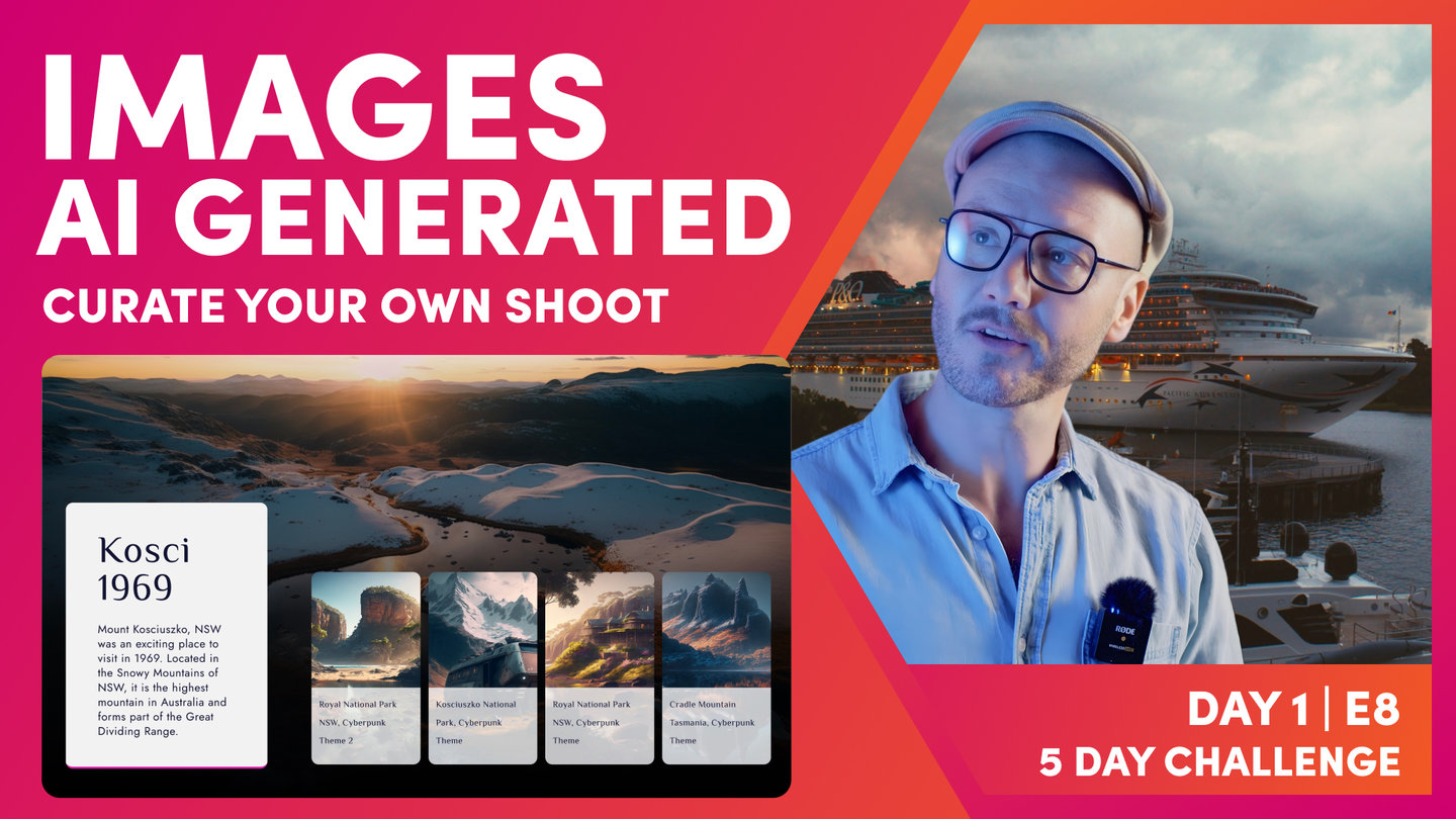
Now that your images are uploaded and optimised, ready for your content team to use, we'll next explore the future of license free photography. Yes, you guessed it, we'll look at using AI to generate images for you, but not just using the AI tools you might be already familiar with. In this Episode you'll learn a structured process to curate an AI photography shoot, that ensures all your images work together in the same style, right across your website.
DAY 1: EPISODES
Play before you Pay?
GETTING AROUND
SUPPORT
AI SALES LINE
AI SUPPORT LINE
ENQUIRIES
team@moble.com.au
GET A QUOTE
A Web Builder for Design. A CMS for Business. We serve all businesses from SME's to Enterprise. Talk with us for AI development, custom website design, website development, ecommerce websites, directories, intranets and social networks.
PRIVACY | WEBSITE TERMS | PLATFORM TERMS | © 2026 MOBLE PTY LTD