
PICK YOUR AI THEME TO GET STARTED

DAY 3 | EPISODE 2 | INTERMEDIATE
BUILD LAYOUTS FROM SCRATCH

Paul | 1:19:24 | 4 hours
The episode is packed with knowledge and runs for over 80 minutes. But stay with it, in the time it takes to watch a footy match, or the time it takes to listen to a Joe Rogan podcast on 1.5x speed, you will have become a website designer! Which a far better shout than spending a year at Uni to learn just the same! After this episode you'll be able to look at any website layout in the world a recreate it in moments and you'll be truly confident to call yourself a website designer.
LESSON PLAN
PART ONE
Intermediate Intro
Paul Davenport | 01:16
In this Episode we will build Layouts from the Alio theme, while explaining the features of MOBLE's Visual Editor so that you have the skills to build any design Layout from scratch.
"Well, intermediate, let's do this. In here, you can see I'm in the MOBLE Editor on a blank canvas, and you can see that MOBLE is a website design builder for design and a CMS for business. Meaning, designers can go and design anything without code and business users can go and edit everything without messing it up.
In this episode, we're going to build out 10 layouts from scratch and show you every single feature of the MOBLE Editor at the same time. I'm going to race through, but feel free to scrub ahead using either the timestamps or there'll be help information that rolls up across the bottom of the screen to help you along the way. And Zola is in position, as you can see, for those that have requested to see her again. Let's now just jump ahead and look at the layouts of what we're going to be building."
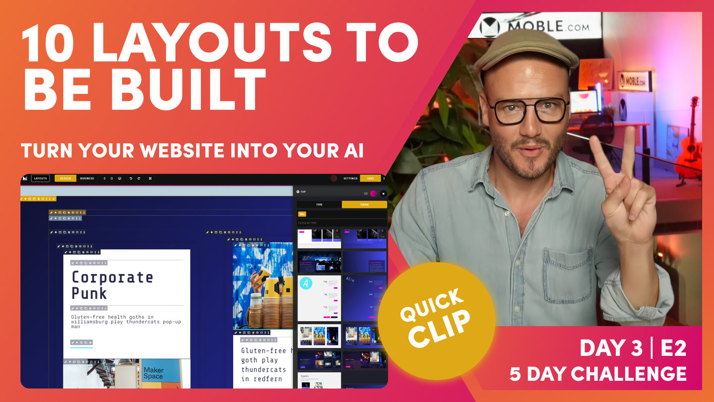
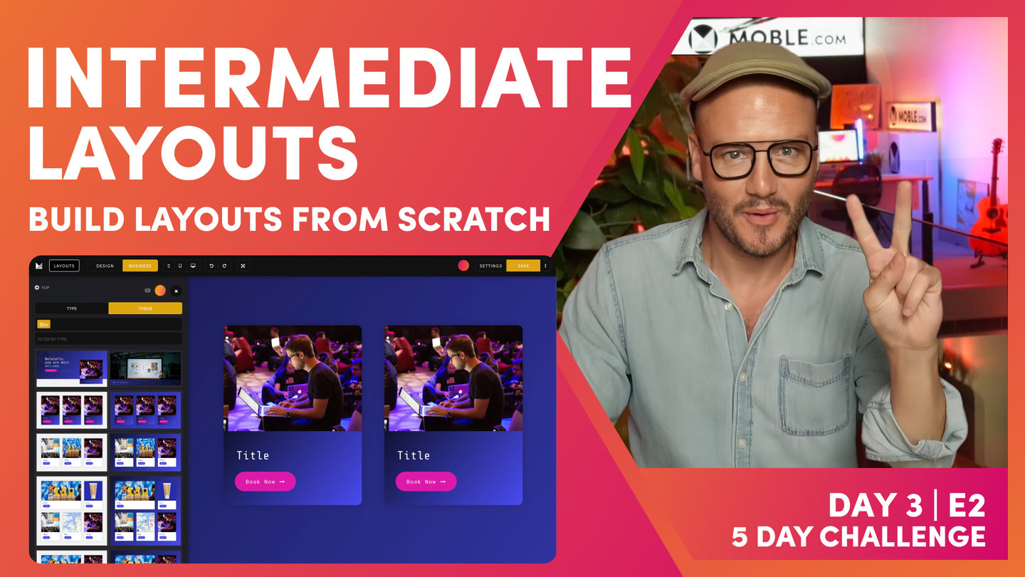
Preview of the 10 Layouts to be built
Paul Davenport | 05:12
Here we take a look at the Layouts we're building in this episode and describe some of the effects and animations you're about to learn.
"Watch this now. We'll just jump over to the Alio theme. This is what we're going to be recreating. You can see here our initial banner. It's got lots of effects and animations in there. And that's because I've designed Alio specifically for the five-day challenge and specifically for this class, so we can show off all the features of the editor so that you'll be able to use them for your designs and literally replicate anything and also be confident to build from scratch.
Okay, so here is the Alio theme, and you can see there's a couple of things going on here already. We've got move right on scroll, we've got a bit of a slider. Well, this particular banner with the shift down effect, that's going to be in the advanced class following this one. But here, you can see quite a signature of the Alio design where we've got our neutral, which we know in the background, plus we've got this white card on top with the shadow.
We'll look more into this. We've got a rotating effect. Notice how these on the right reveal on scroll. Let's have a look at that again. It reveals on scroll. And we've also got these cool extend lines. All of this is super easy for you to do. You're going to see me build this. Again, this one is going to be on the sessions later today after we've done the masterclass. Obviously, widgets you get. This is our hidden font 12, as you will know if you've done the fonts class. And here is where we've got this parallax motion. So, we're going to be looking at that at the end of this class.
Let me just jump over into another tab that I've prepared. This is exactly what we're going to be learning right now. You're going to see how I build out this column structure. And in here, we're going to put a background image, a background video, and also a slider. Notice how they're all the same heights. We're going to be looking at that. Then, we're going to capitalize on the work that we've done and turn our light theme into a dark theme. Your content editor are going to love you because we're going to be building out these layouts as we go, so that all they have to do is click to drop them onto a page.
Then, we're going to turn that layout into this two-thirds, one-third where we've alerted alluded to that before. You can see this makes a nice news and grid layout, but you'll see here we are also going to drop in a shop this time, and we'll also drop in a map. Again, that all nicely aligned at the same pixel height. Then, we'll convert that one into a dark theme. And then, we'll go through, and we'll turn this into a grid. We'll have a video two-thirds, shot one-third, and then we'll have an image or we might even put the slider in there. We'll see how it goes.
And then, we'll have our map as the two-third. And again, we'll capitalise on the work we've done turning that into a dark theme, building out these layouts as we go. Then, we're going to finish the session showing you how this parallax works, but showing you how we build these particular cards. So, there's a few cool things going in there. Again, we'll capitalise it on the work we've done and save that to a dark theme. And then, I'm going to show you how we inverse the layouts. We can again, very quickly, build on the work that we've done, so our content team have got lots of these layouts, and they're all just going to work. Okay, so let me just jump back over into our editor.
As you know, MOBLE is a website builder for design and a CMS for business all in one, all in the same editor, so that designers can go and build anything, and content editors could go and edit everything. And it all happens in these two tabs, design mode and business mode. Well, now, I'm going to start off in design mode because we are going to build from scratch. So, you presented with what we call our frame tools. That is at the top left, and you can see in the frame tools, I can do a whole bunch of things.
Well, first, it opens the frames drawer. And in the frames drawer, I've got a whole bunch of UI tools here. I can control all the background Colours, background images. I can control those effects and animations like we've just looked at there with parallax, I can specifically look at the frames, which is what we've alluded to in the essentials class that preceded this.
And we're going to have a look at advance. We're going to have a look at some of the advanced settings, which is how frames might behave on mobile devices. Do you want to show it on mobile, show it on desktop? And then, we're going to have a look at the borders, shadows, and a bit more behavior on how we can do things like widgets. Do we want slider dots or do we want arrows? What speed do we want the sliders to play at? Okay, so there that covers a quick introduction."
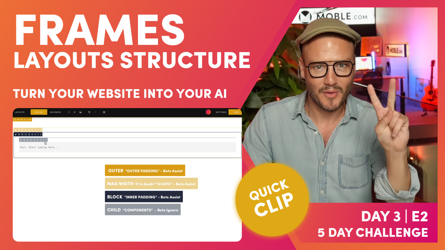
Frames - Layouts Structure
Paul Davenport | 06:28
As an Agency, MOBLE designed a methodology of how to structure Frames, that are not just convenient for initial designers, but also keep our clients on track so they never stray off brand. As a platform, MOBLE bots have been created to serve this methodology, and if you stick to what you learn in this episode, our bots will be able to make rapid future changes changes and redesigns for you.
"When you build out a layout, you need to have at least three frames so that our AI Website Bots can work with you. We have our outer frame and then within that, we have our max width frame. Let's just... adding a child here. You can see, I can drop all these embedable components onto the page. In this case, I can also drop new frames. So, I'm going to drop a child frame that drops it inside this one. That's as opposed to a parent frame, which drops it to the outside. It starts a new frame. I can just minus this, I can just... Sorry, I can just delete this at any time when I want to. I'm just going to click delete there and keep nice and clean.
So, we're going to frame for our out padding. We're going to turn this one into our max width. And inside this, we're going to have another child for our inner padding. Let's go and set this up now. On the pencil icon, I'm going to come to frame because we're going to set up our frame, and I'm going to apply padding to the outside, so I can put 64 and 64 or I can close them all here, hold the alt on a PC or option key on a Mac, and click one side, and it will put the padding around all sides for me. Okay, shortcut. That's option on a Mac, alt on a PC, all sides of a frame.
Now, on the next frame in here, I'm going to apply our Mac width. As we learn in the essentials, ever in doubt, desktop 1440. Our desktop users, it will be a max of 1440 on a desktop. So, if their screen is 1920 pixels wide, it'll be a max width of 1440. Okay, so now we have our inner padding, which our inner padding is what we call a block, so we Colour our block in. This is only a CMS backend setting that we see and our future users see. What we want them to know is when the Colour is bold, that's padding. Our bold mustard is for our outer padding, and our bold blue is for our inner padding. Keeps it nice and easy.
Inside the inner padding, we have our child frame where we put our component. You can see here, we have a light mustard, which is the max width, and then we have a light blue, which is for the component. Well, I'll just put in our padding here. I'm just going to put 32. I'm going to hold option on my Mac here, alt on a PC, to apply this padding to all four sides at once. That's a shortcut there. Hold option or alt, and it applies for all four sides at once.
This is lovely. Now, this is a classic setup we have. We have a outer padding, inner padding, our max width, and then a light blue frame for our component. Let's put a component in here. Here, we use the plus icon to drop in a component. I can add all types of component, text, images, buttons, widgets, even forms, menus. All of these things you will have seen in initial episodes here, I'll just drop in a text.
What I'll do now, just explain why we use a frame for our child components. What we often see is people dropping in like a text, and then a button, and not putting them in a frame. This is not good practice. It might be good for that immediate requirement, but what we are always thinking about, and this is the lesson and the narrative for this intermediate class, is we're always thinking about our future content editors in the future. We're not designing for ourselves right now. We're designing for everyone in the future so that they never mess it up.
Let me explain. Here, I'll put in another child frame. If I can click the child here, it drops it at the top. I'll remove this frame by hitting the minus, okay, because now I'm going to show you another shortcut, which is, again, if I hold the alt on a PC, option on a Mac, it's going to drop at the bottom. So, I'm going to hold alt or option and hit the frame, and it drops it at the bottom. Nice. Now, I'll just put in a button component here so that you can see that. This is the beauty now. I can move this up and down, which is such an easy way for our content editors in the future to move things up and down. We want them to have some controls like this.
And now, they could put in padding, which is another function that we're about to look at. Here, they can apply that also within the frame. This is what we call divs in front-end development. MOBLE, we call them frames. This is because we can apply properties inside that div inside that frame. So, we're looking pretty good here. What I'm going to do is just delete these components. Another great reason why we put things in frames, nice and easy to delete. And we're going to add a column, so I don't need this inner padding right now, so I'm also going to use the delete function here to delete that. And now that's gone."
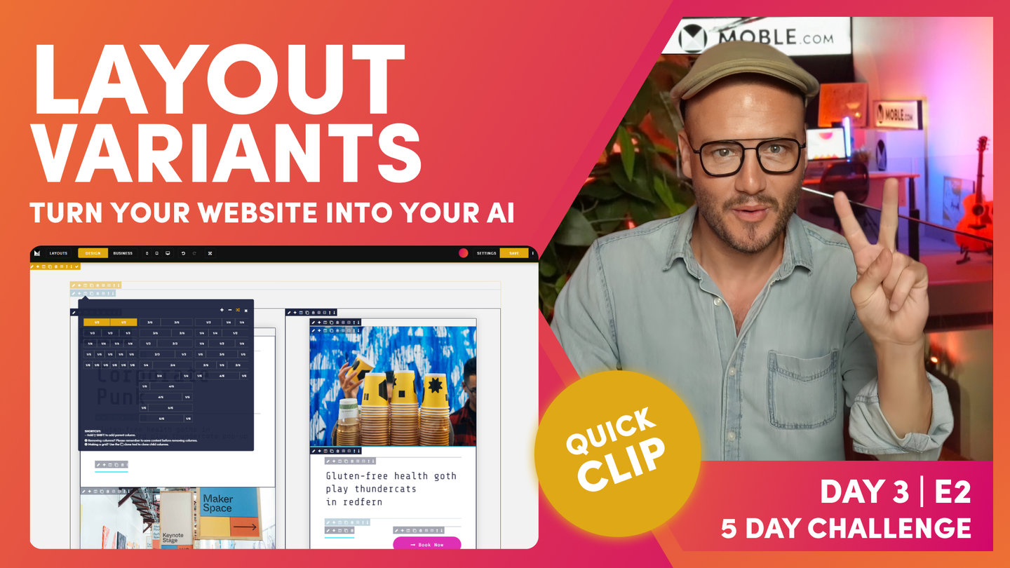
And now, I'm going to show you the third icon along, which is columns. In this case, I'll start with the two-column layout. You can see here, these are all evens and these are actually two columns by fractions, and these are three columns by fractions. Okay? We're just going to start with a straight two. And you can see here, it's automatically added our inner blocks. We've got two columns, and it's automatically put the inner padding into this block, and then it's got a child component ready for us to go. Well, that's pretty nice.
Now, in here, I could go and actually add my components in as I would like. Okay, pretty basic stuff there, but watch what happens in here. I can go back to my column, and I can now just turn this to any of these. In this case, we're going to build out a three-column, aren't we? So, I'm just going to select three column, and it changes it for us.
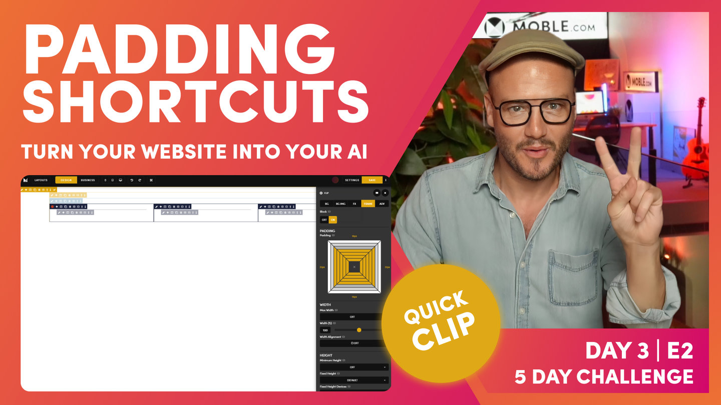
Shortcuts - Padding
Paul Davenport | 02:09
Shortcut are are not essential, but they are more than convenient. Learn how some of the common Shortcuts that MOBLE designers use to make light work of building Layouts.
SHORTCUTS
Hold 'Alt ⌥' = all sides
Hold 'Ctrl ⌘' = one side all columns
Hold 'Alt ⌥' + 'Ctrl ⌘' = all sides all columns
"Now, shortcuts. We've already looked at this shortcut, which is when you click the pencil icon and open the frames tab, you can see that I can apply padding around here. Just by holding the option key, it's going to add it to all sides. When I say option, I also mean alt on our PC. So, watch this. Holding that option or alt key, it's applying the padding to all sides. Again, I'll apply just a small amount of padding, a bit more, a bit more, all sides. Okay?
Well, if I hold the command key or the control key, and I'm only going to add it to one side. It adds to one side but look, it adds to one side of all the child, all the columns. I'm going to add some on the bottom here, just holding command control, and it's one side but of all the child. It's pretty cool. Now, quite logically, if I hold the option and command key at the same time, it's going to be all columns, all sides. So, why don't we make this all 64 or all 32?
And if I now just want to... I don't want these as high to begin with, so I'll make... I want 32 on this side and 16 on the top and the bottom. Okay. In this case, now I've got 32 on all. I'll just hold the command key and make the top and the bottom 16. Okay? So, that's our shortcuts. You'll use those a lot, particularly if you're working with columns."

Embed Text - Components
Paul Davenport | 01:20
We highly recommend adding components to the inner most Frame allowing your to control properties for the component, including moving them up and down. Here we add a Text Component and look at so general principals for choosing text formats.
"The next one, I'll add a child for some text. I'll put the text in. In this case, I'm going to give this... It's just going to be called Title for now. And going back into our formats for our fonts, as you've already learned, I can now give this a heading. Well, I'm taking a gamble here. I'm going to give this a heading three, because this isn't the banner at the top of the page where we only want one heading one on a page, maybe two heading two. Well, this is a three column, I'm guessing this might be even lower down the page.
I'm going to try and guess what my content users want here. This is going to be heading three, but I also am going to give it a particular style. That might be too big because I'm guessing what titles people are going to add in the future, so I'm just going to go with heading three style three for now. And now, I can actually move this one down using the down arrow. Now, we've learned that we can use the up and down arrows to move child components."
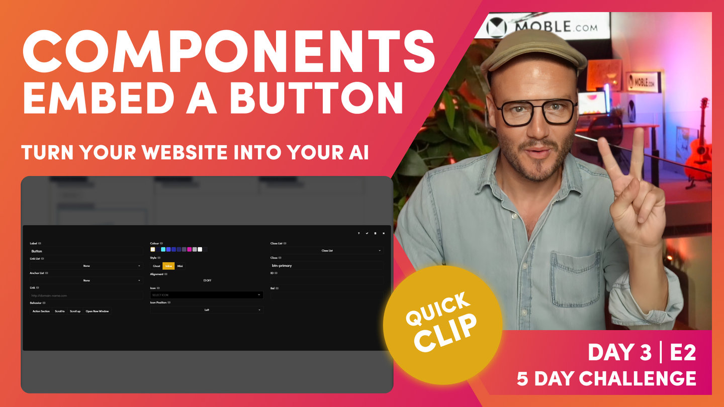
Embed a Button - Components
Paul Davenport | 03:16
Add Buttons to a Frame. Choose to; link your Buttons to other pages, anchor to other Frames on your page, slide down your Action Section, or open up external websites in a new window. Add height above and below your Buttons to improve your visual design.
"In this case, I want to add a button underneath here. In here, I could have another child frame and just click it, and it'll go to the top. As you know now, I'm going to hold the option or alt key, and I'm going to drop that frame straight to the bottom. I'm going to come in here and add my button. Now with the button, let's give it a Colour. To begin with, I might just give it a title. I'm just going to say this, Click Me for now, and let's just make it in our space cadet blue.
Now in here, I can link it to existing pages. This is our link list of existing pages we've already created. Or I could anchor this to another place on the page, to another frame on the page, where you can see, there's no frames with anchors in on this page. Let's just click tick here for now, and I'll clone this particular layout. And then, I'm going to call this one... I'm going to give this an ID so that we know what to anchor it to.
I'm going to go to advanced, and I can just call this 123. I could call it anything, right? If I go back to our button now, you can see that we have a nice anchor. When someone clicks this button, they're going to roll down to that next frame, and you can see an anchor. What it does is put a hash, and what we really want to do is then click scroll to.
Okay, so it's going to scroll to this hash. You can see it's adding classes. We're going to talk about what classes are in a little bit, but when I set up a layout for the first time, I need to take a gamble that the content users might forget to add the link. They might come in here and forget to add the link, and they might not know what an angle link is.
So, when I set up a new layout, I like to set it to the action section. Basically, when someone clicks this button, it'll roll down our action section from the header. That way, if a content user forgets, it's always going to work. Right? So, we're just future-proofing mistakes there. Setting up a new layout, put it in action section, top advice. Then, we've got our icon. Well, this, I'm using an arrow, so I'm going to put the right arrow. And normally, it's best practice... Oh, often common to have your icons to the right.
Let's go and see this here. My icon is on the right, but with the Alio theme, it is a bit quirky that we have our icons on the left. And you know what, I'm going to be using this blue for now. So there, we have a setup. Now, this second frame that I use to show the anchor, the second layouts that I use for the anchor, I'm just going to delete that."
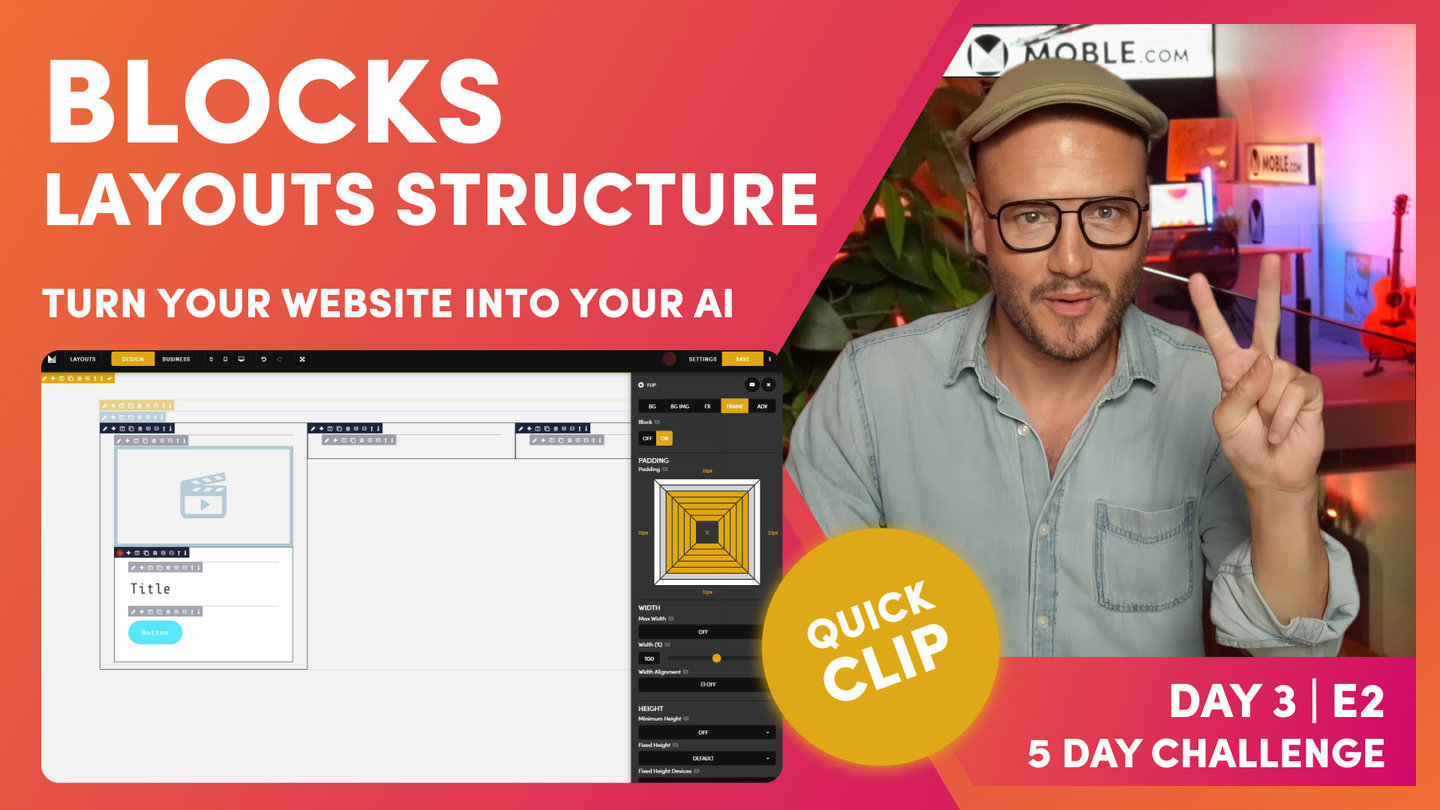
Blocks - Layouts Structure
Paul Davenport | 03:39
Create Blocks as 'Cards' that live inside your inner padding. Here we explain exactly what to do if you require padding on Cards, meaning a third Block of padding required, which always sits on the inside of the Inner Padding.
"What I would like to do here is give this frame, the outer frame, a background Colour. This, it would be our neutral Colour, and this would be our white. We'll remember from the introduction there, we've got a neutral in the back, and we've got a white card that sits within it, so that shows that white card that's going to pop off the page. So, the outer frame is going to be in our neutral. Cool stuff.
Now, we've got a pretty common-looking setup that is, in terms of a masterclass, if I'm getting my eye in here, as we looked at in the essentials, I've got my outer in the bold that's got the padding in our outer padding. And then, our inner padding is also in the bold, so the two bold where we've put our padding, and then we have our column which is in the sky blue, and then we have our max width, which is also in this faint mustard, and our components in the faint.
If we put into business mode now, when we hover over, we can actually see that when we hover over particular components, then the child lights up in the faint Colour and the parent, where the padding is in bold. So, that's design mode and business mode. Brilliant. Our job, as designers, is we are designing so that our content users can make changes and also future content editors, when they come in the future long after we've gone, will always down track and never mess it up. So, that's what we're trying to achieve here.
Now, let's go and build on this here because we've got our outer and inner padding, but we also have a card and that's got padding in it as well. Let's go and put this white card in. Here, I'm now going to use this plus to wrap a new frame around this one. So, I'm going to wrap this one, and this is where we're going to put our white card. I'm going to click the pencil icon here. I'm not going to put it in neutral. I'm going to go across here and put it in white, so you can see this frame as lit up in white.
And what I'm going to do on the frame, to help our users, this is going to have padding in, so I'm going to put this in bold as well. I'm going to hold the option or alt key here and just put in 32 padding across. Now, this frame now with the button is actually outside of this one. We want to put it in there, so what I'm going to do is light up. We're going to move this now. We're not going to cut it. We are literally just going to pick it up and move it to a new location.
But if I hold what I want to move, if I highlight what I want to move in our active state with the red dot, okay, so just click the pencil icon, and then I'm going to move it here to the plus. Again, I'm going to hold the shift key, and it's moved it. And now, I can move the up and down arrows to put it into position. Okay? So, look at that. We now have a card. Back into business mode, we're looking quite good there."
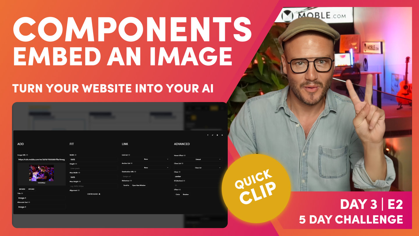
Embed an Image - Components
Paul Davenport | 01:32
Embed and image using the Image Component. Consider using an image 1440px, giving wide scope for future Content Editors, should they decide to move the Image elsewhere on the page.
"What I'll do here is just put an image in. Let's go and click on the image, we're going to browse, and we'll put in our first image here. Now, as you can see here, we've got a image. It's brought over the title, an alt text, the alt tag from the files area. We can have one image in the files area and put in lots of different locations, meaning we only have to upload the image once. But in this instance, I would like to give it a new title specific to this page, so I'm going to call it Man on Laptop, and then we'll just copy this and paste it in. Right? Always try and do that when you add a new image. It's good for your SEO, and at least we'll make it easier for future people when they come and edit that.
Now, we've got an image. Notice this image is four by three. It's 1440 pixels that's been compressed for us by our AI Website Bots, and it's 960 high, which is nice because if people move this, they could literally pick this up and move it to another page and have it full with if they wanted to."
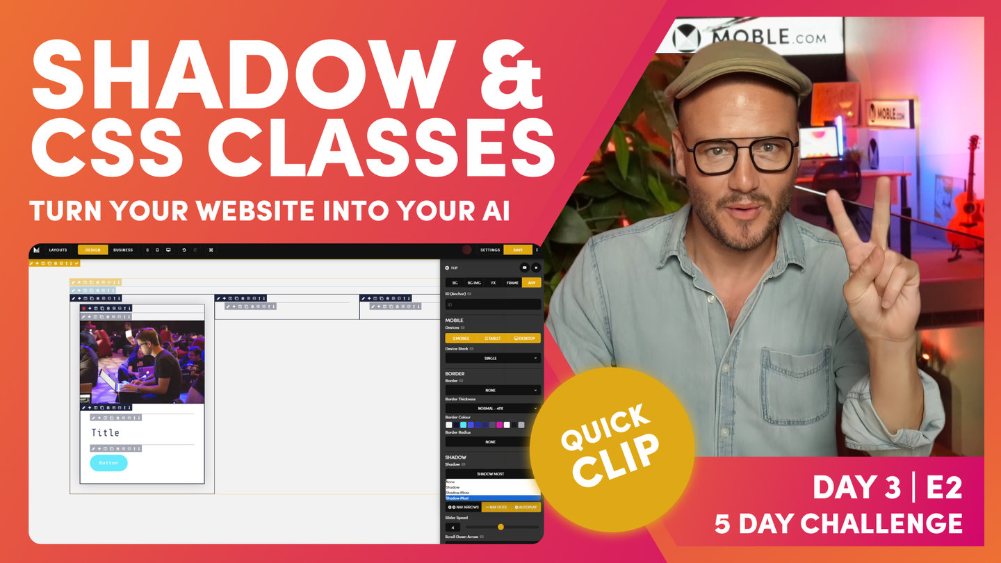
Shadow and CSS Classes
Paul Davenport | 06:53
Applying Shadow to a Frame is straightforward, though here we look how to apply Shadow to more complex Blocks with Cards. We then go on to explain CSS Classes and the philosophy of the MOBLE platform that keeps a uniform code base for developers, supported by a UI that the entire content team can use.
"Now, if we recall on our column that we're building, let's just go and have a look at this. Let's just jump in here. This has got this shadow around it, which the shadow off the white creates this really cool look. We've got this white and neutral, which is why we really like to have a neutral and a white. It gives us lots of really cool design techniques that we can use, and this is one of them. Look at this, this shadow looks amazing, lifting this off the page.
Let's now go and put the shadow in here. But if I go to the shadow, which is in advanced and I click shadow here, you can see here I've got three shadow settings. Now, cool thing to remember here that MOBLE is making the hard decisions for you. MOBLE, as an agency, we've built hundreds and hundreds of websites, so we know the common use cases, and we've bought those common use cases right into the editor so that you don't have to make decisions.
Now here, you can see three very common setups for shadow. If I click this first on shadow, it's added my shadow as you can see, but it's only added around this particular frame. We want to add it around the whole frame. I'm going to talk more about on shadow and CSS in just one second. I'm just going to turn this off, and we've got here this block column, haven't we? Which goes all the way around.
Well, what we would do if we want the shadow to go around here is just take off the padding of the block. So, watch this. I'm just going to take off the padding, and now we can apply the shadow around the side. You think you get where I'm going with this? Let's put our shadow in here. I'm just going to put shadow more for now. It's got shadow, but again now, the shadow is encroaching onto our next column.
What I'm going to do now is use the plus icon to add another frame around the side. And in this one, I will now go and put our padding. And what I'll do is make sure my padding is the same as the other frames for now, but knowing that I could use the shortcuts to go and apply all. Okay. Now, this one has got padding inside it. Our inner padding is now moved to here, hasn't it? So, what we want to do is just indicate that for our team. Now, we have a column with padding around. In fact, because this is shadow more, I'm just going to add a little bit more padding in here. Now, I'll just talk about CSS for a short moment here. You can see on MOBLE, like I said, we've made the hard decisions for you.
The last thing we want people to do is go and have to do more complicated things. If you've used Photoshop or other programs, adding shadow where you need to set particular blur, et cetera. Well, we know that these common use cases just work, but we also know if I add most in there, we also know the distance of what we want the shadow to go with to work with columns. Imagine if a content user comes in now makes this four column, the shadow could encroach over that, couldn't it? So, these are things that most first-time users and in fact a lot of designers aren't thinking about. They're only looking at that design for that particular use case. When they're using it right now, does it look good?
Well, MOBLE is a web builder for design and a CMS for business, we need to think about designing for all those future users. So, we set up common presets, if you like, that we know just work. Even if you are a designer, you know that these look really nice anyway, and you now know that you don't have to think about this for what columns people are going to change to or what devices this going to be looking at. We've already made the hard decisions for you, just enjoy it.
Now, if you do want to change your own, a shadow is a class. So, back over in... I'm just in the advanced tab here. Now, watch this. I'm going to change the class here, and it changes the... I'm just using the UI tools here to make changes, and it's changing the class. Now, if you are a front-end developer, you can go over to the styles area and in the top you can see the html, CSS, and JavaScript. You can go to CSS and actually change the class for shadow-most, and that will change it across the whole website for all those users. If you're a front-end developer, you can really use this tool to maximum effect knowing that you're creating classes that there's UI tools for, and that's very, very cool. I think you get that if you're a front-end developer.
And also, I'll show you our class list while we're here. Our class list is things that mobile are working on new features that are in beta that people can play with, that we haven't actually released in the UI yet. So, there's a quick tip for front-end developers. You see how powerful this platform actually is. Okay. So, we say it's a website design builder for designers and you don't need code, but you still can use code and you still can use code in a uniform way that it still works for all those future content editor. It's very, very cool stuff.
I'll just show you cool technique. I'm just going to flip this across, and let's just say in our class box here, this is all the classes that we have here. I'm just going to make this one a little bit bigger to accentuate what we're doing here. I could just come into advanced tab and actually just remove all the classes, but notice I never remove the class for row. Watch this. Looking over here, this saves me going to remove the padding and everything that I can just hit delete in here, and it removes everything. It cleans this frame. So, that's a little masterclass technique there. Even if you don't know code or never wish to learn code, that's a really quick hack there to clean everything up without having to go and find all the UI tools to turn them off."
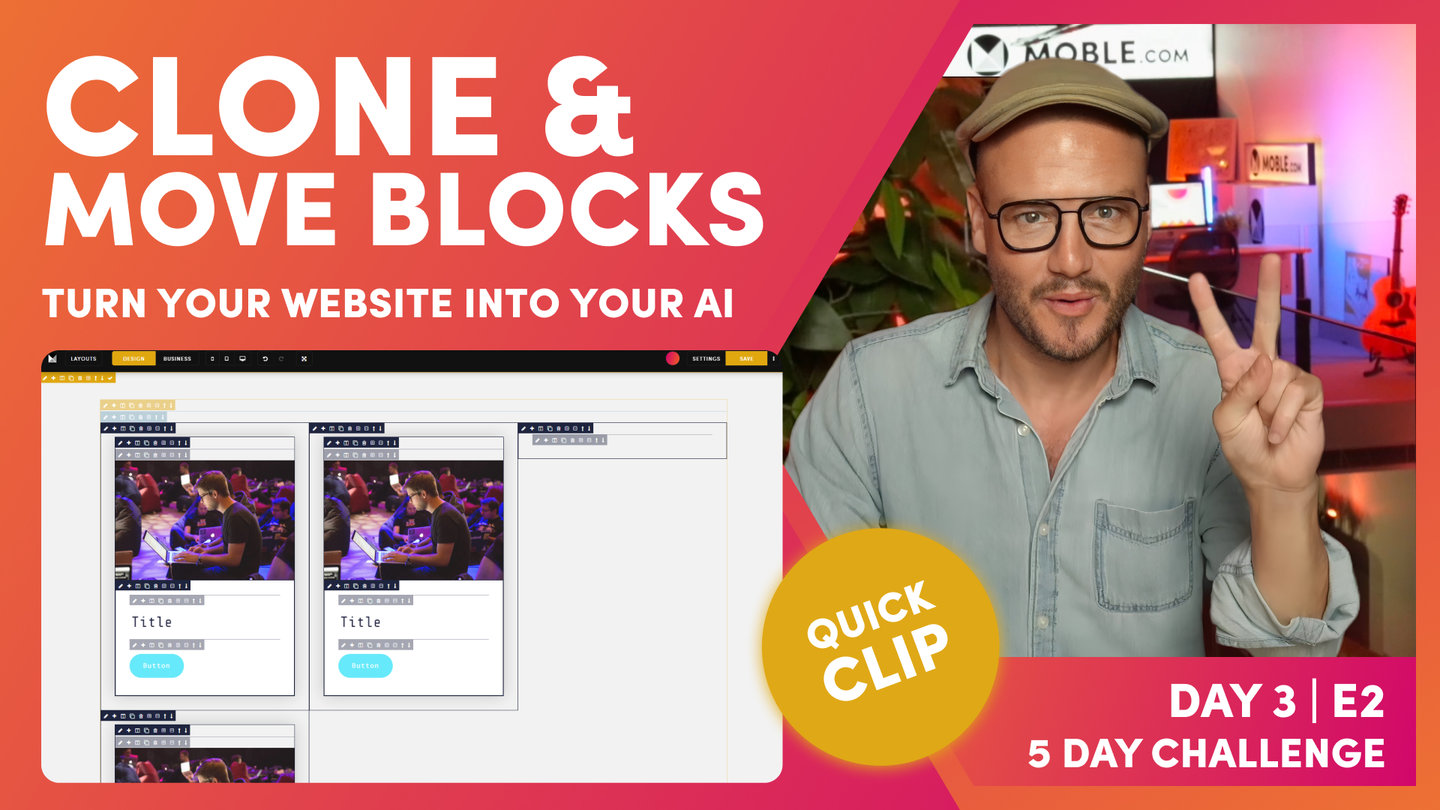
Clone and Move Blocks
Paul Davenport | 01:34
It's possible to pick up and entire frame, including all it's components to a new location on your page. Here we explain this extremely useful shortcut.
SHORTCUT
Move an Active Frame ''
Click the Pencil Icon to make the frame active (red dot).
Hold 'Shift' + click '+' on destination frame
"Here, we are now, we've got our column with our shadow around it and our padding, and we are actually looking quite good there. We've got up to a rapid start, but now we don't want to go and set up this again. We could waste two minutes doing that. As you know from the essentials, what we're going to do is use the plus icon and clean this up. Okay. What we're going to do is clone this now and move it into these two frames. I'm going to hit the clone tool, and I may as well do that again.
So now, I've got three columns. I could move any one of these now into position. Just to save me scrolling, I'm going to click the pencil icon. I'll move my drawer across here, flip it, so I've got my pencil icon. This is our active frame. I'm going to hold shift, I'm going to click the plus icon and paste it in and clean up our frame that we don't want, and we've got that there. Now, this is the next column, active plus icon, hold shift, move. And then, I'm going to minus that out, and now we've got three columns that are looking really nice. Okay, moving on."

Embed Vs Background Images - Fixed Height
Paul Davenport | 06:39
A common query for first timers is knowing when to use an embed image v's a background image. Background Images are most commonly used when you want to apply text on top of an image, here we choose a background image so that a Fixed Height can be applied to your Frame.
"This is an embedded image and as we've learned from earlier episodes, the embed image always shows the image to this size. What do I mean by that? If I change this image to a different size, let's say we've got this one here, which is a square, 1440 by 1440, well that's higher, so that when you have an embed image, it shows it to that particular size. Well, as we know, we want to make all of our columns the same height. In this case, what I'm going to do is delete the embed image. I'm going to delete that. Okay, great. And now, I'm going to add in a background image. Active frame red dot over here, background image, and now I can hit browse and put in our background image.
Well, here is the next lesson. Now, the background here that we've got this particular image in, the frame that we've got this particular image in needs a height. So, I'm going to go back over to frame. We've had a look at width before. We've had a look at max width. We've also had a look at the percentage width to a degree and even the alignment of that percentage width. Lots more on that. This is a really nice feature, but right now we're focused on heights. Here, we've got a minimum height. We could set this to, let's say, 300 and that's the minimum height. If I add content in here, this is a background image, I can now embed content text on top of that. And as people write more text, the content users add more text in the future, but if it sets to minimum, the frame will grow as they add text.
But in this case, I want to fix it to a height always, so I'm going to select my fixed height at 400 pixels. I could make it full screen, but in this case I'm going to make it 400 pixels. I think you get that. And then, there's other things. We're not going to cover in this now, but if the people do put text in here, and I could choose the behavior of how I want that to grow, so I can basically use the overflow here and say if people add more text, make it hidden, keep it there. Or if people add more text, put a scroll in so they can scroll the text and the height will stay the same. More on that in the advanced classes.
Right now, we've got a background imaging, but what is going on with this background image? All I can see is this part of the image here. You see this chair? I'm looking at this portion of the image. Let's go and investigate as to why. Okay, so I'm going to put the active state on the red dot. I'm going to go back to background image, and you can see here that our background image position is set to top left. Well, if I choose this and put it center center, that's center horizontal, center vertical, you can see I'm looking at this portion. Now, this is showing me the image. It's a 1440 pixel image, so we've not done anything to change the size of the image. That image is just its actual size, its default size, and we're looking at that in the center. Okay, so it's 1440 pixels wide. This is 400 pixels high. We want to see all of the image. So, this is where we use the background image fit.
The first thing you'll learn here, background image fit. If I click cover, it covers the full frame, so we lose a bit maybe of the left or right in this case, because it's covering the full frame. Well, if I wanted to see all of that image in a frame, I could use contain. Now, you can see the image here that's contained. It always shows the full image, and it'll stretch to either. If it's a landscape, it'll stretch to the full width. And if it's a portrait, it'll stretch to the full height. So, you always see the full image when it's contained. But look at this, this has got a background image repeat, it's repeating it, but the default is to repeat it around. But if I click no repeat, you can see my contained image.
Now, background image repeat, often it's used for... Maybe you've got a tiled pattern or a tiled texture that you would like in the background, so I could have a small maybe wood grain that just repeats in the back or something like that. That was an old technique in the days of MySpace, in the days of skeuomorphism, but those techniques have long since passed, but it is there if you need to use a repeat for any reason. That's where we'll use repeat. My general setup, ever-in-doubt setup, is background position center center. I use cover, no repeat, and then I could choose to use a background image fixed.
Well, background image fixed is used a lot on banners. So, you have a four width banner, and it fixes in the background. And as you scroll, the text will scroll on top of it. Okay, but in this case, I've got a background image fixed, and it's just showing almost a window looking through that. Because the image is fixed in the background, it's showing the image in its full size, and it's fixed in the background, so cool techniques that you could do here.
What I'll do is just delete this image here, and I will make this one also fixed height, 400 pixels, and let's put in that same image again and show you this cool technique. I will put this center center, cover, no repeat. And in this case, I'm going to turn background image on as well. And you can see, because that image is fixed in the background and it's covering the whole width, it's fixed the background, I can now see that image looking through that into the background. So, that's a cool little technique."

Video - Background - Fixed Height
Paul Davenport | 06:50
Just like choosing a Background Image, you can also choose a Background Video and determine the size and shape of your video with a Fixed Height.
"Now, this one, we're going to have a video in there. What I'll do now is just jump over to Vimeo and grab the code. Here, we are in Vimeo, and as you learned yesterday in the videos episode, you can either embed videos or you can put them as a background and you can do this for both Vimeo and for YouTube. If you need to, go back and look at that video again.
Here, on embed, I could grab the embed code which grabs the iframe, but I'm putting this in the background. Vimeo is just like MOBLE, you can put images in the background or you can put them embed on the top. Well, this is going in the background, so we don't want the embed code. We want to go over to the distribution, and what we want to do is go to file links, and then you can see our 1080 or 1920 pixels. I'm going to copy that.
Just so that you know, I could copy these other video sizes in here, these are the dimensions, like 720 might be a better one in here, but I'm thinking about future content users. People might copy this particular column and move it to a different location, which is then full width. What we don't want is a pixelated video. So again, thinking about those future content users, this is why this is a masterclass. I'm going to be giving you these tips as we go, but it's always around thinking about future content users. That's the narrative here, so those people will never mess it up. This is what we're trying to achieve.
Okay, so copy this link, and we'll jump back into our editor, and we'll click the pencil icon, we'll go to background, and we'll paste in our link. And now, the system already knows it's in the background, so it's going to loop it. We don't want it to stop playing and maybe have a black screen, but we want it to be muted. We don't want it to play sound. The browser typically will turn that off anyway. But if it's in the background, there's no on-and-off tools for the user so you can get in all kinds of trouble. So, we always want it to be muted, and we want it to auto play.
As soon as people scroll to that, we want it to be playing. So, it does that for you as you can see, sets that up automatically. Now, notice that you can't see the video in here. That's because the mobile editor we're making some core decisions. When we built the mobile platform, we decided not to play videos in the editor because that uses a lot of memory. MOBLE runs and works in the browser in Chrome or Safari. There's nothing that you need to download, you just log in and it works, but the browser can only have so much memory. So, we've made a decision not to play videos in the editor. We're not going to auto play them, not going to play them.
In this case, what I want to do, and it's a good idea anyway, is to give this a thumbnail so that we know what that thumbnail is. Normally, that would be the first screen of the video. Now, I'm just going to go in here. And I'd like this particular image, this square image that was an image from the video anyway, so I can actually go and put this in here as the background. Okay. And this has still got that background image fixed on, so we don't want that. We're going to turn that off. Now, we've got a background video in there and a thumbnail."
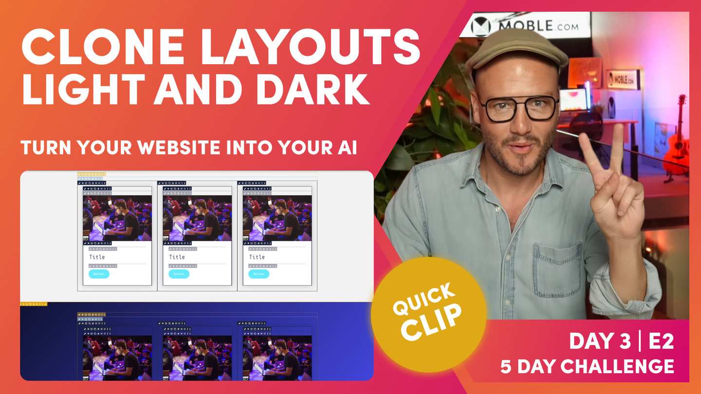
Clone Layouts in Light and Dark
Paul Davenport | 01:57
Now you've made your Layout, it's almost time to save it to your Layouts Drawer for your Content Team to use. However, before you do, why not capitalise on your hard work by making a Light and Dark variant so that your team has more flexibility when mix 'n matching Layouts.
MOBLE's Built For You Package allows you to engage the MOBLE design team to build custom Layouts for you. MOBLE will build 10 Layouts for you and make both Light and Dark variants giving you a selection of 20 beautiful Layouts to Mix 'n Match.
If you're considering starting you own Design Agency with MOBLE here we offer a valuable tip of how you might charge for your services.
"As you can see here, I've got this first column setup that I'm happy with, but what I want to do now is capitalize on that work, as I said into the introduction. So, I'm going to clone this one now. And in the back here, I'm going to change the background image, so outer frame, pencil icon, going to go to my background Colours, and I've got a setup that you're probably familiar with now. I'm going to space cadet, and I'm going as a gradient, this blue. And then, I'm actually using this as 130 on the gradient angle. I can use the gradient angle to find something that I like, but I can hone in and be very specific. I've decided I'm using 130, so I'll just close this now. And now, as quick as that, we've got two layouts for the price of one. So, we're building out layouts.
If you are a designer or thinking about using MOBLE to start your own design agency, this is great because you can give more value to your customers by adding more layouts, and that's tangible value that you can even think about setting your billing towards. If people decide to join this five-day challenge, they want the MOBLE team to do it all for them for two and a half thousand, the team will talk to you. And they'll say, "Well, how many layouts do we need? What can we do within that two and a half?" Well, we'll build very quickly, and we'll make sure that you get as most value of that as possible. And this is one of the techniques that we'll make sure you have both light and dark so that all your content team can use and enjoy."
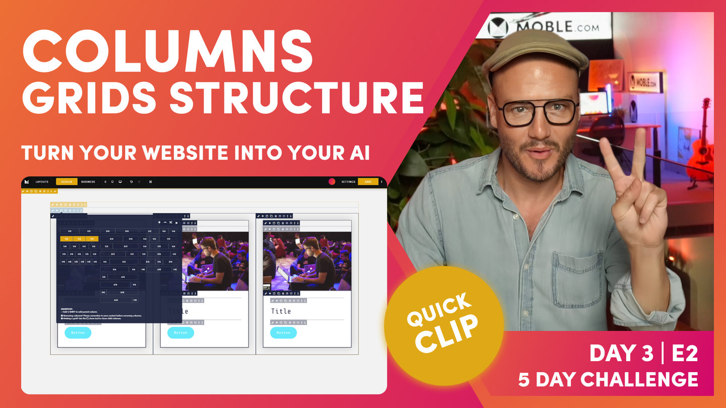
Columns/Grids Structure
Paul Davenport | 05:22
Use the Columns tool to flip Layouts to a different column layout. Go a step further by cloning Columns to make Grids. Understand that you can rotate the order of Columns, and importantly decide which Columns will be removed.
"Now, I'm going to show you the third icon along, which is columns. In this case, I'll start with the two-column layout. You can see here these are all evens. And these are actually two columns by fractions, and these are three columns by fractions. Okay. We're just going to start with a straight two. And you can see here, it's automatically added to our inner blocks. We've got two columns, and it has automatically put the inner padding into this block, and then it's got a child component ready for us to go. Well, that's pretty nice.
Now, I can add my components as I would like. Pretty basic stuff there, but watch what happens here. I can go back to my column, and I can now just turn this to any of these. In this case, we're going to build out a three column, aren't we? I'm just going to select three column, and it changes it for us. But what I want to do now is capitalize on that work as I said in the introduction.
So, I'm going to clone this one now, and in the back here I'm going to change the background, so outer frame, pencil icon. Going to go to my background Colours, and I've got a setup that you're probably familiar with now. I'm going space cadet, and I'm going, as a gradient, this blue. And then, I'm actually using this as 130 on the gradient angle. I can use the gradient angle to find something that I like, but I can hone in and be very specific. I've decided I'm using 130, so I'll just close this now. And now, as quick as that, we've got two layouts for the price of one. I'm now going to turn this three column into a grid. I'm just going to clone this one.
We've got our original there, that we're going to add to the layouts drawer at the end. And now, in this one, I'm going to put it back to design mode, and now you'll see the beauty of the column tools. We looked at this slightly before the column tools, but now if I click the clone icon on here, I can just look at these, I can move up and down. I've got two images on the top and the bottom here. So, that's the beauty of using these parent columns because we can move our rows, if you like, of our grid up and down.
Now, what we'll do in this case is make a decision. I'm going to delete this image because we've got an image below here. I'm actually going to turn this into a two-thirds video and one-third shop. I can do this in the columns tool. This is what I want here, two-thirds, one-third. But if I was just to click this one straight away, when you change this, this has got three columns and this has got two, so it always deletes the last one. The last one has to go.
We want to keep the shop one. This is where we can use our rotate. Watch this. If I hit rotate, but we still want to keep the video there, don't we? I'm just going to click rotate one more time. Now, our image is over on the left. I'm confident now. I can now put this to two-thirds, one-third, and now we've got our video as the hero and then the shop to the left. So, this might be talking about the product, and then we've got buy it over here, which could be a cool way to use this particular layout.
At this point now I could say, "Yeah, I'm happy with that." I'll actually clone this one. Okay. Now, we've got our variant, and then I'm going to make our dark version capitalising on the work that we've done in three very quick moves. Now, we're looking really nicely there. If you recall from the introduction, I actually said that we're going to have another map here.
What we'll do in this case, we'll keep the slider, we'll remove the image altogether, and we'll have a map two-thirds and a slider one-third, in which case let's go and have a look at that. I'm going to use the clone tool to create another variant. And now, let's go and have a look at this so I could hit. Now, we want to get rid of the image, so I'm just going to use the rotate. The image is still in here. Again, use the rotate. And so, that's where we want to do.
Now, I'm going to change this to the two-thirds, one-third, and now we have our map. We want our map to be on the other side. What we want to do now is use the rotate and now our maps on the other side. I'm going to pop that into business mode. Now, that's looking good. What do we want to do next? Capitalise on the work that we've done, so I'm going to hit the clone icon. And now, I'm going to put this into our dark, knowing my settings, always being consistent."
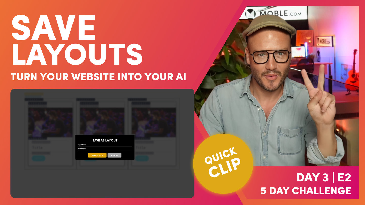
Save Layouts
Paul Davenport | 04:51
Now you're ready to save your Layout to the Layouts Drawer. Test you your Layout before you save by previewing on all devices. Once you've saved your Layout, check that you're happy with the screenshot, and even replace the automatic screenshot by uploading one of your own.
"At which point, because I'm happy with those, I would save these as a layout. But always, before you save as a layout, you just want to preview those on mobile and tablet. I'm going to click my mobile preview icon. And here, you can see our mobile view, so let's just move along here, and you can see we're looking really nice on all devices.
At which point now, we will make those layouts. When you save layouts, you click the tick icon here. This one would be a grid with three columns, so I'll call this grid. I'm just going to call this one grid light and then press save. Then, I'd move on to the next one, and I'd call this grid dark. And so, as I'm adding these layouts, they're adding to the layouts drawer. What I'll do now is just whip through this on a fast-forward and then show you how these appear in the layouts drawer.
Now, our layouts are saved. I'll just show you two troubleshooting tips that I often get questions for. If I go to the layouts drawer now, our layouts are not there, which is weird because when you save layouts, they save and add to the top. Well, this is because you just need to make sure that you refresh the page editor where you are.
So, you could click the refresher in the browser, but since this is taken as screenshot, it's doing a whole bunch of things when saving those layouts, sometimes I like to do a hard refresh, which on control is shift command and R, really nice hard refresh that'll tell the browser, "Hey, make sure you do a proper refresh."
On safari, that will be hold shift and click R for that hard refresh. I'm going to do that now shift, I'm on Chrome, shift command and R, so I'm giving that a nice hard refresh. The hard refresh just takes a little bit longer than your normal refresh, so I'll just sit with this just so you can see how long that actually takes. There you go through hard refresh is complete.
So, at which point now, I'll come over to the layouts. And you can see all of our cool layouts that we've got here where you can see I've got the three columns. I've got my what are called grid light and grid dark. And here, I've got the alternate versions of those, which is pretty nice. They've all added to the top.
Now, this particular screenshot, it's either not finished saving yet at this point, or would you see the white space that it's got in there or it's struggled to find out the actual height. I can actually go back into the layouts drawer, and I'll just show you here. If I hit our bot, you can see that you can also save entire pages as a layout. If this was an About Us page and I wanted this whole layout to be saved, rather than clicking the tick to save this one layout, I can save the whole page as a layout too. So, that's in the layouts drawer, hit AI Website Bots, give it a name, and save it as a layout.
But in here, I could also go to our layouts area and start to look at our layouts. If I click layouts now, you can see here that I've got my layouts here, and I've actually put these into a nice short order. I want this to be number one, two, three, four, five, and six. We can see that all there. Now, this particular image you could, at which point, if the editor is a bit slow in taking that screenshot, you could actually just take a screenshot yourself.
On a Mac here, I've just opened up the click to open up the images normal, but I've just gone shift command and five, which opens up the screenshot tool where I can choose the dimensions. If I just press capture now, that'll take a nice screenshot as you can see. Now, what I can do is go to the settings area in here, and I can upload a new screenshot. On my browser, on my local computer, I could actually call this image the exact same name. If I could upload a new image or a new icon, that's fine, but sometimes it's good to keep it the same name. It might be that you've used that image somewhere else, so you can call it the same name."
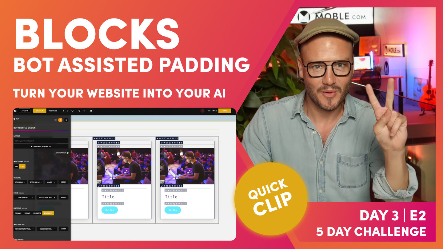
FAQ - Bot Assisted Padding for Blocks
Paul Davenport | 01:26
A frequently asked question is how does the bot algorithm work when you have a third block of padding in a card. Here we explain so that you can feel confident building more complex Layouts and know that your Layouts will be compatible for Bot Asissted Design.
"Brilliant. So, we've covered some really cool layouts there, but I'll just answer some frequently asked questions at this point that I always get when I'm training clients. The first thing is, this is our structure, and those who are quite astute there will have noticed that I said in the essentials only ever use two banks of padding. But when we've created a card, we've actually used three banks of padding. So, we've got our outer padding, and we've got our inner padding.
When we hit the bot in the layouts drawer, right outer and inner padding, it's actually going to update these two. When there's a card, the card also has padding inside it as well. Well, our bot knows that's a card. It knows that we've got this particular card in here, which the block is set to on, and we've got padding inside it. So, that's one of the reasons that will help our bot if you put the block on and put the padding inside it as well."
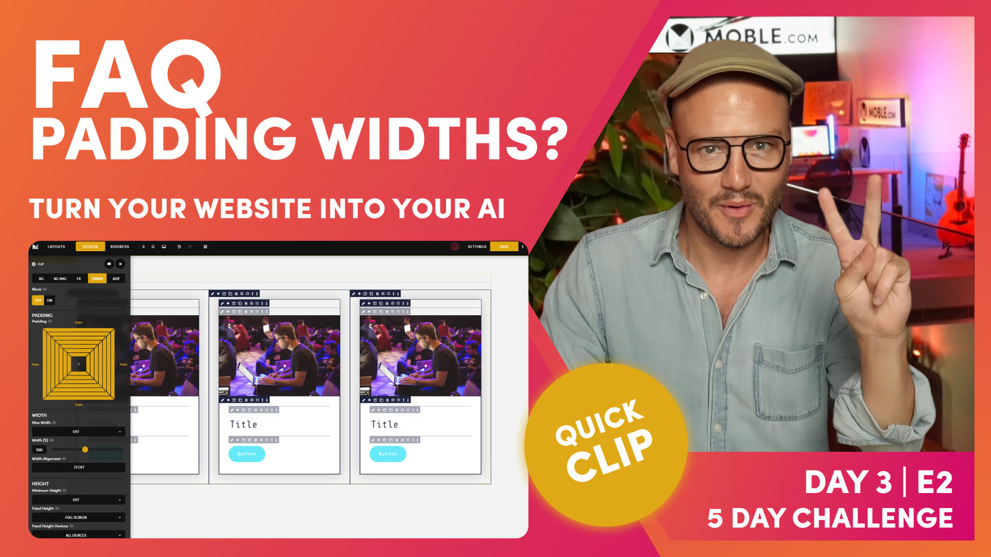
FAQ - Why can't Padding be bespoke Widths?
Paul Davenport | 02:00
Designers sometimes question why MOBLE don't recommend having bespoke Padding Widths. MOBLE's UI has Left and Right Padding in widths of 2px, 4px, 8px, 16px, 32px, 48px and 64px. Working with these precise widths ensures your content team will always keep consistent padding alignment. It also means that our bots can apply your padding preferences to all Layouts, giving your team an extra 5,000 Layouts to play with, that will always be perfectly aligned.
And... this is the narrative of today's sessions, you are not just designing for your immediate design considerations, your are designing for all future content users, so that they will always stay on track.
Remember, if you do want to customise your frame to an exact width, you should use the Percentage Width tool allowing to have the precise look that you require.
DESIGN PARTNER AGENCIES
The clips ends with a note to Design Partners. Design Partners can use their custom Layouts across client websites. In this scenario, Bot Assisted Padding and Alignment has never been so valuable, making MOBLE the perfect platform for Design Agencies.
"What if I want to make my padding 117px wide? Well, you as a designer might want that choice, but as a designer, the core learning here, you're not just designing for yourself right now. You're designing for your content team and all the future content editors that might come in, whether it's a new marketing agency or whoever it is, and we always want them to keep on track. That's why we have set pixel widths for padding width, right? And that's cool now because our AI Website Bots can go and fix all that up for you. And that means everyone always stays aligned and never goes and messes it up.
So, we're designing for the fact that we don't want people to mess it up. That's one of the boundaries of which we're working towards, which is really cool, and yet saving you a huge amount of work. You can see if we stay in these particular pixel widths, we can just fix it up, and of course when they just drag in your new work, it will just work and be aligned.
And don't forget, if you're a design partner, you keep all of your collections, all of your layouts, and you might want to use this layout that you've designed for one client and use it on a new client. They might have completely different padding alignment where you can go into your partner portal, into your area, just dragging that layout, and it will just work for that new client as well. So, there's so many use cases for why we do this in a particular way."
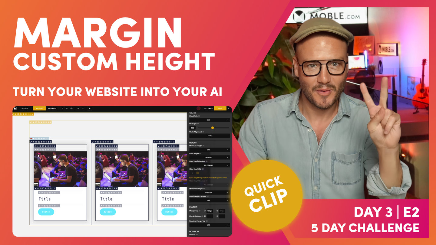
Margin - Padding can be bespoke Height
Paul Davenport | 03:42
While we don't recommend having bespoke Padding for Left and Right, you can use Margin to determine the exact pixel height for Top and Bottom, on both desktop and mobile.
Please note, part if this Clip is is taken from Part 2 below, where we combine Shift Up Effect with Margin to create perfectly balanced formatting.
"To do this, I'll go to frame and then scroll down, and this is where I'm going to introduce margin. Now, what margin does, it adds padding to the outside of the frame, right? This is CSS now, right? In here, I could put in 100 pixels. Now, the reason I'm doing 100 pixels is because I've put 100 pixels in here. Now, I've shifted up 100 pixels, and I've allowed padding of 100 pixels, right? Top tip on using margin.
Now, shift is only a function of desktop. We don't shift up on mobile by default. At this case now, I'm only adding margin top 100 pixels to the desktop only. We've got desktop here, we've got mobile there. Okay? This is pretty cool. Remember now, we talked about using padding, and these are standard padding heights and widths that we've got, but we can control any pixel height with margin. This is really cool now. We're not going to get into any trouble because we're designing in a really logical way thinking about everything. I'm back in business mode now. I can now see that we can see this has shifted up by a hundred pixels. It's actually shifted up and we've had a hundred pixel margin in here. Pretty happy with that. We're looking really nice."
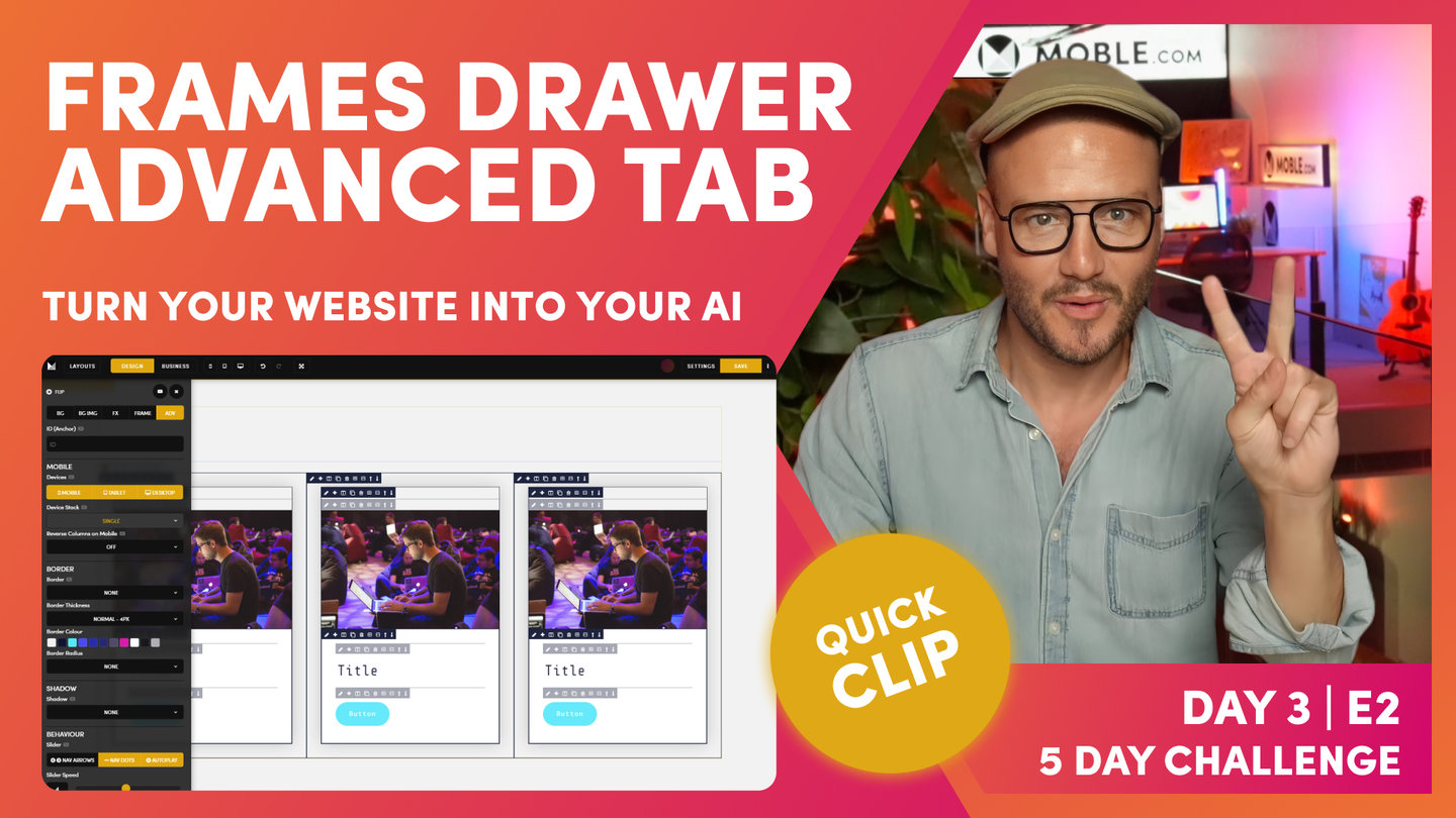
Frames Drawer - Advanced Tab
Paul | 03:05
Now you're acquainted with the main tools of the Editor, it's time to summarise the features of the Advanced tab within the Frames Drawer. Here, you'll find a collection of powerful, but common, tools that you will use time and again in your web design journey, so... it's important that you know exactly where to fine them.
"And finally, just surprising where we're up to right now. Let's just look at the advanced tab. We've looked at anchor, haven't we? We give a particular layout or particular frame within the layout and ID, and then we can anchor to that. And you can anchor via a button or via a text link. I could even make an image, an embedded image. I could also link that and anchor to that too, so there's anchor ID. Mobile devices we haven't covered yet, but you can say, "I don't want to show this particular layout on mobile." In which case, that frame, everything within that frame now won't appear on mobile.
When you do have quite large pages, you might pick and choose what you want on mobile and tablet. If I wanted this on only mobile and tablet, it would only be on mobile and tablet. That's obvious, but I can also control the stacking here and say when this response is down, these are going to be single stack, but I could choose those to be fixed, so all three will appear on mobile. I'll still get one, two, and three, or I could double stack those. Okay, so that's mobile behaviour.
Now, borders, we're going to look at borders in the final part of this intermediate session. We've looked at shadow, we've looked at particular behaviour. Notably, you can also change the speed of that slider if you want to. Scroll down arrow, we're going to look at in the banner episode. When we build out our Alio banner, that allows us to put an arrow, which we click, and we naturally scroll down from a banner.
There's a few behavioural properties in here. We've alluded to overflow dynamic text we covered in the menus and navigation, whereas if I have a widget, I can control the hover over text Colour, I can override our core settings for Colour, and we've looked at classes. So, we really have whipped through there in a really cool way to show you all of these features for that they're in the editor that you can now be confident to use.
I think there's enough there to say, right, if you want to build a custom layout or if you want to have a go at just looking at any other website in the world, now seeing if you can recreate that and test it on all devices, I think right now you actually have got the ability to do that. But just to finally complete this episode in a nice way, let's now go and have a look at this particular layout from our Alio theme, and let's set this up as a nice way just to wrap this intermediate session."
PART TWO

Part 2 Intro
Paul Davenport | 01:02
We finished the Intermediate class by diving deeper into common web design editing techniques. Here we look more closely at Columns and Buttons, then look we look at some simple, but striking, effects like combining Parallax with Margin. We finish with some Padding and Alignment Device Testing and QA, before we capitalise on our work and make Variant Layouts for Light and Dark, and Reverse Columns.
"All right, well, to complete this intermediate class, we are going to be having a look at using all the knowledge we've gained so far to build this layout from the Alio theme, which has the parallax and this shift effect on here. And notably, this particular right-hand column is actually thinner than the main one on the left and it's not using any extra padding as you know now. So, let's do this. Let's complete the intermediate class, and let's go and build out this layout. Zola, are you still with us? Yes, she is. All right, let's do this."
Paste Plain Text
Paul Davenport | 02:16
When pasting content from an old website or browser based design programs like Figma, many first timers make the mistake of copying over the old unwanted HTML from that platform. It's always best practice to paste plain text to keep your content clean. Here we show you how.
Note, when pasting from tools like Microsoft Word and Google Docs, MOBLE will attempt to strip out the unwanted code when you paste. However we strongly recommend that you always check that you're not bringing in unwanted code that will impact on your text styling.
Here we also look and using the Up and Down arrows in the Frame Tools to position your frames in the the order that you require.
"What I'm going to do here is just copy all of this text, and I'm going to go and put this text into the card, and we're going to create this blue accent line as well, and we're going to move the card on top. Currently, our card is below, so let's go and do that first actually. We'll jump in here, and we'll move our card below. So, this is the block so I can move now the frames within the block, so... Okay, we're looking pretty good there.
What I'm going to do is I could paste this text in here but that's not a good idea because when we paste texts from the internet from other pages, it's going to bring in all useless classes that it copies. So, we don't like to do the paste in that particular way. I can pull my cursor back in and hit undo, and that's going to move that out. But there's two ways. You could paste in here, and then highlight everything, then clear the formatting, but it's still going to keep the divs in.
A cool little trick I'll just show you, if ever you are copying huge bulk amounts of text, you can just go and put it into the source code and that's just like putting it into a plain text editor. Now, I could clone this one and take out the text that I don't need. And then, we've got two. What shall I do here? Well, in this one, we're going to give it our title. This is going to be a heading two. It's not the main banner yet. It's lower down the page. I feel like this one can be a header two, so why don't we put this in style one at this stage and put it in bold. And then, on our next one, let's have a look at that. Let's go and we'll make this heading three for now, so I can just go straight, heading three, looking good."
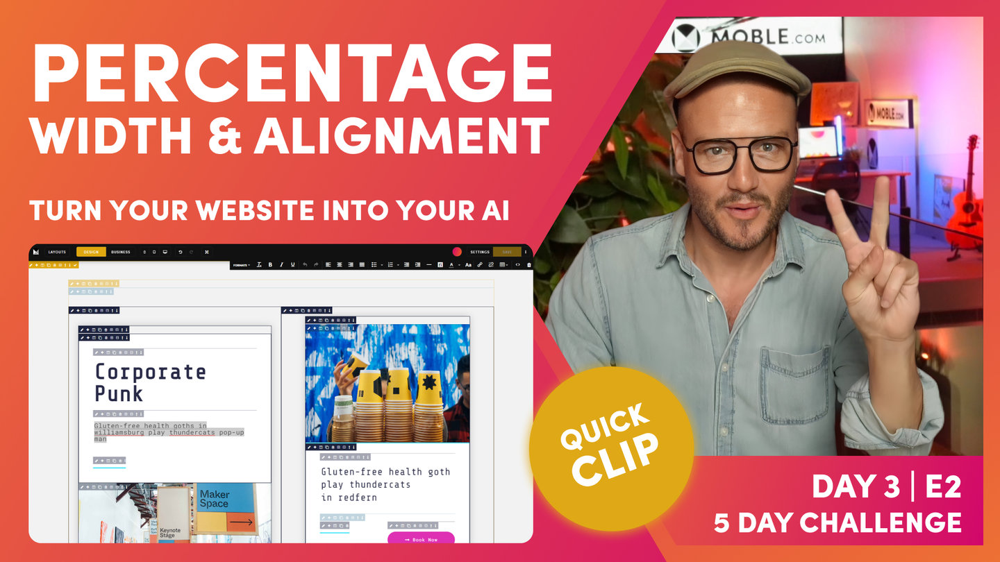
Percentage Width and Alignment
Paul Davenport | 01:52
Define the exact Width of your Frame with the the Percentage Width tool. It is important not to apply more padding as you always want to keep you Inner Padding consistent for perfect alignment. To tailor the width of the Frame, use the Percentage width tool, as explained in the FAQ above.
Next, apply the alignment of the Frame to the Left, Centre or Right and tidy up the alignment for other Frames with Buttons.
"Let's go and apply our width in here, and let's quickly just tidy up some padding in here. First of all now, I'm going to make this a width. What I'm going to do, I'm not going to apply any more padding than on an inner padding. I am going to put 85% width in here. What I'll do is flip it this side so that we can see, and I'm actually going to make the width of the whole thing 85, right? You can play with it with your eye, just move it to whatever you think is going to work. I just know I'm on a two-column, I like working with 85. And then, of course, I'm going to do my alignment here into the center, so that is now looking pretty good. We've got 48 on this side. So, why don't I put 48 on this side, hold option, alt, all sides. Pretty good.
Now, when I put the center on this one, this is why this is a masterclass, it's also put center on everything else on the inside. This one is a text. By default, it is left-aligned, so the alignment on the text, we know. But with the bottom, it's confused now. It's also put the bottom on the left... sorry, into the center, so I could come back to my alignment here and override this one and say, "Hey, actually, that's on the left.""
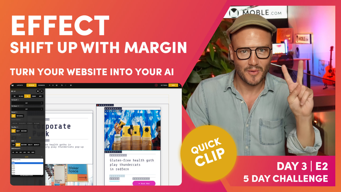
Effect - Shift Up with Margin
Paul Davenport | 03:21
Shift Frames Up, Down, Left or Right by either a percentage of the parent Frame, or by an exact pixel width. Learn more on Shift Effect on later Episodes in Day 3. To get your started, here we look at balancing a Shift Up on the right column with a Margin on the Parent Frame to nicely house the Shift and create a beautiful look on all devices.
"What I'm going to do now is show you an effect. In this case, I'm going to shift this one up more. Let me just do this. I'm going to go to our effect and see I've got this shift up, and what I can do is actually move this by a percentage or by an actual pixel. Right? So, what's the difference? Well, if you're shifting up by a percentage, that is an okay strategy, but I don't like that personally because when our content team adds more text, it shifts up as a percentage of that height. If that's a hundred percent, it's going to shift it 25% up. I don't like that. I want to work in exact pixels. This is why when we use the vertical shift up and down, it's much better off to use actual pixel wicks.
I'm going to select 100 pixels. And now, this is applied, this is shifted up, but why can't I see it? Well, this is because I'm in design mode, which shows me all of the frames. It knows if this shifts it up, I might not be able to edit. So, I go to business mode, and now I can see this particular frame. It's really challenging, the space on here. We've shifted that up, that's pretty cool. But now, I'm going to give you a real tip on front-end development. If we've used shift to shift up 100 pixels, why don't you go to the column here, the parent and why don't we also add a hundred pixels in here."
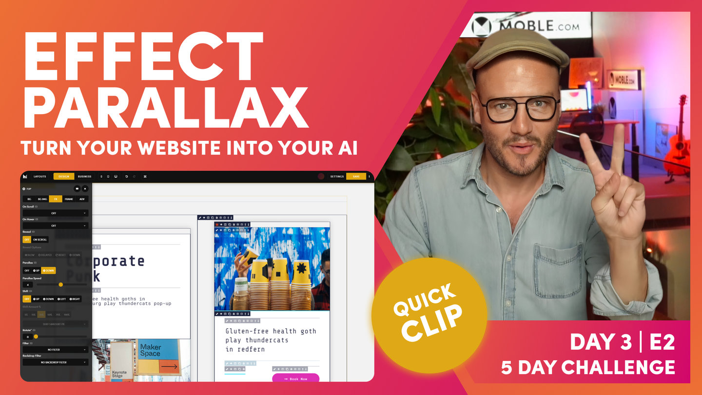
Effect - Parallax
Paul Davenport | 01:56
Apply Parallax to any frame to create beautiful motion as you scroll through your website pages. Here we explain parallax with troubleshooting tips, such on only applying one Effect to one Frame. If combing two Effects, then decide which Effect to place in which Frame.
"What I'm going to do now is actually introduce our parallax motion. Now, this is another front-end developer principle that I'm now going to tell you. And that is in divs, what MOBLE call frames. You do not apply effects in the same frame. What I will do here, I've got shift up in this frame. Here, I've got this frame below here, which is the parent frame where we've got the shadow. Okay. So, what can I do? Well, I will choose to put my parallax motion in this particular frame here. Over to effects, we've got parallax.
Now, I could move this up, now it's already shifted up, whichever way I am around. It's already shifted up. If I move the parallax up, it's going to move up more, so I've shifted it up now so I can move it down. That's nice, isn't it? Again, I'm going to put down, and the standard speed that it will put it to is four. I could move it faster or I could move it slower. I'm happy with four. I just know four works, but you can play with it yourself for your particular height for your particular page.
Here, we've got our motion, but notice again, motion is not one of those things that we see in the editor. But when you press save and view on the front-end, you will be able to see it because we're making those cool decisions to keep the editor as fast as possible, so we don't show background videos in the editor, and we don't show parallax."
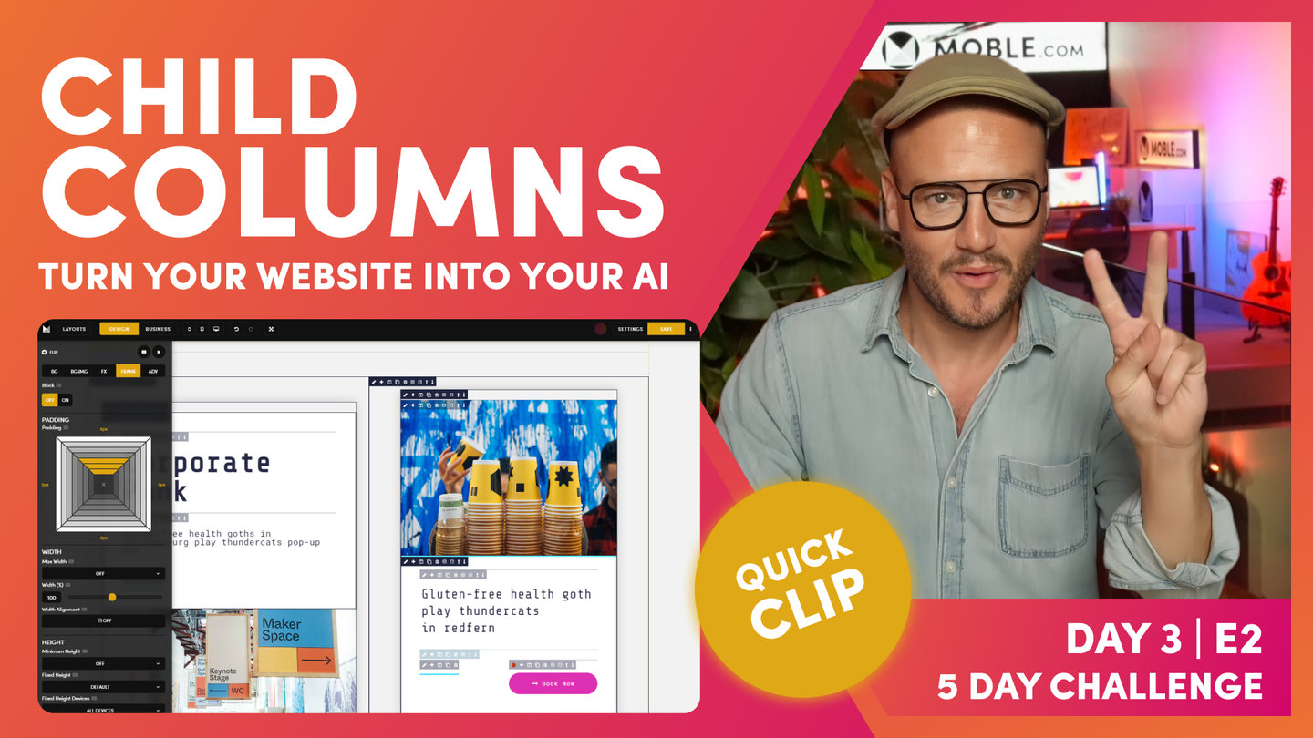
Child Columns - No Block Required
Paul Davenport | 02:36
If you add columns to a child Card, inside your inner padding, then you don't need to apply a Block. Our bots will ignore any Padding that doesn't have a Block (dark blue). Meaning you have even more flexibility to add columns to child components and can customises them as you like.
"Cool. But in this case, I don't even want this one. I'm going to delete this button because if we go back to what we're trying to build, our button is in a two-column layout here. All right. Let me go and put that two-column layout in. I could do all kinds of things here, but I'm just going to do this from scratch. Let's just delete it all. All right, it's gone. In here now, what I'm going to do is use our two column and actually apply this now. So, watch this, two columns in we go.
And there, it's dropped our column for us but, look, it's already been really nice. And it's put in our padding for us, which we can see here, thank you. But it was really nice of it, but we don't actually need that padding because all we're going to do is drop in a border and a bottom. Now, you just need to make some logical decisions on how you clean things up. Well, in this case, I can use the minus function to get rid of the outer frame. If I delete this, it's going to delete everything. But if I hit the minus, it's just going to unwrap. You can see there from the tool tip, it's going to literally remove only that frame, leave all the contents within. So, unwrap. Okay. Now, we've got a column.
In this one, I'm actually going to put a border in this one. So, which one should I delete? Well, I could delete either of these. Because I don't want any padding on this, I'm actually just going to delete the parent here so I can unwrap the parent. And then on this one, I'm going to put a button so I could make a choice here. Do I want to leave in this padding? I don't know if I do at this point, so I'm just going to unwrap both.
Now, that's not something that you can do when you're in the child. These are all the light blue. All I've done there is delete the two parent blocks. It's up to you. There's no rules of thumb there. I just like to keep clean as I go, because I don't like any junk in my code. So, there is that. This is a masterclass, so I'm showing you how us designers like to work to keep it clean."
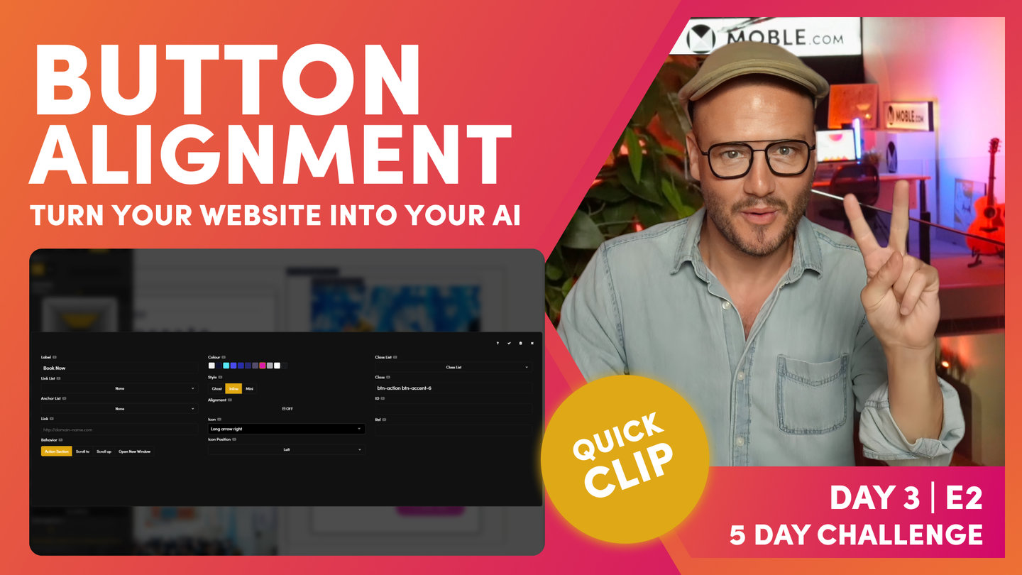
Button Alignment | Button Inline
Paul Davenport | 01:42
Here we look in a little more detail at some of the options for your buttons. First we recap how to align buttons. Next, we learn how to turn 'Inline' off, a useful setting to make your button stretch to the full width of the Frame, which can be particularly useful for high conversions and mobile devices, as we discover on the next clip.
"We're going to have our button. What I'm going to do is drop in the button. You see, it's automatically put this into the center because we've got the center over here of 85% in the center. So this content, it's assuming this wants to be center too. We don't want that to be the case. There's two things we could do. As you know now, you could move the alignment to the left. That's okay, but I don't need that either because what I'm going to do with this button is actually, if I say book now, I'll just use some texts that I've made earlier.
In fact, on Alio, it's actually capitalized so I won't do that. I'll actually write it capitalized as opposed to uppercase. And what we're going to do now is we're just going to use our action section. As you know, I'm going to make it pink. What this has done, it's in line. The button is the size of the text, but if I take inline off, it will expand it to the width of the frame. Like this. Pretty cool. Okay, so we've got book now, and then our bottom's going to be on the left and we've got right. Cool."
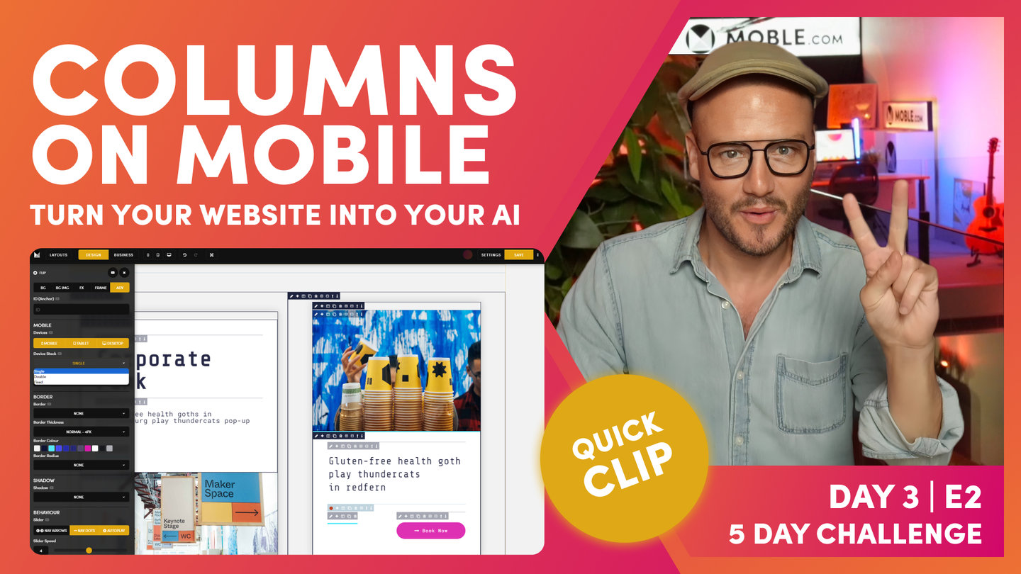
Columns on Mobile
Paul Davenport | 02:24
Here you learn how to show and hide Frames on Mobile, Table and Desktop which can be extremely useful to show less on mobile so that you content is both neat and concise.
"Let's just go and have a quick look at that. I think that's okay at this stage. But when this is on the mobile, we've got two choices to think about here. When it's on the mobile, we've got two choices to think of. Do we want to show this particular accent? And then, if we did on mobile, because it's two columns, it's going to stack them. So, we could decide do we want to fix it? Well, let's go and see this. If I go to my parent here and on the parent, I can say device stack. Well, we could make it double or fixed both at the same in this instance, but I'm going to make mine fixed.
Now, the reason I would choose fix over double all the time is simply because your content users could add more columns. So, if you want it to be fixed for two columns, if they add a three, you're most likely want it to be fixed, so you're working with general common sense and probability. Whereas double stack, if they add a third column, it's going to double stack one and put the other underneath. Okay? Fixed will mean that on mobile now, this is going to be fixed. Well, I'm not too sure that's going to work, right?
At this point, we will use our preview icon and have a look what it looks like on our mobile. Here, we can see it's a bit messy. I'm not too convinced that's ever going to work, whereas I'd much prefer my button to be full width here, and it's a real strong call to action for Book Now. So, we don't want to use the fixed in this instance. For this mobile behaviour, what we want to do is, with this particular frame here, don't show it on mobile. And then, we could say, "What do we want to do on tablet?" Well, we may as well go for conversions. It's a cool feature on desktop, but it's really a bit of overkill on mobile and tablet, so I'm going to get rid of that one. Let's have a look at our preview. Let's go and have a look and that's much better button."
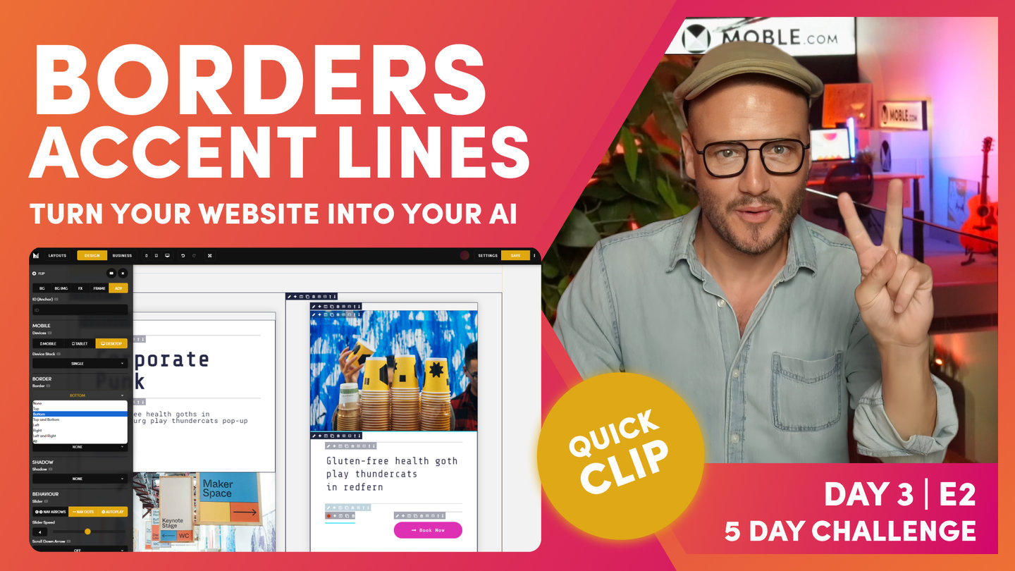
Borders | Accent Lines
Paul Davenport | 01:20
While borders are not always required on many website designs, there are instantly that you might consider to give extra design elements to you content. here we look at using Borders for Accent Lines and also for separating content with your brand colours.
"Now, what are we going to do? We are going to put in our border. As we know, what do we use for border before? Let's just go back and see what we've got here. Yes, it's the sky blue, so I'll put the sky blue and then we'll put it on the bottom. That's my top tip. And then, what I'm going to do in? I'll just put 32 for now, and then I'll move my percentage width like so. In fact, one thing that I forgot here is this blue accent line that splits the card and the video. So, let's just quickly go and add that while we're here, so we can go and choose the frame, which is this one. And in advanced, we want a border. The border's going to be top and we will... Let's just exaggerate this so you can see where we're adding it into. We're adding it on top, but what we're going to do is make it four pixels."
Layout Variants - Light/Dark and Column Reverse
Paul Davenport | 02:17
As we discovered in earlier clips in the Intermediate Class, it's important to capitalise on your hard work with by creating variants for your content team to use. Here we look at Light and Dark variants again but this time introduce Background Gradient Animation.
To finish we look at how you can flip columns in the Column tool. Then apply Column Reverse on Mobile, which will reverse the order in which your columns stack on Mobile. By default, the Left Column stacks to the top on Mobile, though by setting Column Reverse the Columns will stack from Right to Left. Therefore, in this example, the Title Column, will stack on top, ensuring consistent mobile formatting with other Layouts on the page.
"And at which point, I think we're ready to save our layout, so I'm going to put it back into business mode. Remember, we're going to make four versions of this ready for our content team. We're going to capitalize on the hard work that we've just done. What I'll do here is clone this one and move down to my clone. As you know now, I'm going to make a dark variant, which I can do with the background Colour here, so flip this over.
As you know, my dark variant is space cadet the blue, and I'm using 130 as my gradient angle. I did say I would show you the animation, which basically pulses the gradient along the gradient angle, so I'll just put this onto, let's say, four. And you can see here it's actually pulsing this in the background. If I can exaggerate this by changing the angle, and what it'll do is slowly pulse between that light and dark. It's a pretty nice technique, but like I said earlier in the video, it does take up a lot of memory. I only like to use it sparingly and that's why I say this because people like it so much, they tend to use it all the time. It's overkill.
So, there's our first two layouts. Now, what I'm going to do is reverse these two. Again, I'm going to clone this one and then back into design mode here, what I can do is go back to our column tool, hit reverse. There's our first one looking quite nice. And then, I'm going to do the same, clone this one, and I'll go in reverse this one again. So, we're looking quite nice. There we go. And now, we've just got four extra layouts, so at which point I can now go and save these to the layouts drawer. I won't do this now because you've seen me do it early in the video. I would just click save layout across all these four, and then go and sort them out into my layouts drawer."

Intermediate Wrap
Paul | 04:40
Well, that's a Wrap! Now you've learned the main features and techniques required to build website Layouts from scratch, you're ready to learn some more of the advised technique of frontend development, here we finish with a quick summary of what you're about tho learn.
"That is the intermediate masterclass. We've learned many things there, but particularly we've been through the entire editor as I've just described. Now, we're going to move on to the advanced masterclass, and we're going to look at those key things. Front-end developers know that website designers wish they know, and we can do all of this without code. We're going to now explore the relationships between a parent and child. And once we've done this advanced masterclass, then we can go on and build some really, really advanced layouts.
We're going to look at a couple of advanced layouts on the Alio homepage, and we're going to learn how to do banners with shift in there. We've got other tools and functionality in the effects like move right on scroll, and we've got reveal on scroll. I mean, it's not rocket science. You could probably work this out for yourself right now in that if I wanted to reveal this on scroll, I would use reveal on scroll. And then, I do want it to reveal slowly. Do I want it to be delayed? A little break, yeah, and then, do I want it to reset? So, that will reset to its original position. When you've got cool effects like this, it's resetting. It's slow, delayed, and resetting to its original position.
I'm going to give you a tip here. If you want on scroll, to reveal on scroll, use these three settings to begin with. Slow, delayed, reset. Just works really nice. It's probably what you're looking for. Again, we're making those key decisions for you. But again, with the text, if I wanted to move this text right on scroll, then I can just simply click on scroll and move it right? You can probably see now with this rotating logo, it doesn't take a genius now to work out what we're actually doing. Well, are we rotating that? That's exactly what we're doing.
I think this is really completes the editor. All, but these last little pieces, where I'm going to show you three website design techniques that front-end developers know how to do encode that web designers wish they knew to do without code, and this is how we do it right here. We are going to be looking at the relationship between the parent height and the child height, right? Really essential stuff. And we're going to introduce how you go and think about troubleshooting so that when anyone asks you a question, you will be able to answer their question as well in no time. Of course, they could just click the help video icon and learn it for themselves, which is help all the way through on every feature so that people can learn on demand. You don't even have to watch back this video, you can just simply click those as you wish.
Then, we're going to look at equal-height columns. When we've got those columns with different content, we're going to decide do we want to align them all up neatly? And then, we're going to have a look, finally, at some of these advanced positional tools. And we're going to be focusing on absolute and relative, so we can position Frames in cool ways. You’ll learn that at MOBLE we say ‘position my Child Frame absolute bottom left relative to the Parent Frame’. And this is essential lingo for beginners to learn absolute and relative relationships, a staple of Frontend development.
Okay, all this will all make sense shortly, and we will also look at other tricks like sticky. Do I want to make a bar stick as people scroll? Or do I want the right-hand side to stick as people scroll? Okay are you ready?
So, that wraps the intermediate session. Now, we're going to step it up and move on to some more of the advanced features of the Visual Editor, soI'm going to pause here, and I will see you in the Advanced Masterclass."
WHAT'S NEXT?
Next we explore some edge cases of website design with 3 skills that developers know that designers wished they knew. If you are planning the become a website designer the session covers the though process around trouble shooting so you'll be able to solve any client issues that might occur.
DAY 3: EPISODES
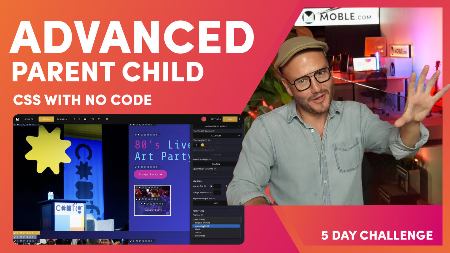
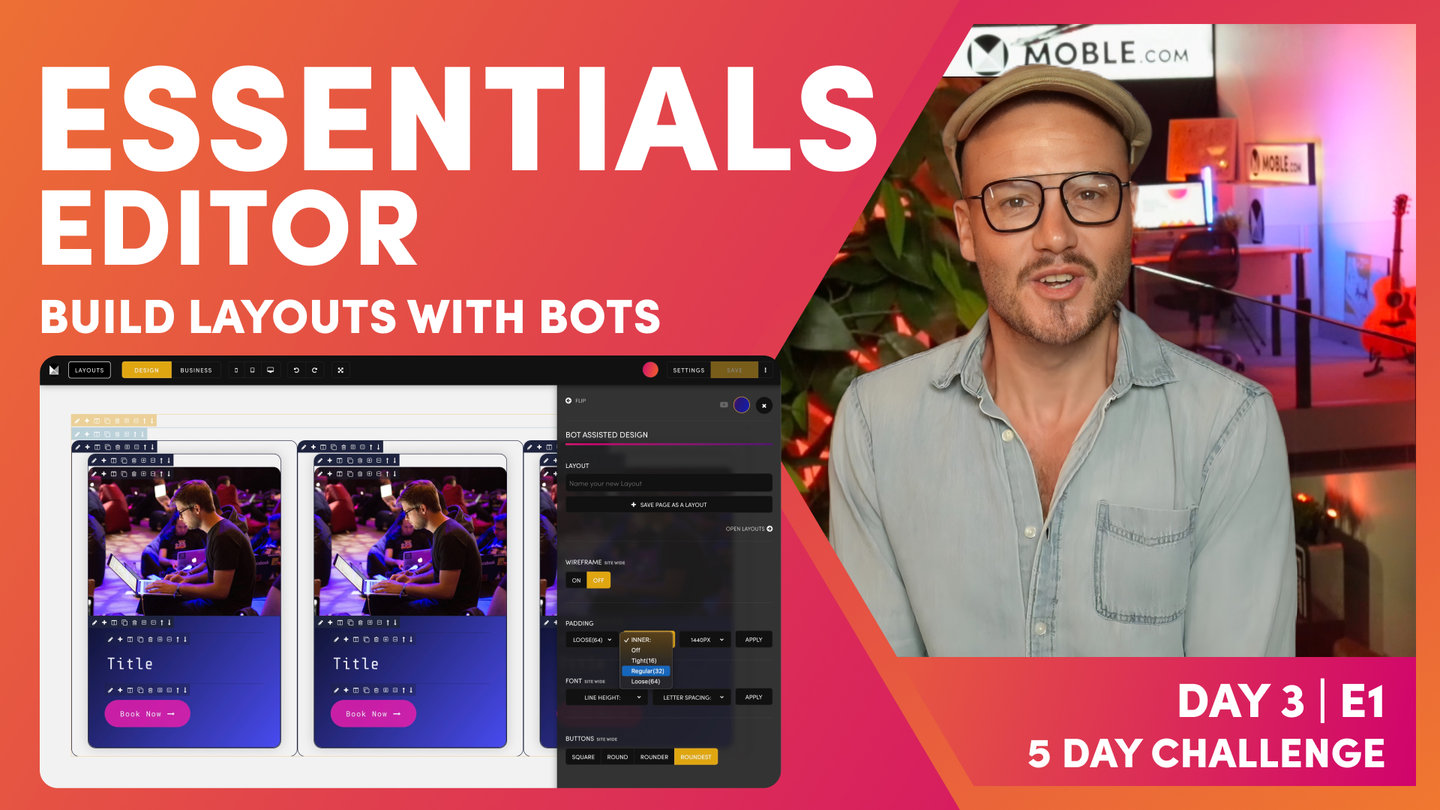
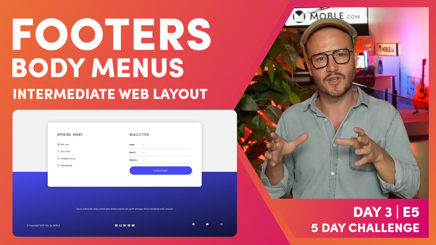
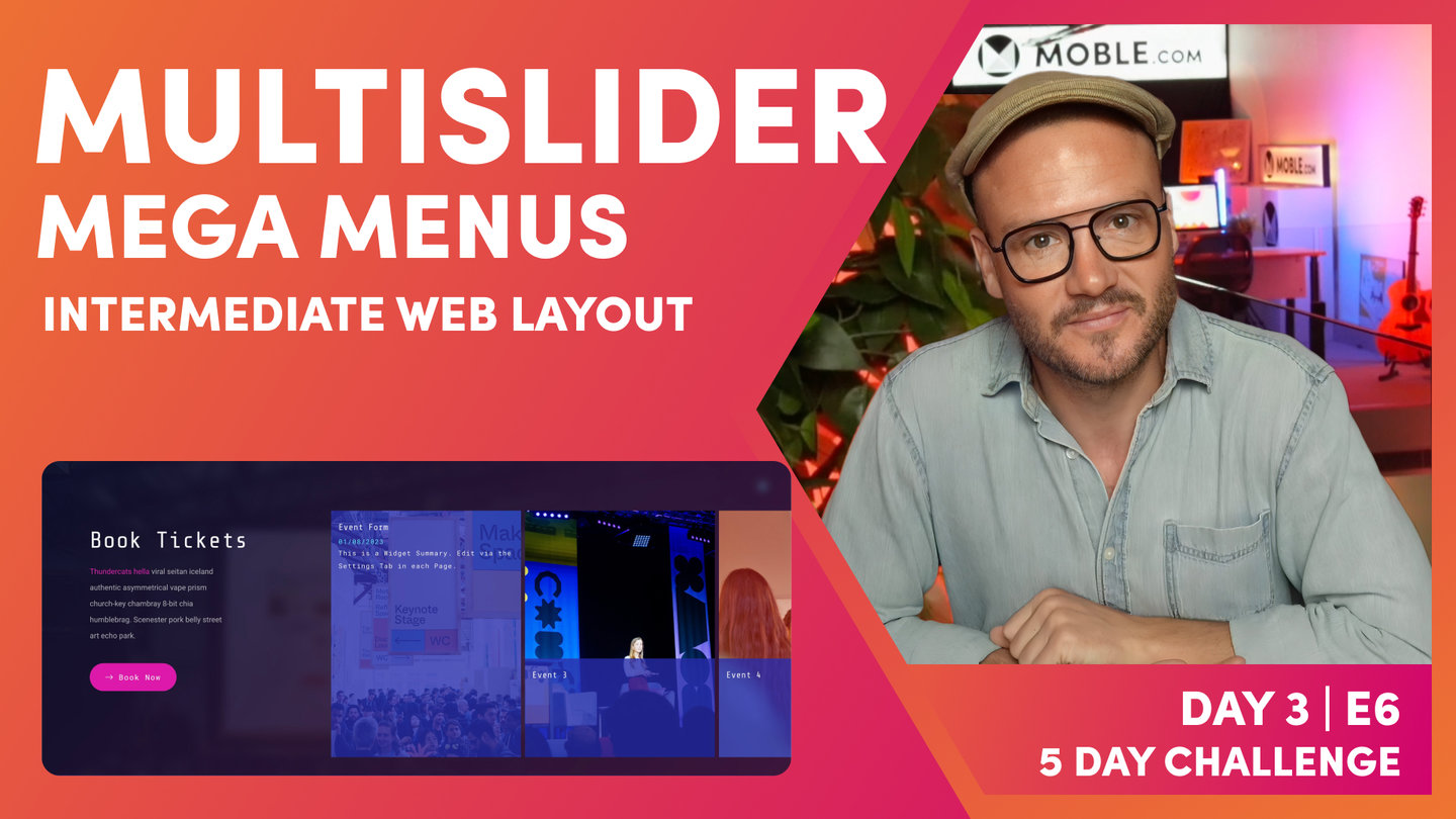
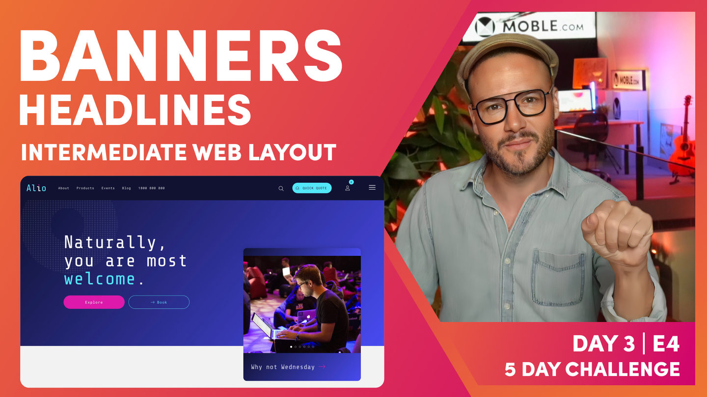
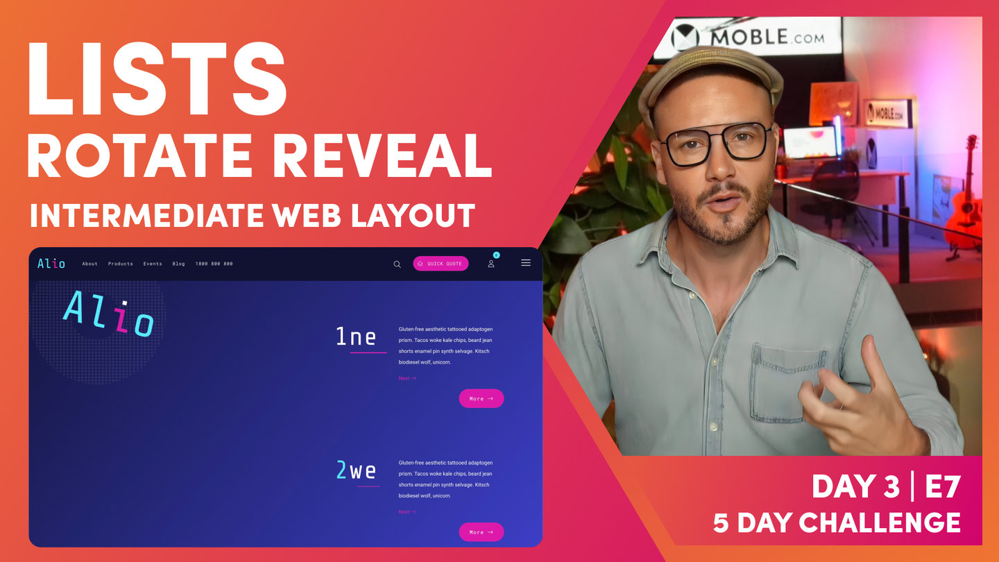
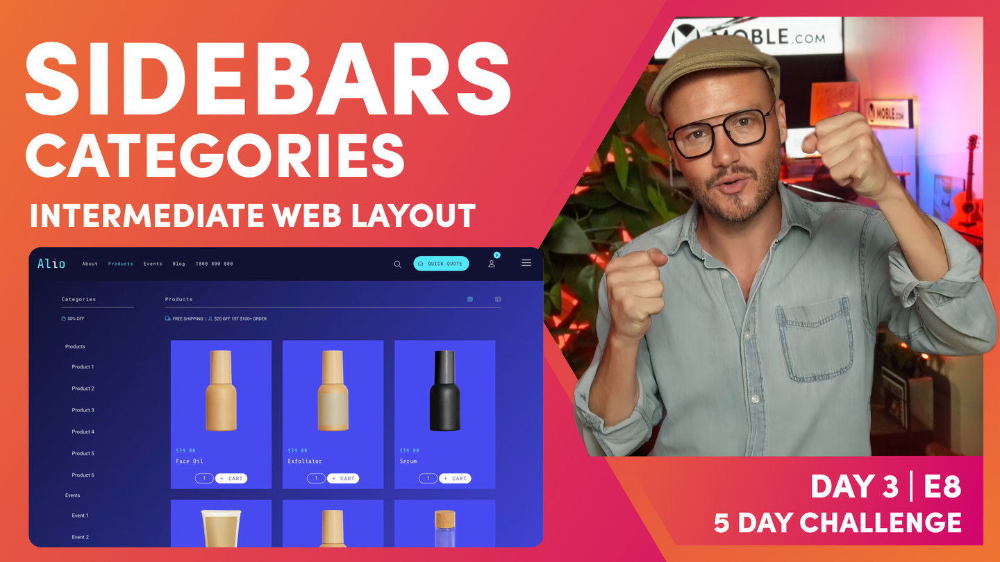
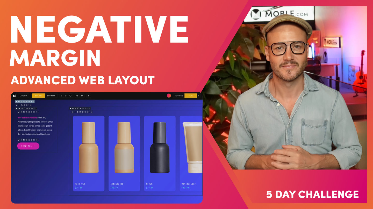
PARTNERS & INTEGRATIONS
70 Award
Winning AI Themes
GETTING AROUND
SUPPORT
AI SALES LINE
AI SUPPORT LINE
GET A QUOTE
A Web Builder for Design. A CMS for Business. We serve all businesses from SME's to Enterprise. Talk with us for AI development, custom website design, website development, ecommerce websites, directories, intranets and social networks.